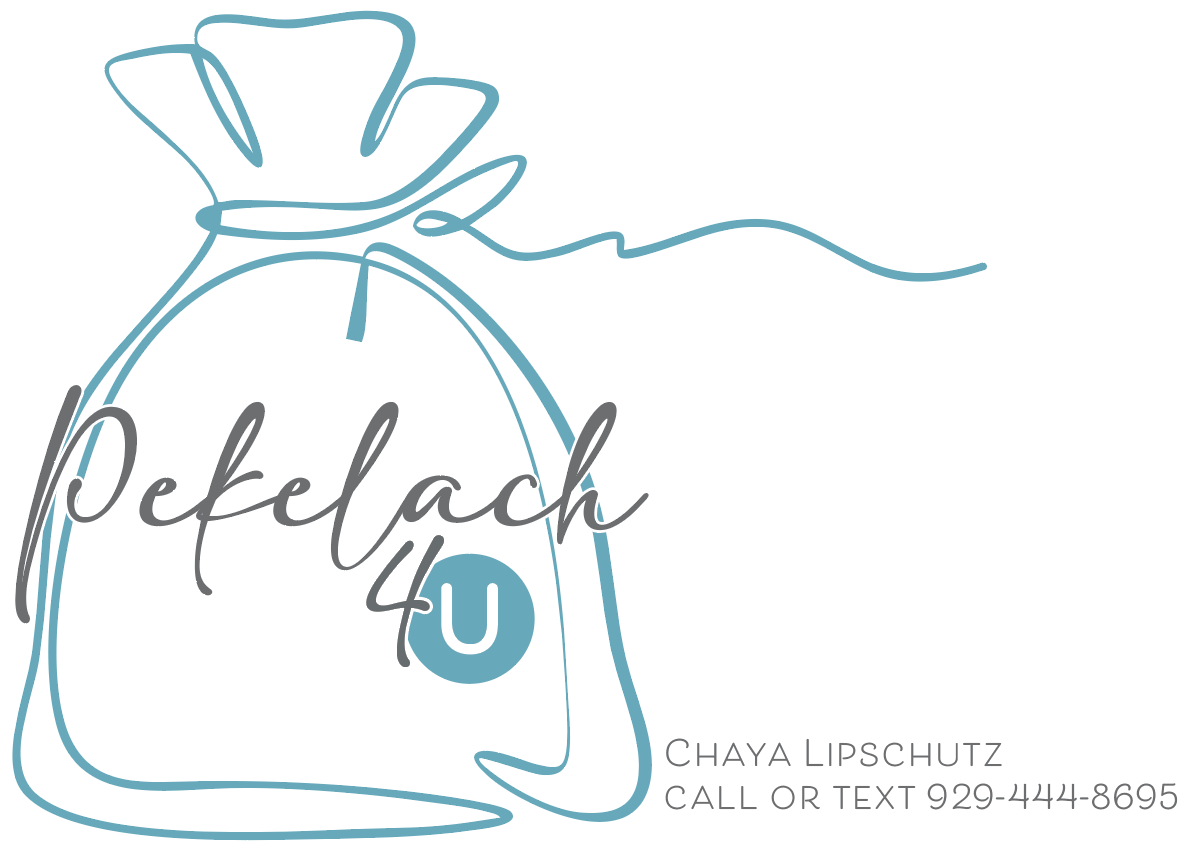
I just made this logo, and my client needs it by tomorrow -She is starting a pekelach company and wants this logo for her bags. Any critique on it? (2 different versions)
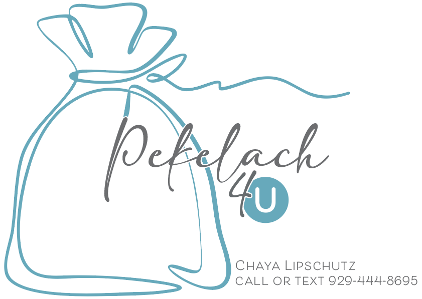
like option 2 it seems more balanced
She liked option 1 in the end, but I also like option 2
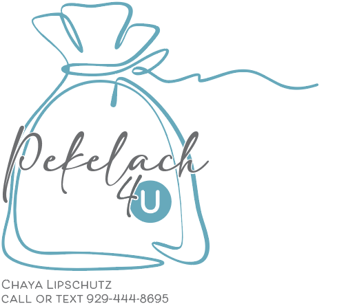
oh well, so maybe put the contact info under the pekel
and are you able to shorten the string?
Yes- should I?
Will the contact info under the logo look like too much?
Can it be on the side? It is going on a bag…
i think that would make sense just so that it would fit better on a sticker or whatever
how bout trying it out and posting it?
like it doesn’t fit in
also, something about the “u” looks funny, and i cant place my finger on it…
should I try a different font?
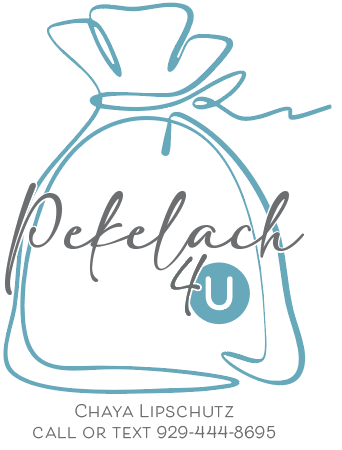
The u looks a bit like an ou kashrus symbol
much better!
lol thats what it is!
but to what would you change it to?
I like the logo very much
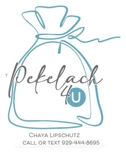
Personally I do not think the owner of the company and contact info should be attached to the logo. The logo should be an entity for itself say in the center of the bag. Then at the bottom corner you could add the contact info in a blue box or any other way which suits the design… Does that make any sense? by binding it together i feel the logo is loosing its touch
Agree with @weiss4155 Logo should be it’s own thing, then on things like stickers you can add on her contact info.
I personally would make the peckel smaller so the text fits in it better.
I love it, it’s adorable!