Good idea, @blimi !
Changes looking nice!
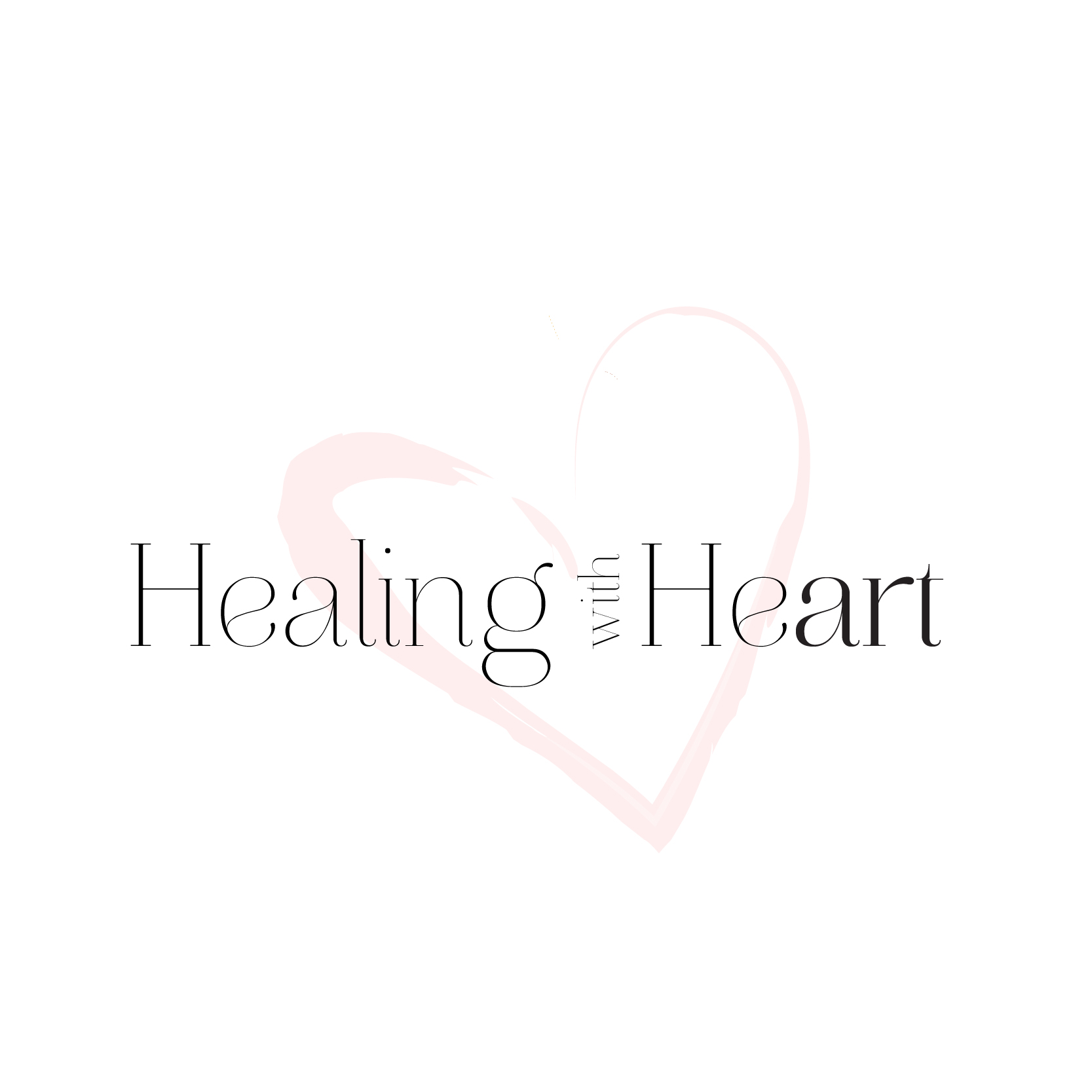
I’m sure you can think of hundreds of variations for the icon, I happened to have pictured the paintbrush a bit bigger and the handle going off the top edge of the heart…
1 Like
I really like both options now!
I think I like this one (originally #5) best now and then the other one
1 Like
Thank you! I appreciate all of you’re help 
sure! My pleasure!!
I like it how it looks now with the lowercase bold ‘art’
Great job!
1 Like
Thank you!! I will let everyone know what the client chooses 
so pretty
1 idea…
maybe you use the heart shape instead of writing out the word “heart” ?
1 Like
Thanks for that idea!
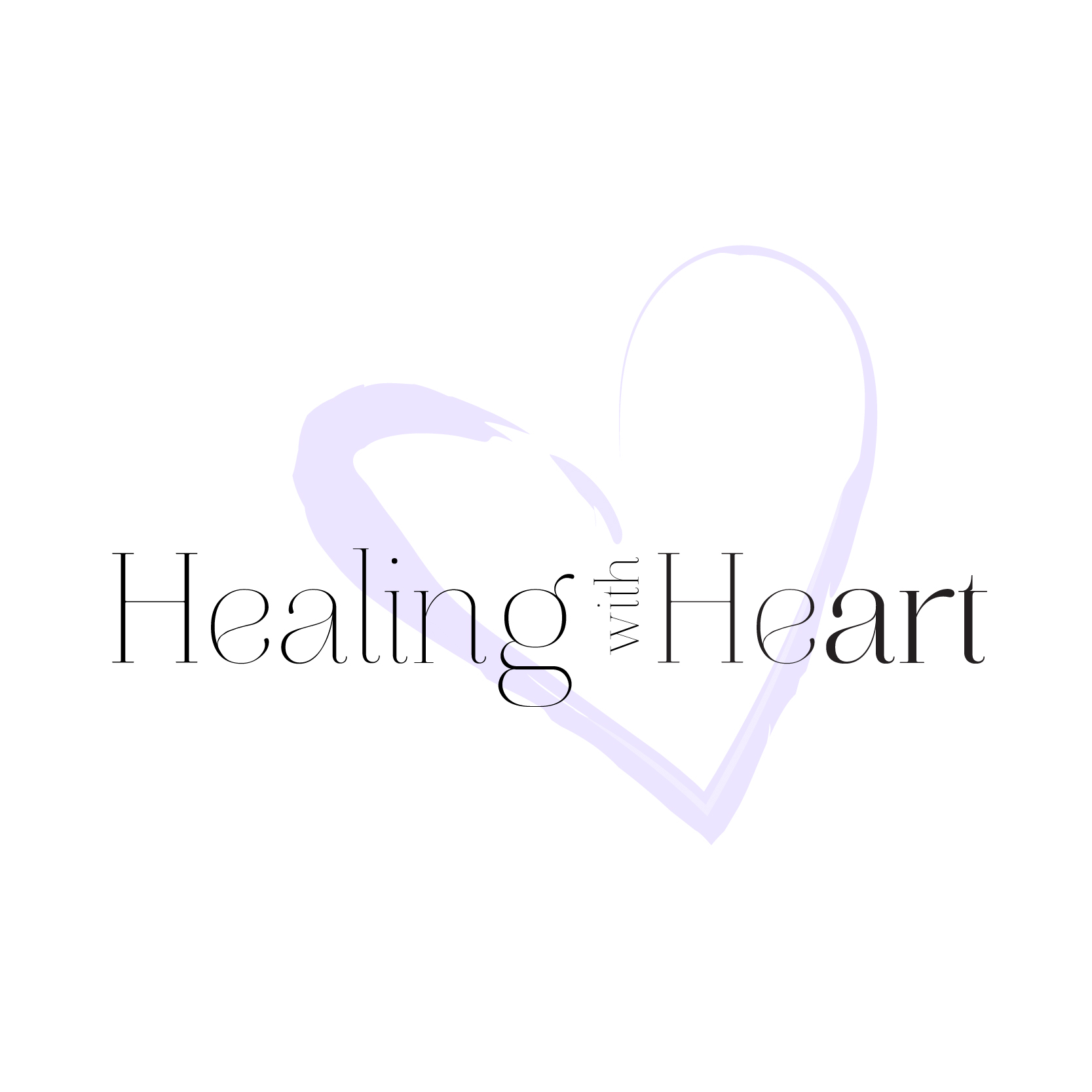
The client likes #5 the most. She wants the word art to be in caps and in different colors (oy, clients…  )
)
nice!
maybe she doesn’t think it stands out enough.
What about showing her an option in a different font- one that the bold is a stronger contrast to the regular font.
This is in addition to the changes that she requested to see of course.
1 Like
Great idea, thanks!
Beautiful job, Breindy!
Thanks for sharing! - It’s always nice to see the finished product.
1 Like
Really nice!!!
1 Like
Thank you so much @Breindy-S and @schlomithsassoon for your feedback