
Hi,
I’m in middle of working on a logo for a life coaching business with a focus on using art as a tool. The client left the colors and fonts up to me so I decides to go with the pastel, watercolor style. I’d love to hear all your thoughts and ideas. I’d appreciate everyone helping me decide which to send to the client.
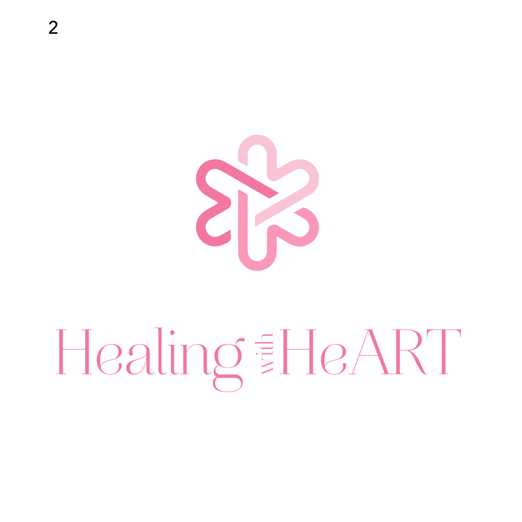
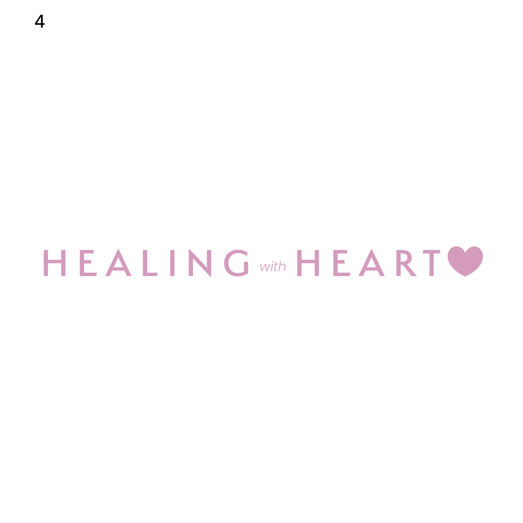
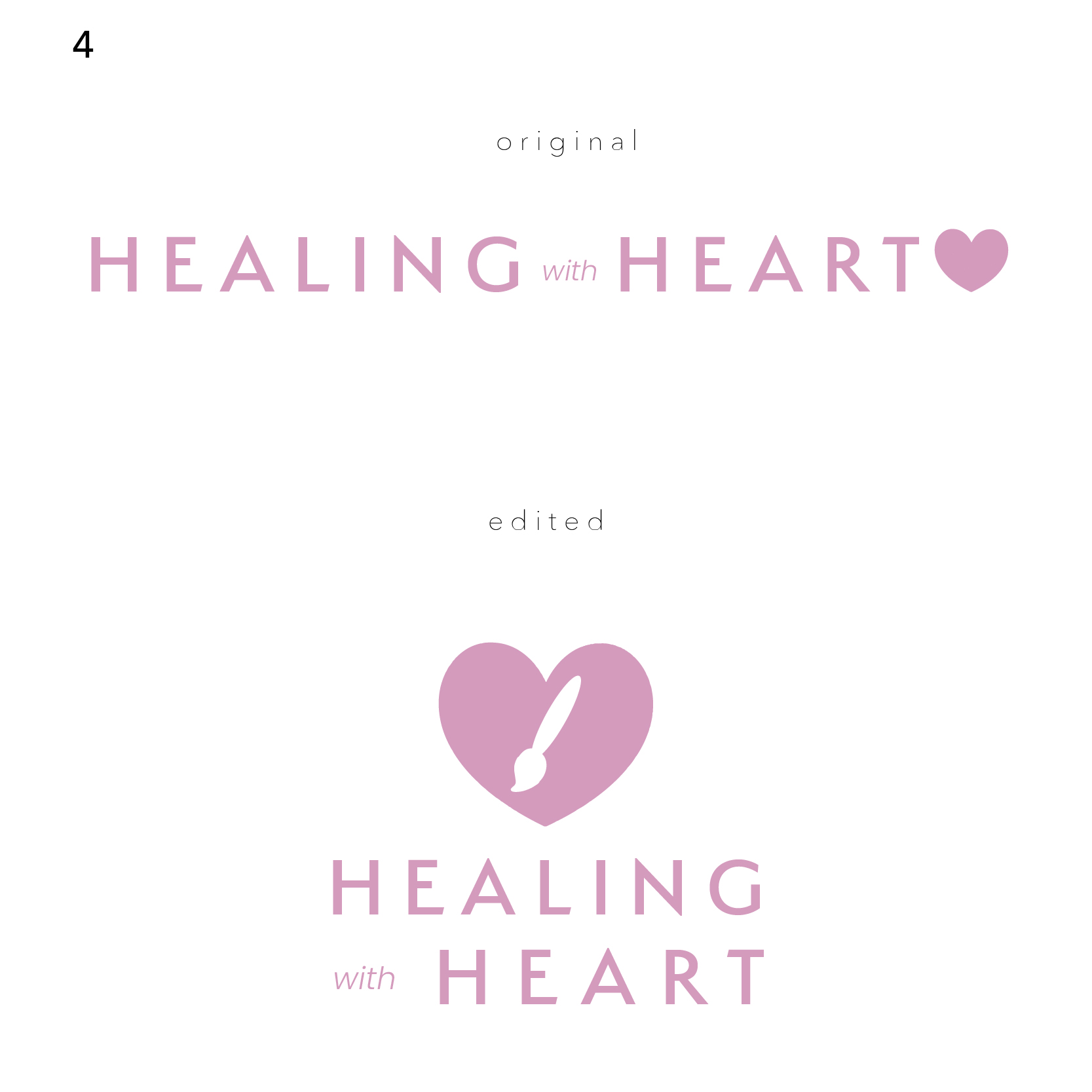
Wow nice! I would work with 2 and 4. Don’t love that Art is all caps
1 Like
Such nice logos!!
lol I’m having trouble choosing 
This is how I am looking at them…
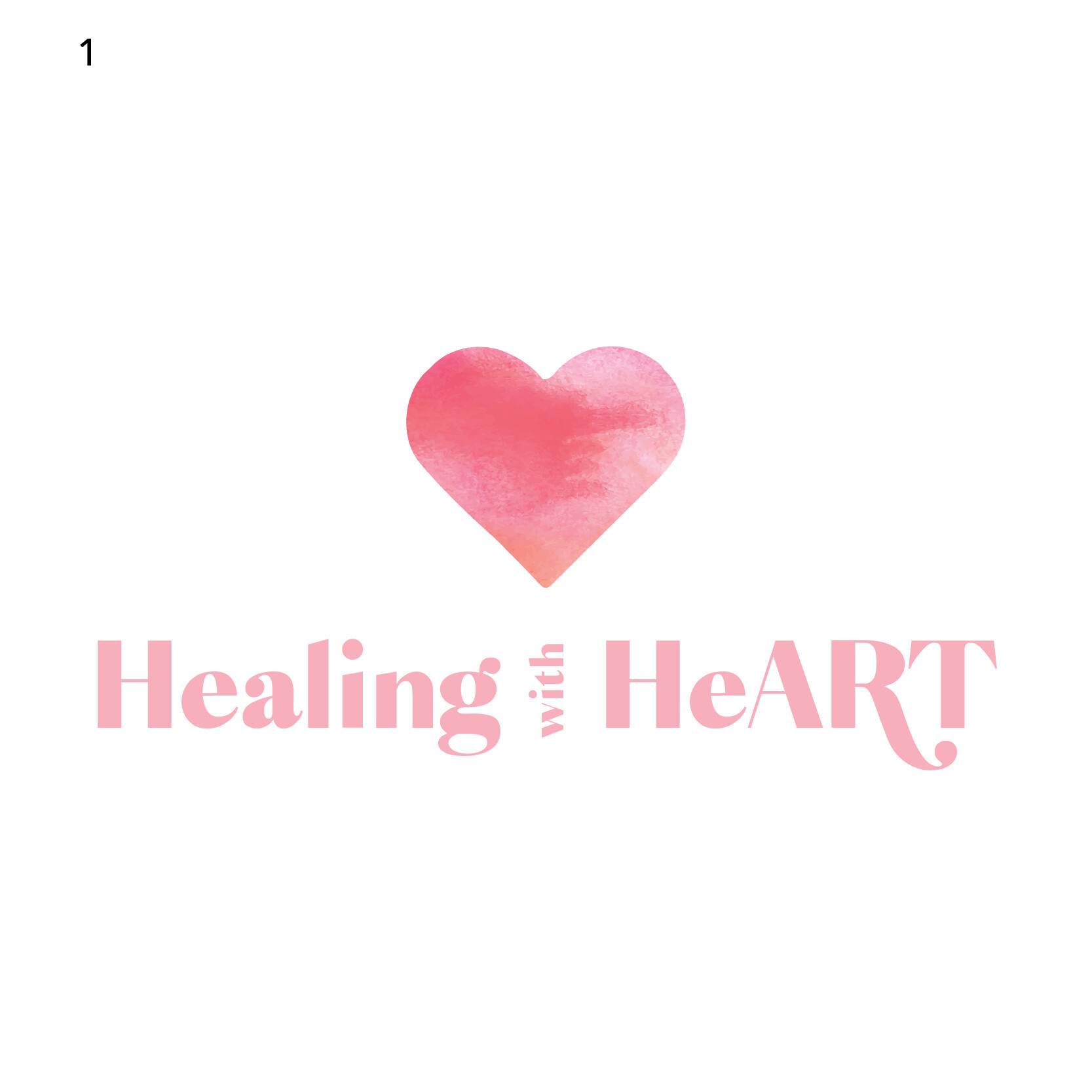
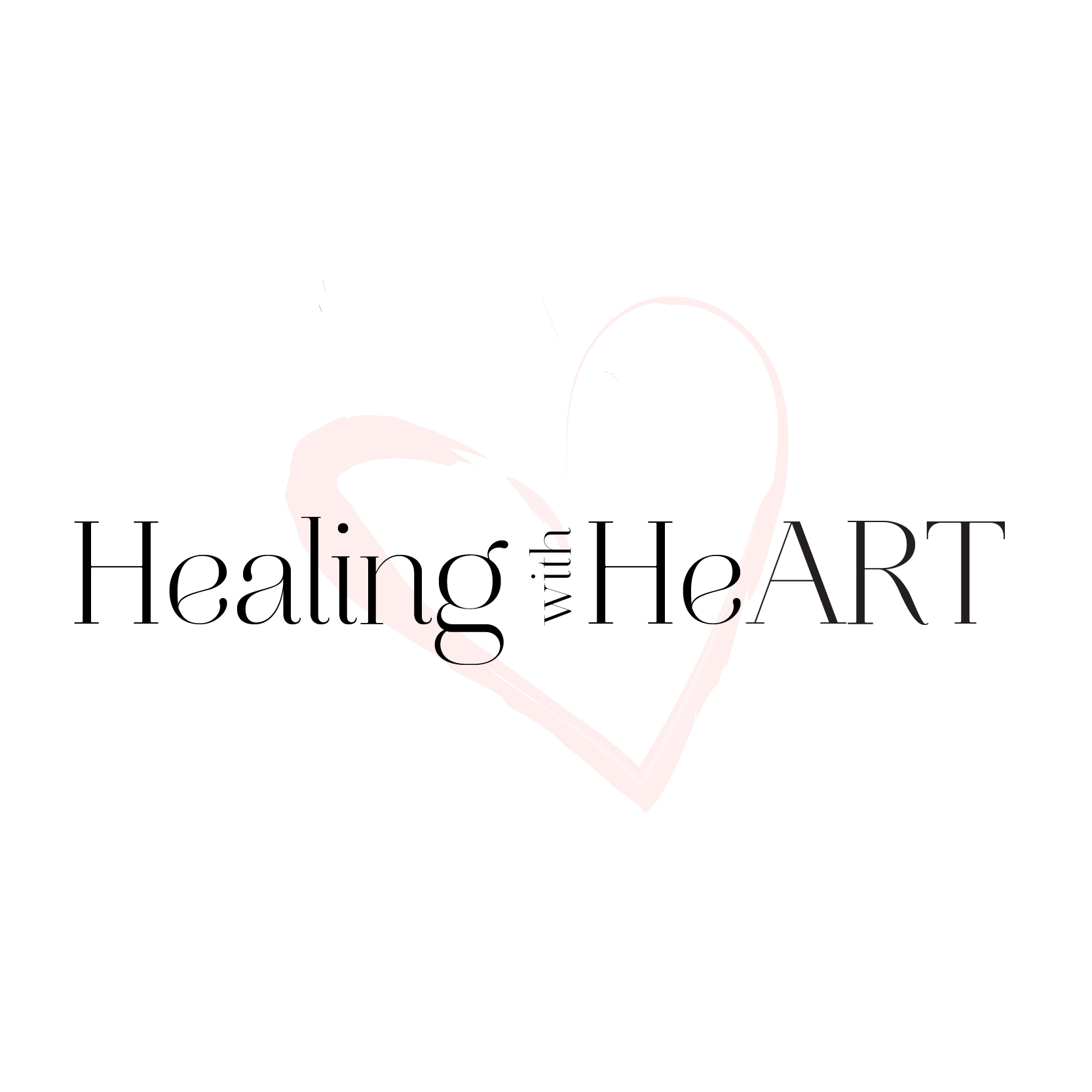
#1- I like the font but dont love the heart on top - I also don’t how most of the options are so long - can you try some with “healing” on top and then underneath “with heart”
#2 - its a cool icon but I feel like it gives off a very medical feel - it reminds me a little of
although maybe that is what you are trying to portray…
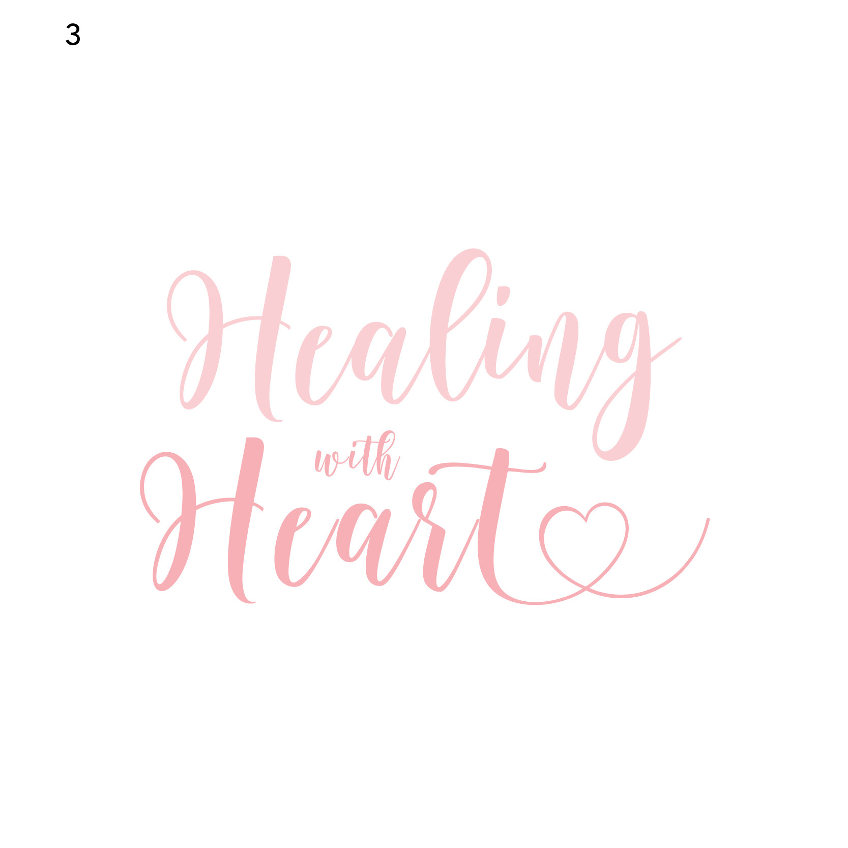
#3 - I like it but I feel like its too cutesy…not sure…
#4 - I love the coloring - I think this is the one I like best!
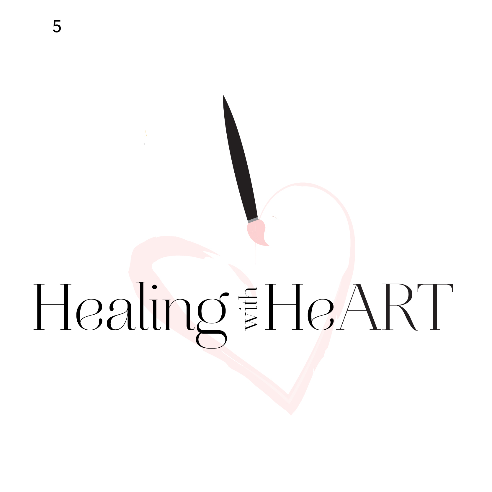
#5 - I like the font and pink color - don’t love the paintbrush -it is a trailing element…
Hope that helps.
Definitely vote for #4!
Looks very clean and professional
1 Like
Really good! I like 4 and 2 the best. Good luck!
1 Like
they are all really nice. i will vote for #4
1 Like
Thank you so much!
Thank you so much for all your feedback 
Ok so basically you’re saying #1-3 are out. Isn’t #4 too simple? I posted it because I like how clean cut it is but I don’t think i’ts much of a logo (at least not yet). For #5, my personal favorite at the moment especially since it conveys the art concept the client wants, what do you mean that the paintbrush is trailing? how can I improve that logo?
Thank you!
Thank you
Thanks so much! Any ideas how to make it look more like a logo (if you know what I mean)?
Maybe a negative paintbrush in a heart?
It would be nice if #4 had an interesting/ original icon…
1 Like
The paintbrush in #5 looks like it leads your eyes off from looking at the logo since it’s so vertical- it sticks out too much from the logo - I think you can drop the paintbrush but keep the heart where it is - it still looks artsy since it has the watercolor feel… I also think dropping the paintbrush will give it more sophistication.
and #4 - even though you think its not a logo yet - I think you can send as another option to the client - it has such a neat look…
Can you try to have the letters ART stand out without leaving it in all caps, maybe change the color or thickness?
1 Like
I like that idea of a negative paintbrush in the heart, I’m going to try it!
I’m putting in a vote for #5
1 Like
Yes, I’ll try that. The client wanted it like that but I can show her in lower case and see if she likes it. Thanks for the suggestion!
Thank you! 