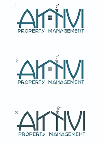
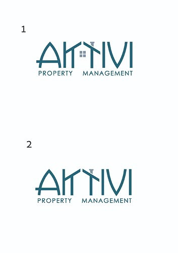
I’m working on a logo for a property management company, I want to know if the name is clear enough? and any other additional feedback.
Thanks
It is really amazing! For me the name is clear enough
I would work with number three. I think you can remove the two lines on top of the chimney.
I would also change the font of ‘property management’ to be more basic (nexa style).
I would also try to give a bit more spacing between every letter of AKTIVI because it looks a drop squashed
it looks great only thing I had a hard time seeing the m right away I thought it was an ivi as the other letters dont have a break init only by the house
is it not an I V I ?
I read it as A K T I V I
it is aktivi, I just wanted to make sure the k and t are clear enough.
It’s a great concept!
It is hard to read though. I was not sure until you just told us. I’m trying to think of ways to make it more readable with the same concept…
Also:
The steam from the chiminea is too much.
And yes, change “property management” to a simple sans-serif font
I couldnt read it…
yes its definitely better, now I see what it says. Great idea!
search this by images, maybe you’ll find a way to make them clearer.
“k t house logo”
I think it needs to be a little clearer still. I wouldn’t have known what letters.
Maybe slant the top part of the k more or separate the letters more.
I see where your going but I still see it as m even though its not.
It should be clearer what the name is, this way if you only see it for a few seconds youll know what the name is right away.
its not clear to me. I kept trying. to figure out. what the middle letter was. was assuming it was 3 initials


