Hi, I created this logo for a company that sells custom paintings of gedolim and the like. Any feedback?
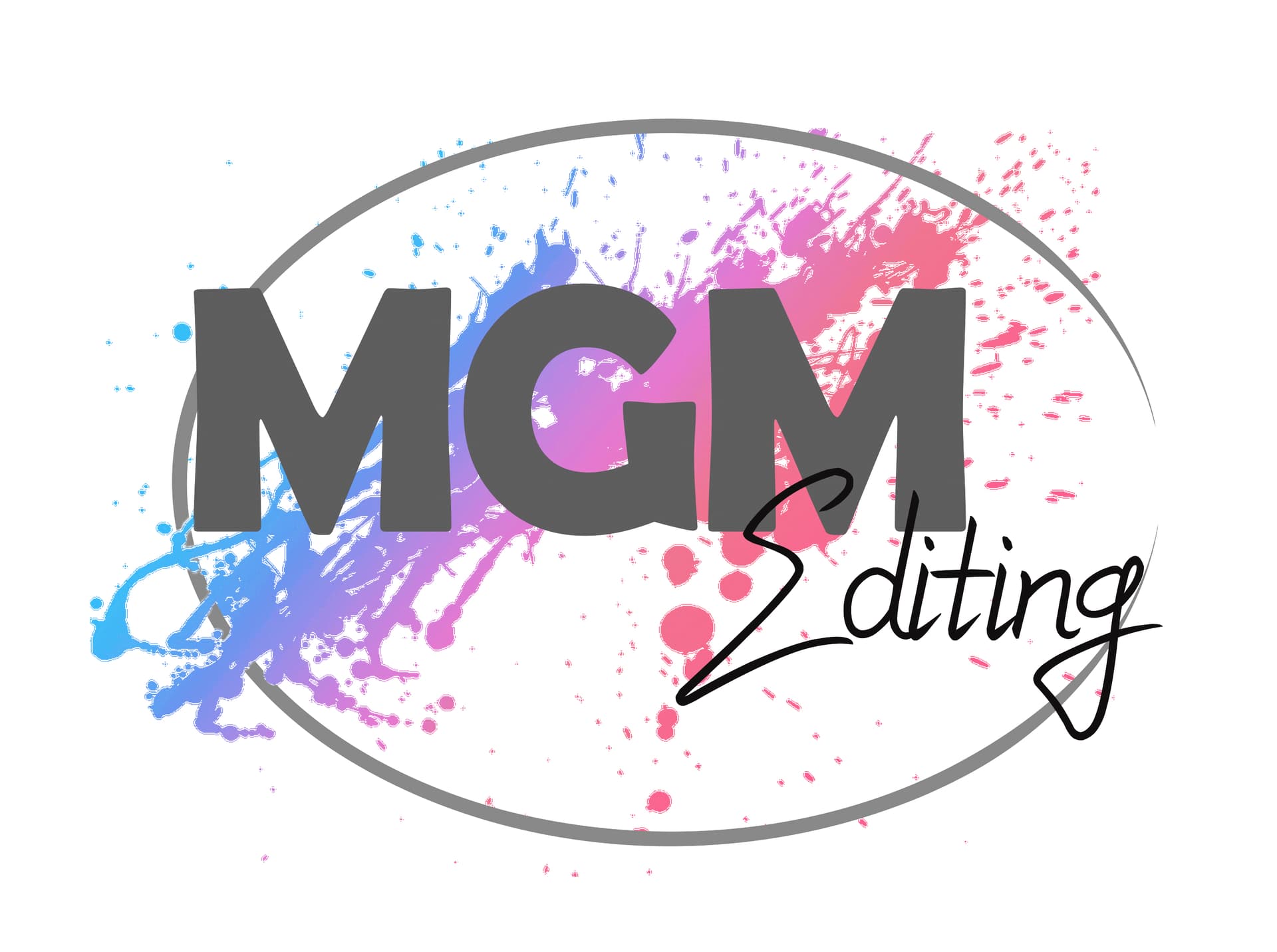
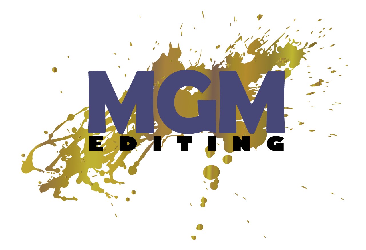
I feel like if it’s for Gedolim, maybe the colors should be less bright - maybe more sophisticated colors like gold, grey, maroon, navy… etc.
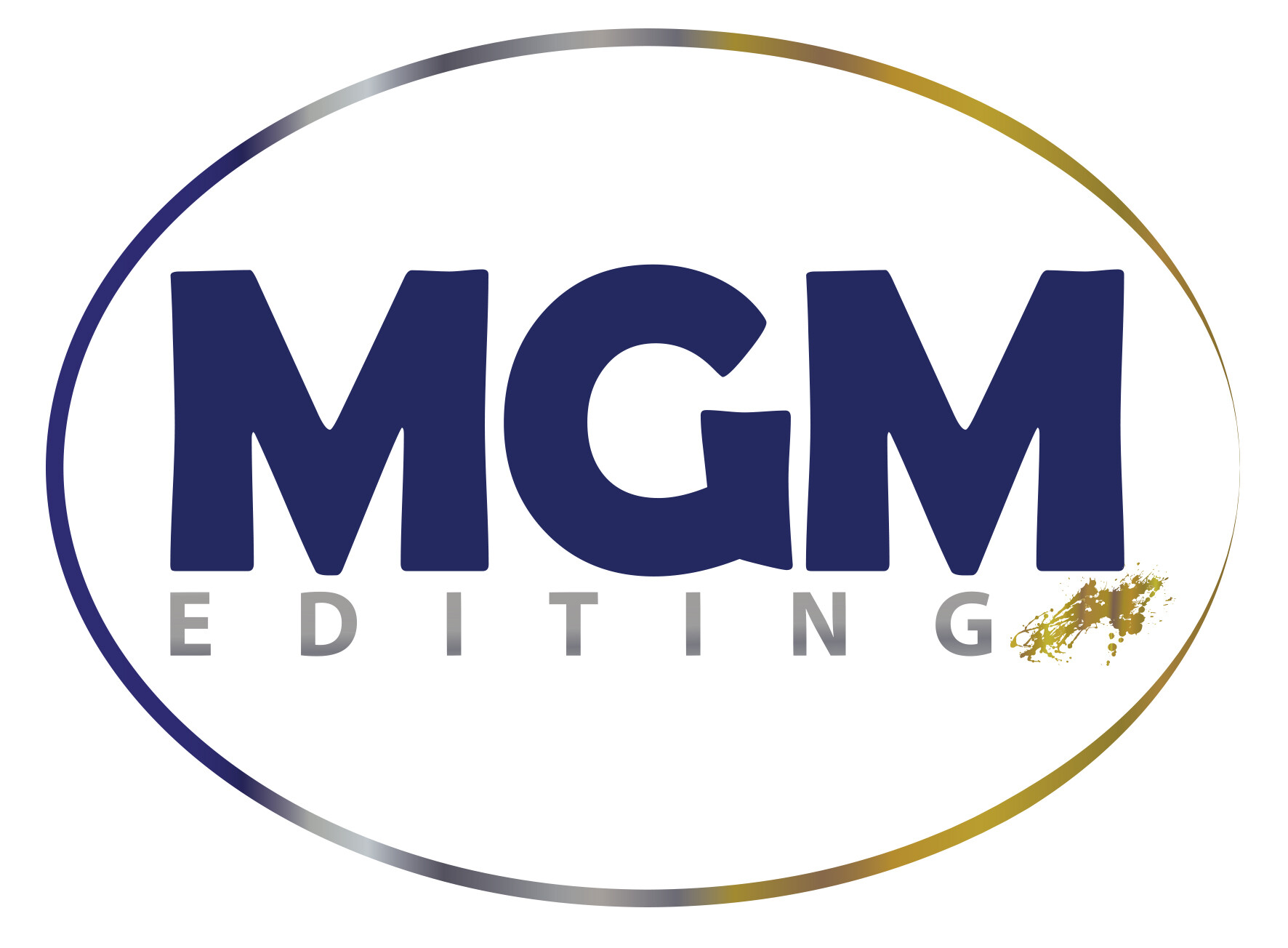
Also, not sure if it will look good but maybe take away the oval around the paint splatter. I would then suggest moving the word Editing so that the E sticks into the G. Maybe also change the font of the word Editing to something more “handwritten” I don’t love this font…
Another idea I have is maybe mask the paint splatter into the words MGM - it somehow is bothering me that it’s not so neat outside of the text (which is totally my personal preference…)
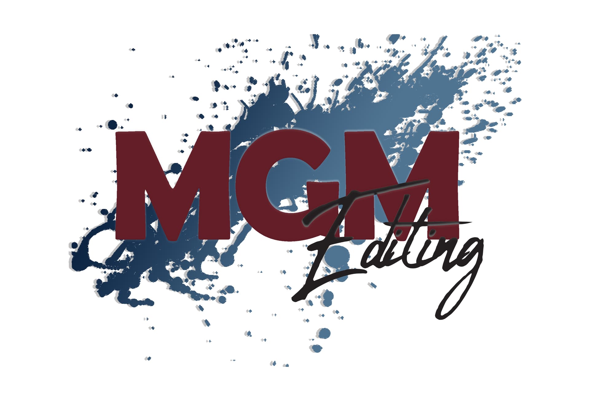
Keep the MGM in gray and play with the background splashes color. I agree to go more into gold, navy, dark blue, creme type of colors.
Nice!
Make sure that the colors contrast enough with each other. Since they are all dark, it is hard to see.
In illustrator, there is a new type of gradient tool that lets you be more flexible with the placing of the colors. Maybe try it out for the background color splash. Also, I don’t think it needs the shadow.
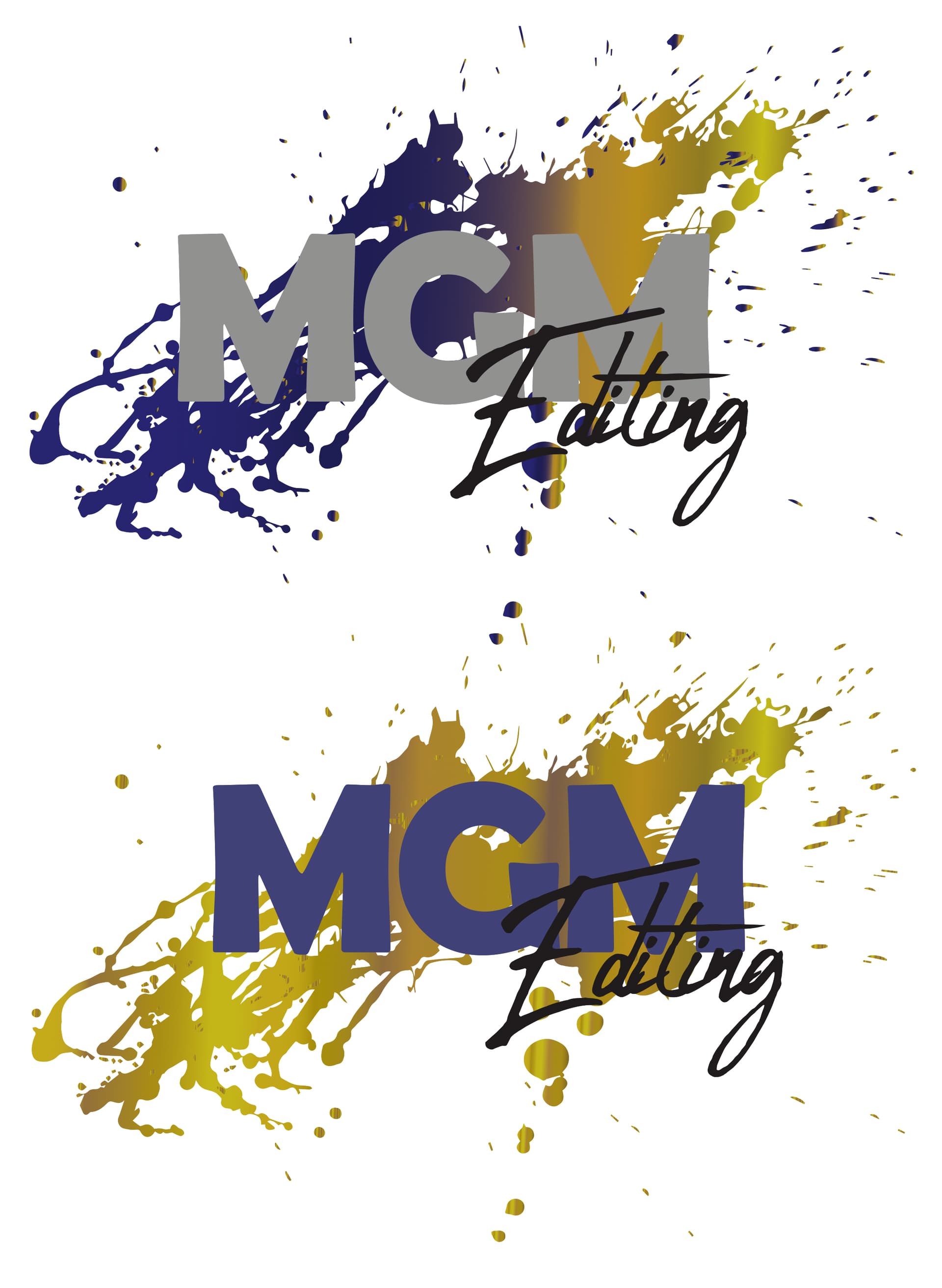
I feel like the gold and silver get lost on each other. In the first one, the last M gets lost, and in the second one, the “Editing” gets lost. The Silver and blue contrast nicely.
Maybe try the first one with a solid maroon splash?
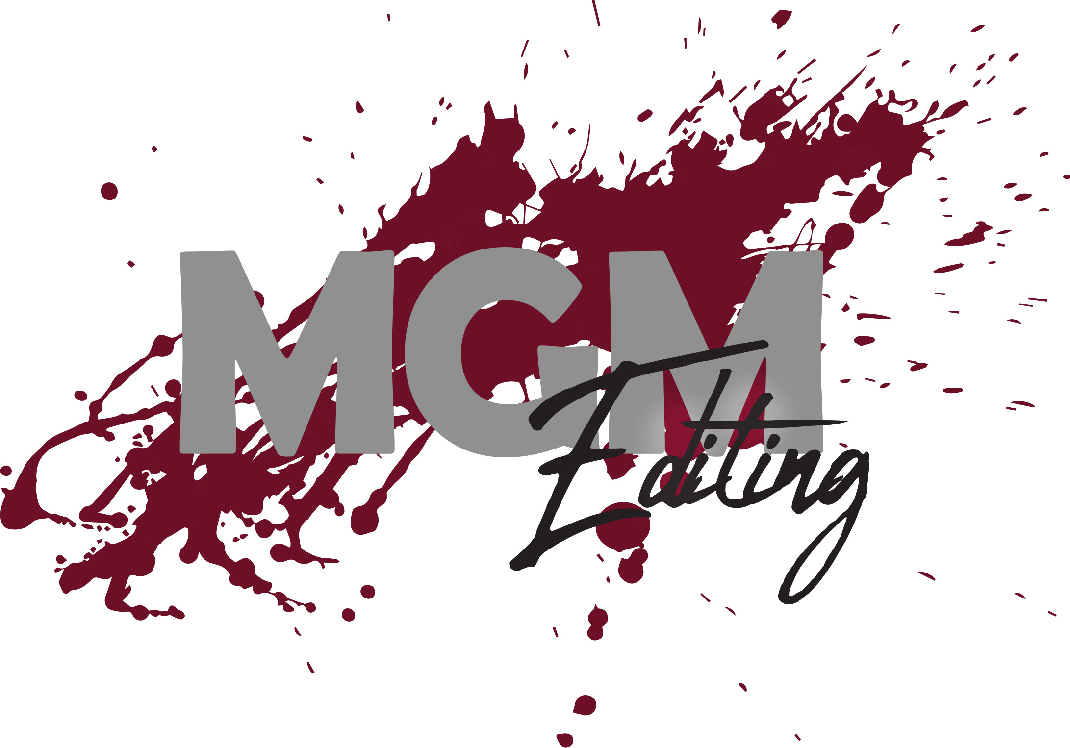
better?
I like this coloring best (attached) The blue in this paint splash looks cool cuz of the gradient.
I liked that you aligned the text from the M to the M - can you try something a little lighter (not so bold) cuz the MGM is pretty bold. Can you try to make the paint splash neater or do something else? - A good logo should have good “lock fit.” and no trailing elements…
other ideas you could do: 1.make a paint palette inside the G
2.mask the splatter into the letters MGM so the letters have the paint splatter effect but it still looks neat
3.maybe use a paintbrush as the leg of the first M
Sorry to drive you crazy but a logo is an important part of a company and the nice results in the end will be worth the effort…
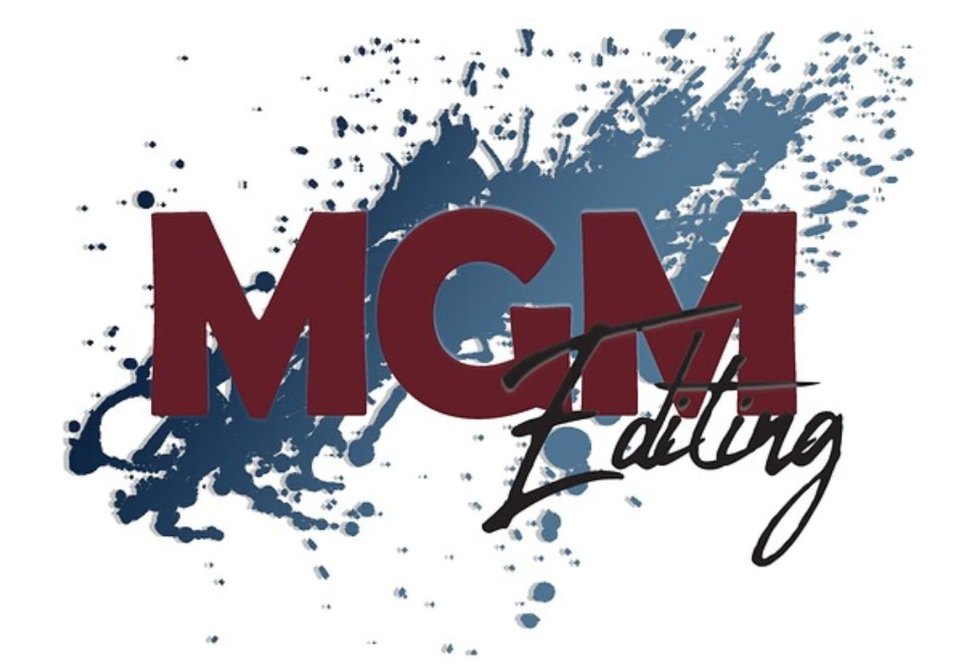
I think this is better - definitely cleaner looking but now the paint splash looks like it was just put random at the end. I think it should be a drop bigger to go under the last M and extend a tiny bit out of the oval / or try to overlap the splatter on top of the M - see which one looks better…
I like the last one best. I feel like the ones before, though colors definitely better than the original, it gives off to me a logo of a funky fun company. I would never think it to be gedolim paintings. Maybe try a different idea, not splatter. The splatter to me takes away from the sophisticated look the logo should have. Maybe an accent of a paint brush stroke. Good luck!
Prefer the one without the circle, I like the more random, dynamic, feel of the other, the oval feels too clean. Breindy’s color suggestion seems to be a good combination. Interesting name for a company that sells paintings, wouldn’t know that from the name.