Hi Everyone,
Im trying to come up with a really really neat modern logo. Im kind of stuck.
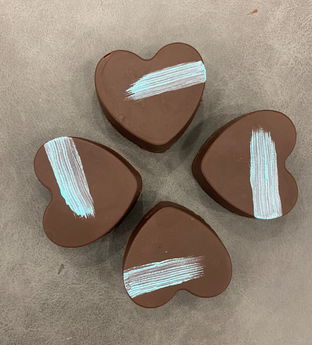
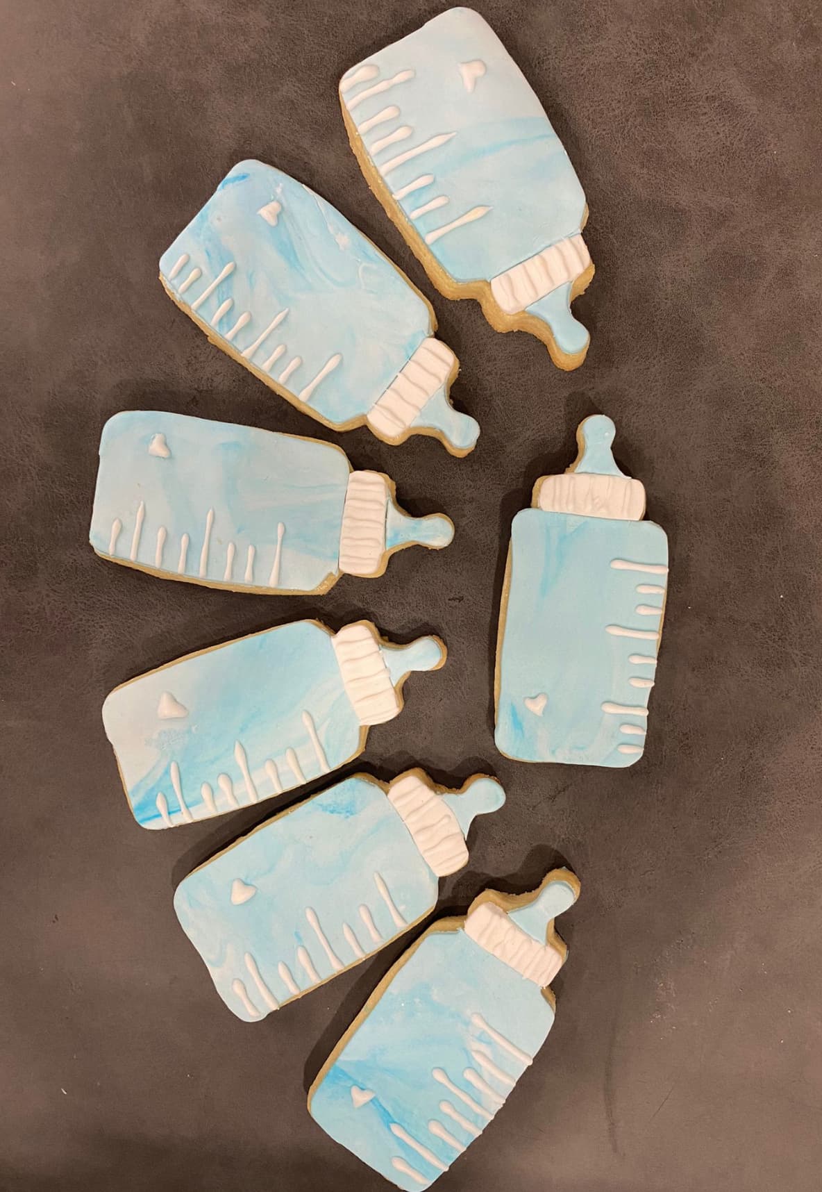
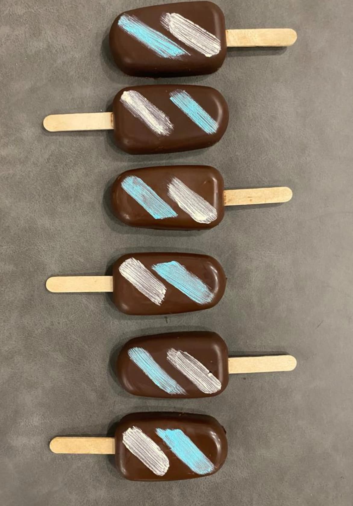
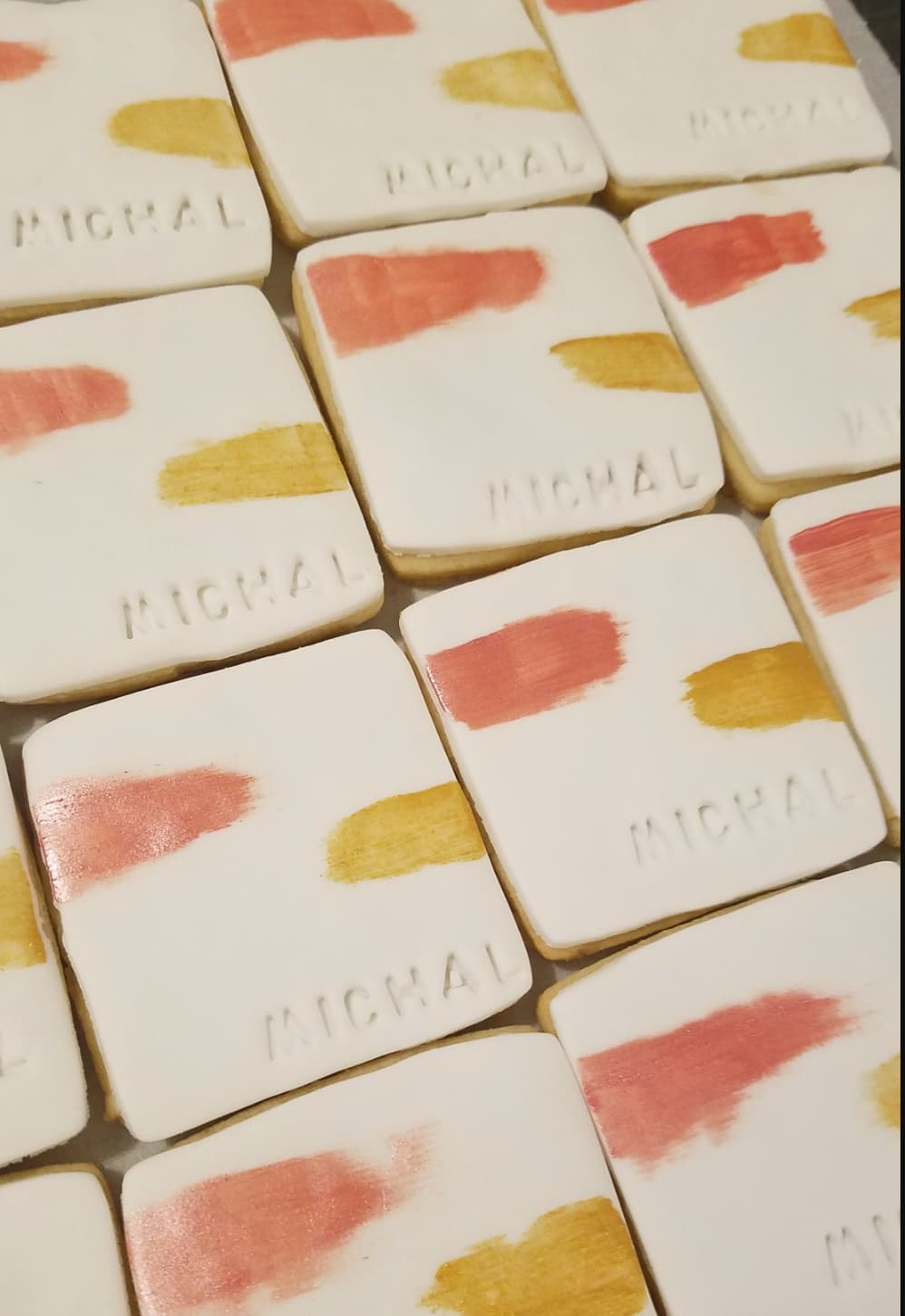
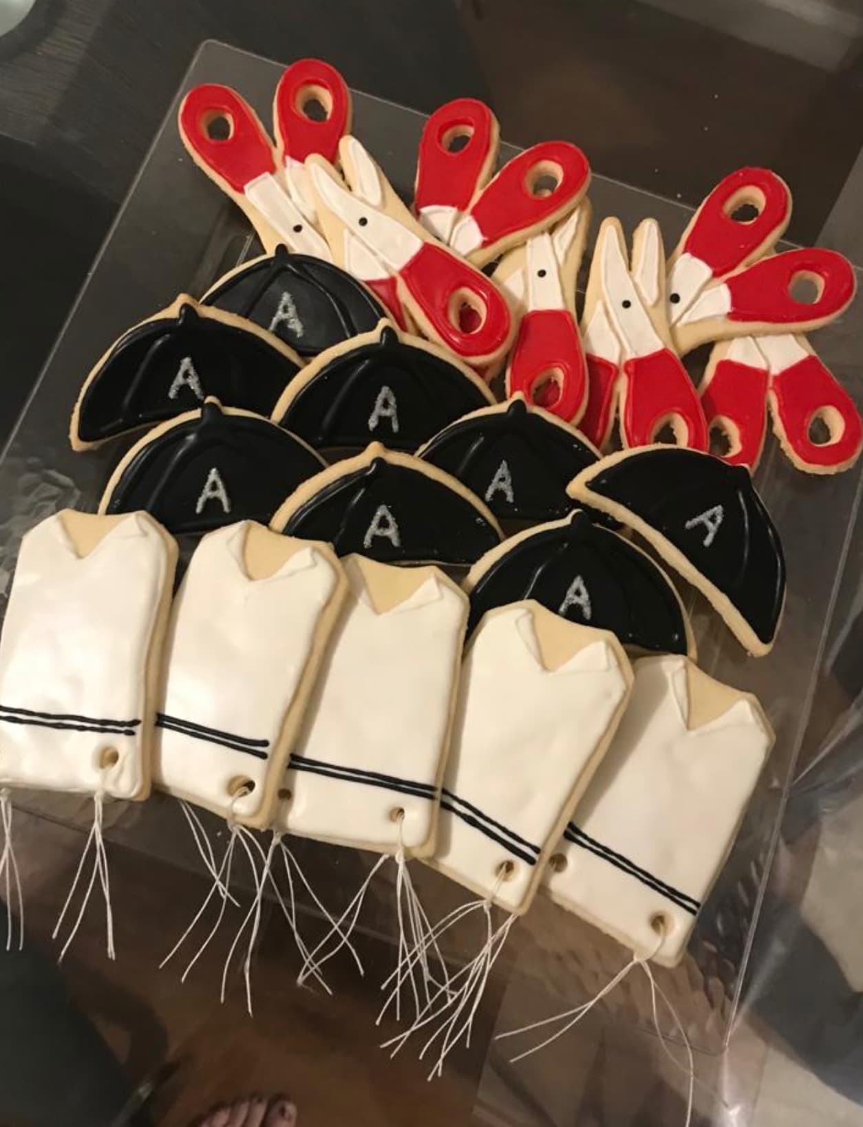
The company is called Upstate Desserts. This lady makes really really nice things. Most inspiration im finding is with baking not really her dessert style. Attached are pictures of what she does to get an idea.
Any good ideas anyone??
Thankx!!
Try to research related industries. Events, event planning, wedding stuff etc.
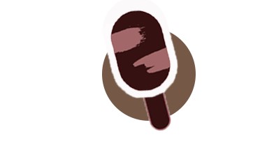
It looks like she uses these paint strokes a lot in her stuff maybe you can make one and use it as the s in upstate or something idk just a thought…
Is her baking a cleaner, sharper style than most baking logos that you see?
If yes, maybe try using a sans-serif font with a clean icon instead of script
ye, I think thats what i want to do. She does very modern updated things. I just have to find the right icon. I like this idea. I wish more of these kind of icons would come up when i search.
i would also try to incorporate the brush stroke as raizy suggested. It looks like that is her personal style.
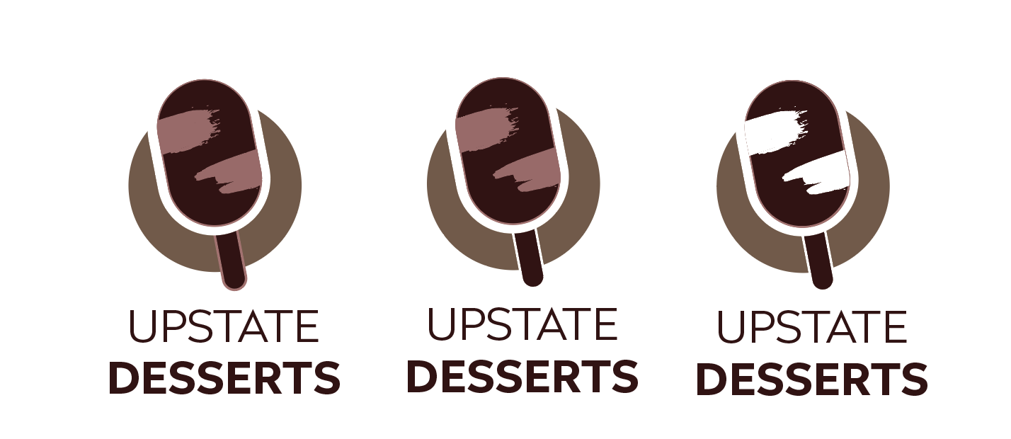
I think because there is a bit of white in the brush strokes it looks more like tape than brush strokes. Is it possible to clean up the white a bit more?
any other good ideas for a logo?
Nice idea so far!
Maybe try incorporating negative space or making it incomplete, your-eyes-fill-in-the-blanks to add more modern, sharp feel.
Shutterstock inspo:
Hi, jsut adding my 2 cents…
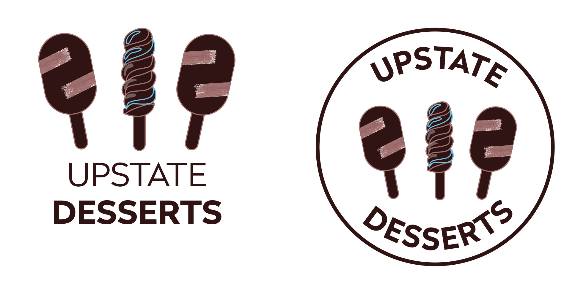
maybe you can take one of the rectangular popsicles you have there, put a circle behind and a white stroke around the popsicle part with the stick right below. MAybe you will get a u shape then?
ya thats really what i wanted, just something simple with just lines or empty space, thanx for these ideas. ill try them out.
Outlines will give you more of that upper-class feeling you are looking for.
I think it looks really good with the u in the background
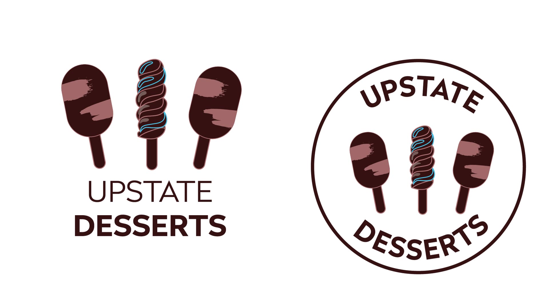
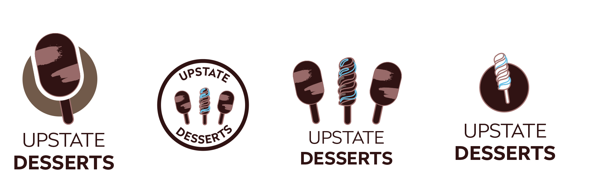
So which of the 4 logos would you choose, any last minute changes needed?
Client likes all 4, she’s having a hard time deciding.
Thanx again everyone for your help!
Really nice options!
I think that for a logo 1 would work best because it has the least detail.
Even on that I would remove the stroke on the stick and have it be negative space instead, and maybe the paint strokes also.
the middle one