
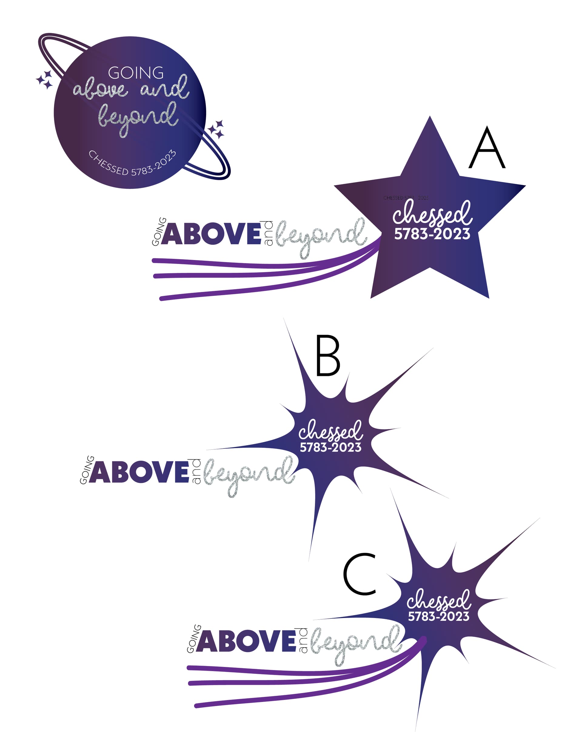
Any thoughts on these? It’s a rush job, needs to be done by like Monday/Tuesday…I originally created the planet one, but the client didn’t like it, so I created the star ones instead.
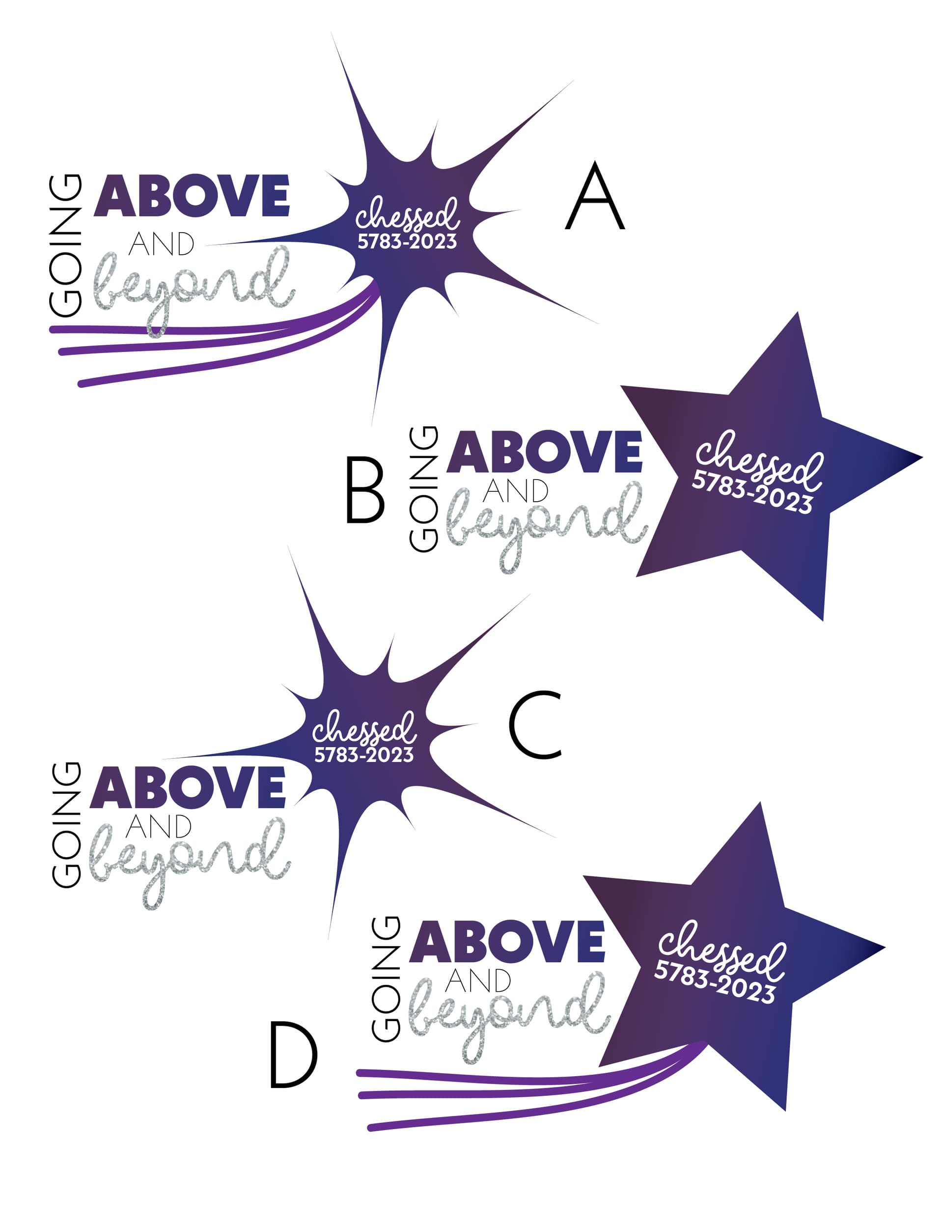
Maybe try stacking the words ‘above’ and ‘beyond’, and fitting the ‘going’ and ‘and’ on the sides of that. I like the stars ideas that you have but I think they need a little more white space in them.
I like A from your first options best.
I like D from your second options… maybe just move the star and lines a little more to the right to give the words a bit of breathing space…
I feel also that if you just wrote “Above & Beyond” - it would be much cleaner…
I think the word going should be the same direction as the other words, since it’s hard to read that way. I like A and C from your new options