Logo critique needed please!

Hi,

I’m designing a logo for a dentist and need a little help :wink:
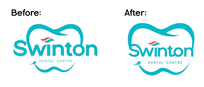
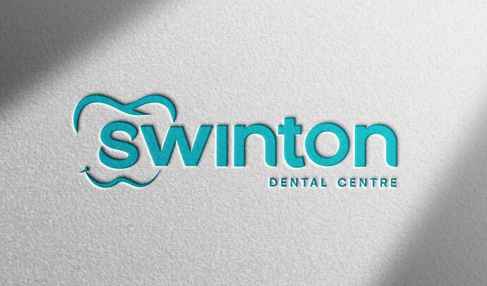
I have an option here on the left that I like - but when I look at it, I feel it looks too messy. I tried putting it all in the tooth instead of having the letters stick out … But you lose the whole effect of the letters going into the tooth… Is there any way that I can make the ‘S’ and the ‘N’ work better without putting all the letters into the tooth?

Also, do you think it’s too busy for a logo in general?

Would love your feedback!!

Thanks

I love the colors! I like the one on the left since there’s more white space but the letters still look a little crowded there. I agree that it’s too busy with the little toothpaste “swoosh” and the tooth. Maybe simplify it so there’s less going on overall.

Nice!

Second definitely looks like a neater and more of a solid logo to me.

I personally would remove the whole tooth shape. The custom font + swoosh makes such a sharp logo!! (Or maybe give that as a second option…)

1 Like

Thanks! I changed the ‘S’ to lowercase to see if that would make a difference…
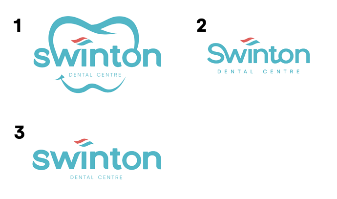
@goldie-mezei I took out the whole tooth. Do you think these options are working?

1 Like

Looks really good! I like number 3 a lot! I would just tidy up the kerning of the letters - like the w and i are touching and the n and t are slightly to far as well as the o. I think you should try a version of number 1 where the tooth isnt connected to the o or w it might just look good and neat! Great job!

Thanks @malky-h !
What do you think of these?
I love the toothpaste but does it still look neat?


I love #3 as well! I really love the toothpaste swoosh. #2 is a nice idea but the attached letters affect the readability a bit. Maybe you want to offer the client #3 with and without the tooth. Can’t wait to see the final!

I love #3!

I love this

image

and this
image

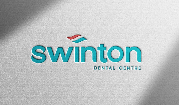
Ok think these are my 2 strongest options!
Can I have your votes please?

1:

Or 2:

Thanks so much!!

Stunning!!

Both are great and give off a diff vibe. Would you send client 2 options?

I vote for logo #2

I vote #2 cuz the tooth paste thing is unique while a tooth is very standard but I also really like #1. Try offering both

Let us know what you end up going with!

Wow!!! They are both SO good! If I’d be the client I’d have a real hard deciding… maybe #2? Its very neat yet original, but 1 is super too! great job!

I’m going with number 2! Thanks everyone :wink:

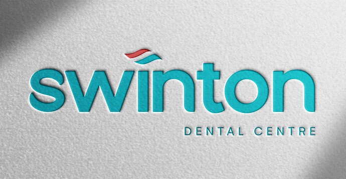
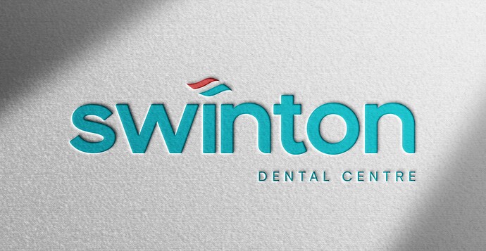
I tweaked the letter ‘s’ but now I can’t decide if I prefer the original or the tweaked version…
What do you think looks better?

1:

Or 2:

I like the original better

Same here. I think the first is more original

hey! really really nice!! i also really like the tooth option actually so good luck! hope the client was happy!!