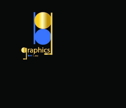
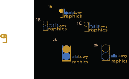
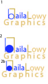
I am making a logo for myself I would like feedback
the colors didi come out off its more of a navy blue and a gold
The B and L is nice idea and creative!
I think you need to write out BL Graphics or Baila Lowy graphics… right now it just looks like graphics with a nice mark - no one will chap its a B and a L unless they know your name.
Also the mark looks a bit big in comparison to the text. I would work more on the layout - maybe turn the mark towards the right and then have the text underneath it… try a few different layouts and see which one looks best
The gold looks olive green on my screen, also the gold circle looks visually bigger than the blue
Nice.
The name is way too small.
Maybe have the symbol be the same size as the name.
You can drop the g in graphics and put that there instead.
I would also take out the gradient.
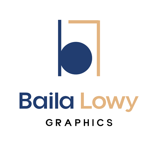
How about trying a layout like this: I also simplified the icon because I think it’s a little too much
So originally it was supposed to be Bg graphics because I go by baila Gitty so that second thing was a g
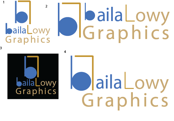
I would say 4.I love the colors. Maybe do a sharper tone of blue, like royal blue, and stronger gold,and graphics couid be smaller and in royal blue too. I think that would make it bolder.
Processing: logo revised.jpg…
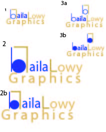
here are two otions based on the critique any opnions/ feedback
the coloring is really off
How do I make it a stronger gold without it being to orange yellow or brown?
I would get a nice metallic gold background and use that color for the gold.
It has a very busy look to it. Maybe try having the logo and under it it should say baila lowy and under that graphics. It would have a cleaner look.
I like 2 and 3b . Maybe align graphics better with the top line or make it smaller… Good luck , cant wait to see your final logo!
I think what’s making it look busy is that you are trying to incorporate the logo into the text.
It would look more professional if you had the logo icon with the text underneath. Also the word graphics should maybe be smaller. It’s fine if it doesn’t align with the words Baila Lowy.
