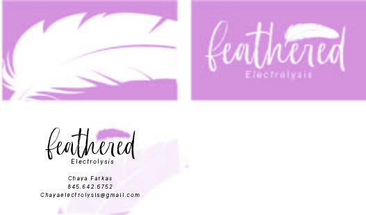
Hi Im making this logo for someone who’s starting an electrolysis business. she wants me to incorporate the feather somewhere but I’m having a hard time figuring out where it looks good. any ideas welcome.
thanks!
maybe in the curve of the f (on top)
I happen to also think it looks good where it is…
looks great like that!
I’m thinking maybe off from the ‘t’
hi! now im working on a business card for this client. i did the two options for the back of the card but for some reason im having a hard time coming up with an idea for the front of the card. this is what i came up with so far.
any ideas?
Thanks!
Maybe use only the feather icon on the front of the card to give you more room to play around?
also in that big feather on the back, you can do the word part of the logo on top in smaller
Thanks!
Any other ideas? Idk why my mind is completely blank on this!
maybe something like this? you can write the info on the light purple square…
see if she can come up with a phrase to use
Oh I like that! Thank you!
Hi I’m still working on a business card for this client. She already chose a design that she likes but she wants to but a line or like a quote on the business card that goes along the lines of ‘minimal pain maximum results’ but she doesn’t want to use those words cuz she feels like it doesn’t sound soft and feminine. I’m not good with copy so I don’t really have any good ideas for her and i would like to just finish this project already because it’s been dragging on since Chanukah already…
If anyone has any ideas I would greatly appreciate it!
Thanks so much!
this is an old thread but it is not your job to create copy! the client can hire a copywriter for that…


