Hi, I was looking for some suggestions and critique on this logo design.
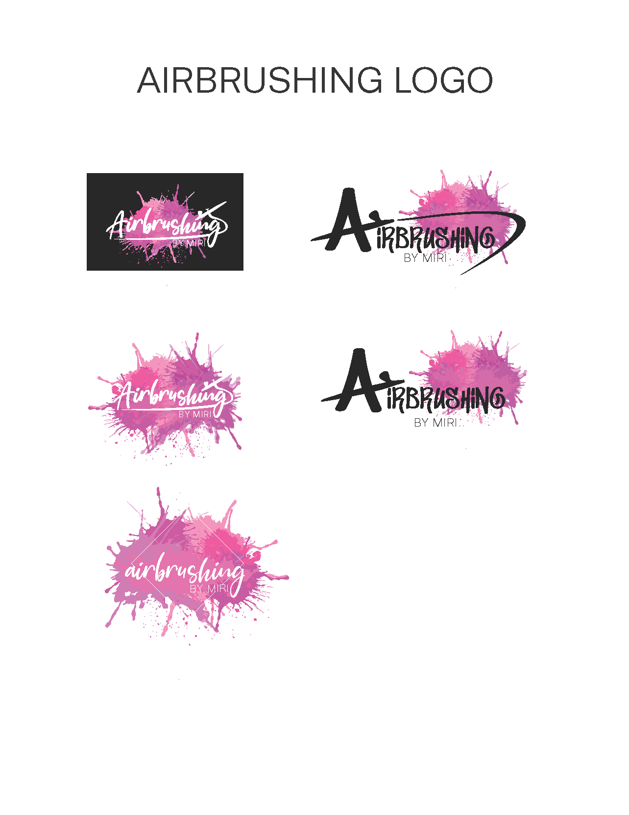
Wow! it looks gr8! not sure why it is pixelated though? did you make it as a vector file? And as a logo i would suggest to take away the splash background and use just the words which look really good (I like how the brush is used in the words) as it would then be way more adaptable - the splash would be perfect to use on an advert or something like that.
Thanx for the feedback!
Any preferences on which logo to use?
The first and second logo from the left looks really nice! As i said previously, I would use just the wording and take away the other elements for a logo. Those designs would look really cool as a business card though!
Thanks!