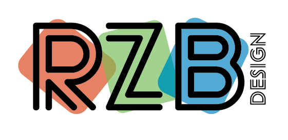
Hi im trying to make a logo for myself for my freelance graphics business.
Im just playing around a little and i came up with this.
I was wondering if this is a good logo or if im trying to kind of make it an advertisement for myself if i should try to do something more sophisticated.
I would love to hear everyones opinions.
Thanks!!
RZB design Logos|561x274
1 Like
It’s nice, however for my personal preference it’s too playful… I would go for something more bold or sophisticated - really the style you want to portray to future clients…
1 Like
i like the brightness of it while it being muted colors. i wud maybe have the word ‘design’ in a regular font though, not the double-lines one and that may make it more streamlined. maybe experiment with a dark gray vs black also.
i remember yrs back when i did a logo redesign, i made a choice of logos and sent them to designers and non-designers who are more likely to be my target audience and interestingly about 90% of the non-designers liked the more fun, playful logo which was based on my original one and 90% of the designers liked the cleaner, more modern logos…so i actually went with the fun, playful one… it should fit your style/personality too i guess!
just food for thought!

I like #2 best.
Not loving that the word design is so squished and also maybe write “design by” - Design Rayz sounds funny - You can also put the word design on the bottom horizontal line of Z and then it says rayz design which sounds a bit better…
True. I was thinking rayz design but now that I look at it again it looks like it says design rayz