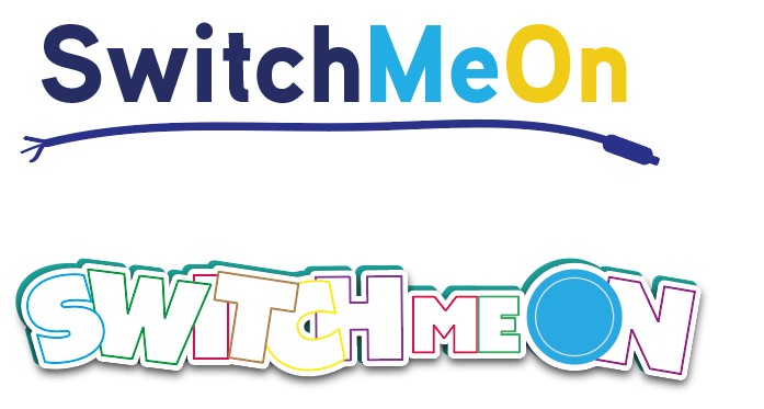
Hi, I have designed these logos for a client who adapts toys for disabled children. Please let me know what you think? And comments, please!
They are both cute but I like the second one better because it looks more like it is for a children’s product.
Second one definitely, very cute! Maybe try adding a plug inserted into the O of on overlapping, and cord hanging off but to the side…that may add something and can interpret the plug idea of first one.
Second one works better. Would try adding something into the O in what would be the negative space to add some meaning, not too big, not sure if it would work better that way or not. Might want to try limiting the colors, rare to have a logo more than 4 colors, though you could use tints.
The second one is so cheerful !
i like the first logos letters though think the cord underneath should be clearer but hate the name she chose for the company🙈
