I’m designing this logo. HAving a bit of trouble figuring out hte colouring- I had it as green and blue but then when i put it on green background, it looked a bit boring to have all the green white so added in yellow windows, but if i then coordinate it on light background it looks to cheerful with 3 colours (yellow windows)
Any ideas? Thanks!
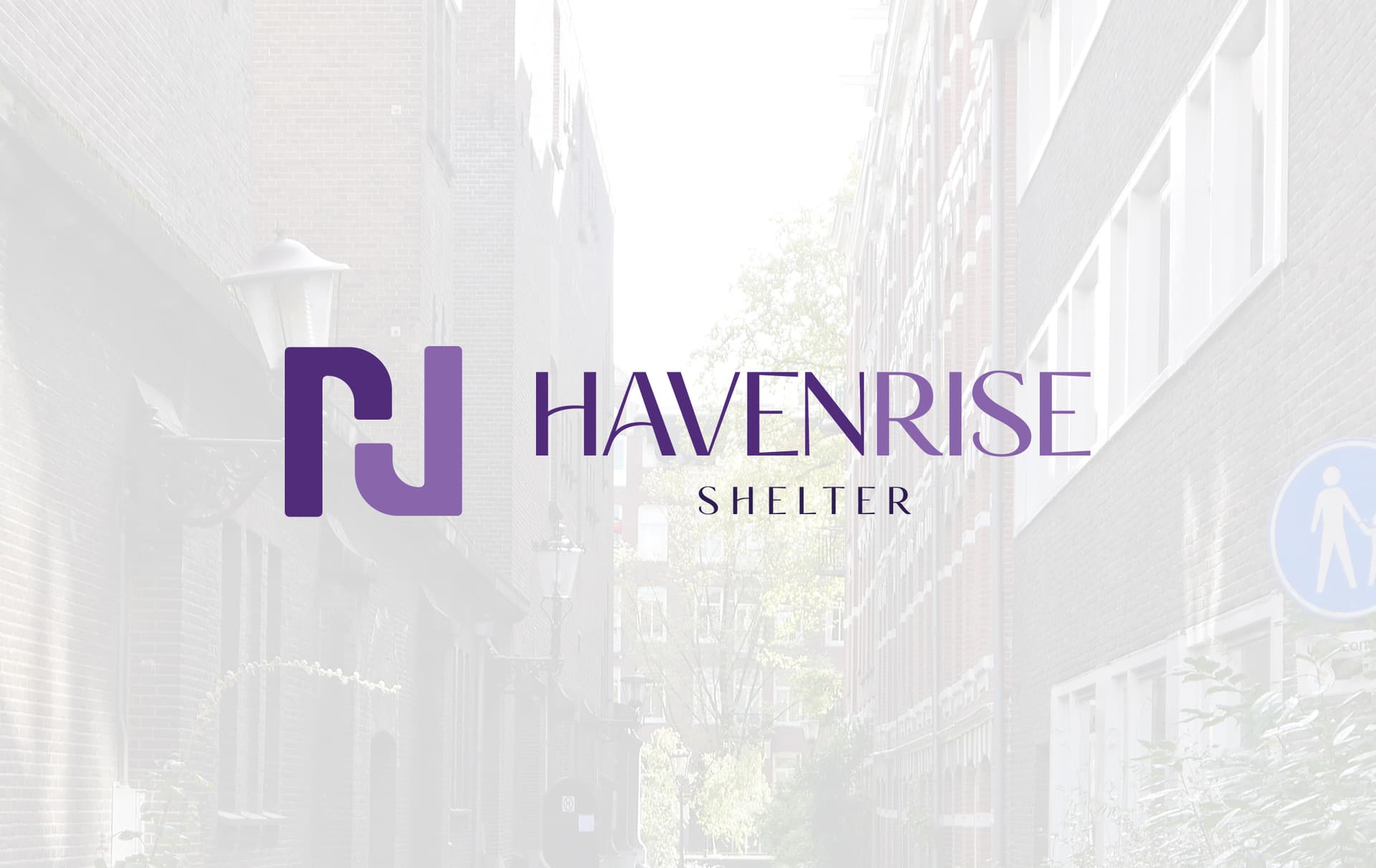
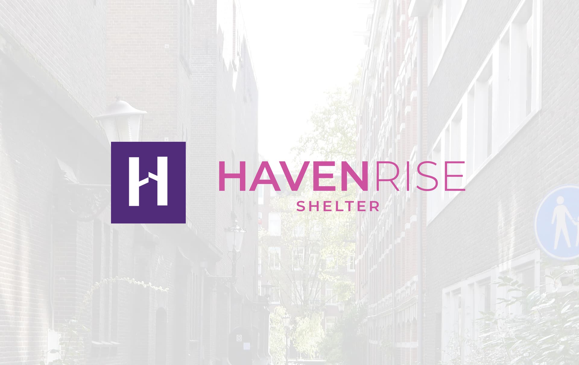
This is a logo for an organisation which helps homeless people with housing solutions
I think the yellow windows are fine, personally. And I love that you took advantage of it being a San Serif and still made it look like a Serif (a drop) to shape the triangle of a house.
I know this is accidental but also thought its cute: when you typed having, the h and a are in capital letters and I at first thought that was purposeful but then realized it isn’t. Its a cute thing since the logo starts with HA. Random observation and also to make you laugh. Always a good idea to put a smile on someone’s face.
Shelter can be bigger, closer up and make sure its centered.
Regarding the colors. Why did you choose green?
Why not something caring, in the pink shades.
pink with an orange tint.
green, blue and purple could also work in softer shades
here is a website i did: https://malkylandaulcsw.com/
she is a female therapist but i could not go too pink