I am stuck. I can’t decide what colors to make this logo.
The client has no idea either.
It is for a SEO company that she is starting called Web Drive.
(I think that we are pretty settled on the logo, but I would take critique for that too.)
Which color options do you think I should send for her to choose from? Or should I just send them all???
Love the logo! So creative! Looks very perfected and thought-out.
Maybe add more space between the icon and words?
I like when the road color matches the word color (like 1c and 1d)
Maybe try a bright, royal blue for a techy look? Or another neon-ish color…
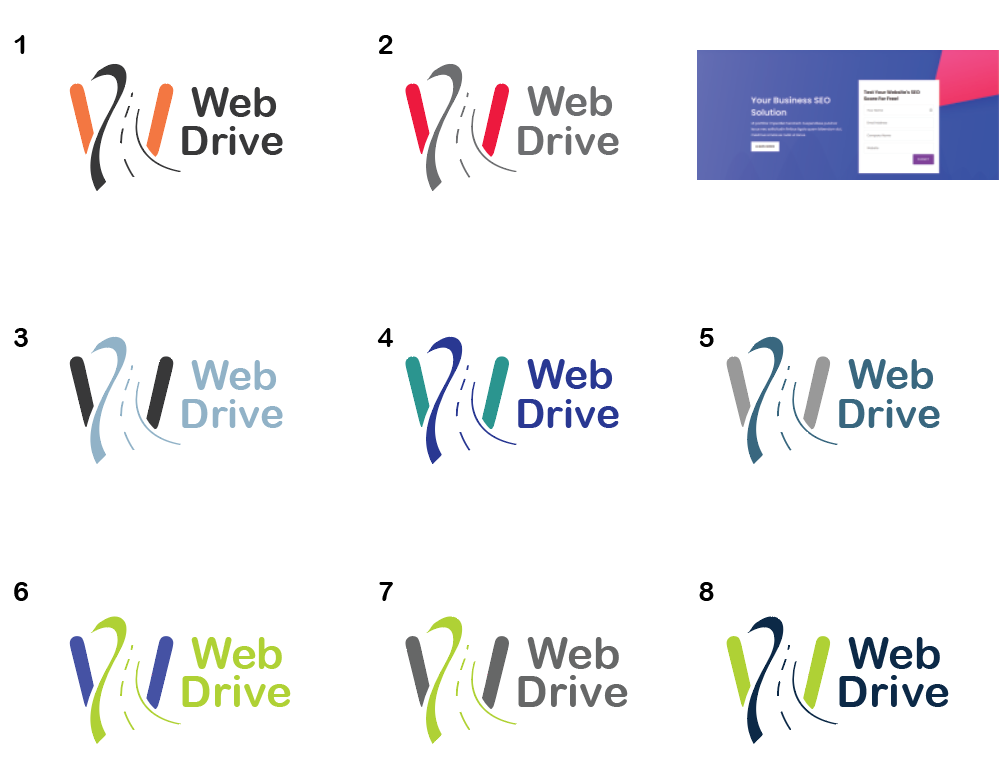
Of these options, I like 3, 4 and 8.
Hatzlacha!!
So I tried both of your suggestions- the brighter colors and duller colors.
I also did two options of each with words being the same as either the road or W.
And thank you for the compliments
when working on a logo (or anything) for so long, you kind of just dont see it anymore… so I appreciate the feedback!
of these, I like 1b, 3b and 8b best, although I think it may be worth trying a few more variations of a dark color like black or navy with another brighter color, like you have in these options.
I agree about the words matching the color of the road.
Really nice logo!
I like 1b, 2b, 4b, 5b and 8b.
I’m not in love with the font. It looks very typical. Unless they/you specifically wanted this one…
Maybe try having the ‘Web’ the same color as the diagonal lines in the icon and the word ‘Drive’ the same color as the road. not sure how that would look
I think the spacing adds a lot, I would even try a tiny bit more… Brings out the icon really nicely!
Agree about trying another font, maybe something sharper… Wondering how it would look if the big W also had sharp edges, like the road, and the font, too?
Also, maybe match the height of the words to the top of the diagonal lines, not just to the bottom?
I would do black with a blue similar to this… (one of those out-of-gamut blues… not sure if that’s “allowed” for a logo and how it would work in print?) just my personal preference
I don’t know much about graphic design-but I think the work you do is amazing!!
The green you used looks the most ‘techy’; I would maybe try out such a green with different shades of grey or black…
(I love the combination of 4b, although I’m not sure it’s very techy.)
i think the more muted blueish colors (2a/2b) and plain font are good b/c the actual image is quite funky and gives a sense of movement so the rest can be calm - that’s just my 2 cents.
I’ll ask the client about the font. The truth is that she hasn’t seen it yet with this font option, but she did say that she wanted it more rounded verses sharp.
About the color, she wants the web and drive to be the same color
Ok. Here are the updates:)
Is it few enough yet to send to the client?
Also, I forgot to mention on thing:
She sent me a screenshot of what her web page looks like (attached on the top right corner). She plans on changing the colors one day, so she wouldn’t want me to use them (she stam doesn’t like them), but she doesn’t want her logo to clash in the meantime either.
Is this a concern? And if so, what should I do? Just stick with the bright color options?
Thank you for all of your opinions until now!
I love #3, and #8
I think for now, you can give her a logo that is a solid black or white to be placed onto her website and then when she updates it, she can match the colors of her website to the logo she chooses…


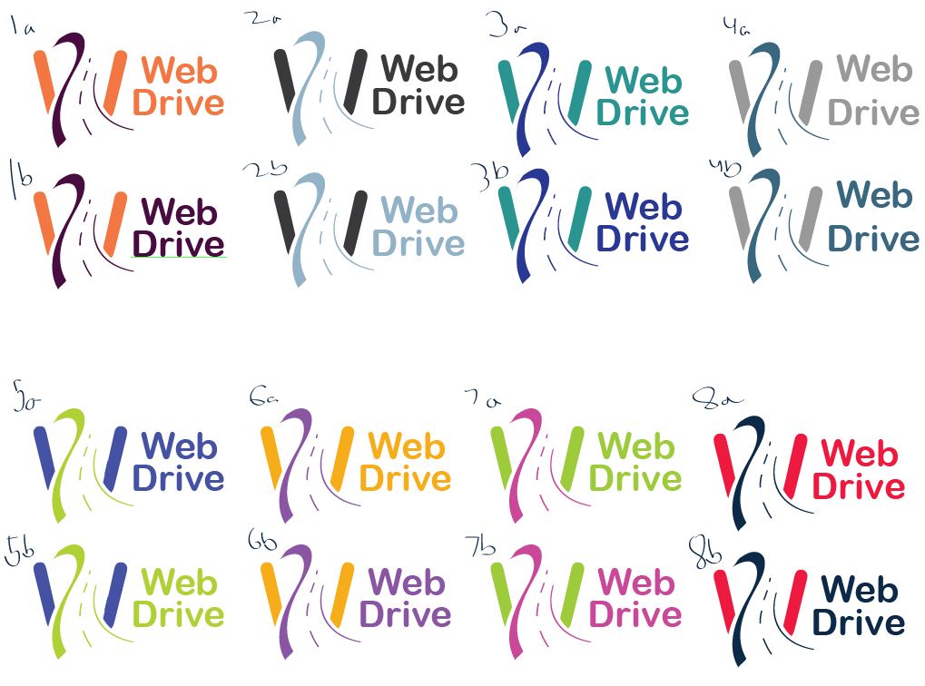

 Just thinking that there’s something about 1b becasue the orange and black colors connect roads and tech…