Hi,
I made this logo for a client - any critique?
I feel like it’s too simple…
Also i really don’t like the colors… she said she wants pastel but i think it would look nicer in diff colors, like more stark…
Any suggestions on which colors i could use?
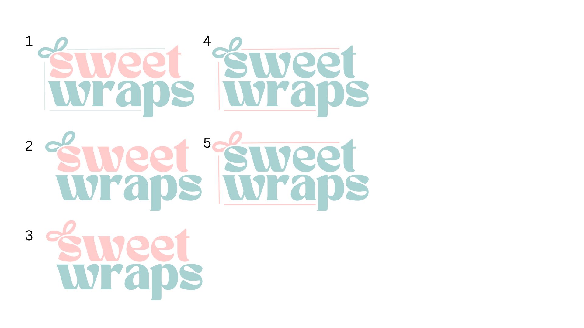
I like 2, best contrast!
Hatzlacha
I would go for one or two
I would go for two
I love that its so simple and clean. I like the font what is it?
I vote #2
i like 2
Vote for 2!
Love the clean effect
Tan Nimbus
Ok, so 2 it is ![]()
![]()
Thank y’all!

agree
1 Like
Another vote for 2!
You can make the colors a few shades darker. But otherwise it’s really nice
Really nice!