hi just looking for critique and suggestions on this logo and business card!!!
thanks!!
HI,
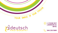
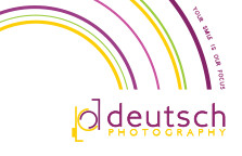
Nice colors! I like the logo! I would suggest seeing how it looks to have the word photography starting more to the left fitting into the yellow piece going down, because right now that piece seems to hang on it’s own. I also think that word should be a lighter weight…maybe lighter weight with looser tracking so it can go all the way across.
For the your smile line, I like the way it is positioned on the side of the card where it is in yellow…I think it should look more similar to that stylization on the other side as well…you can change the color and the overall size of the lettering on that side, but I would keep it in the bolder style, same relative tracking, and fitting in closer to the curve to be more consistent with the other side.
Also on the contact side, try the logo a bit smaller so their is not focal point competition, the image and slogan would be the stronger focus.
Nice work!
I love it!
Great job!
Hi,
I am designing this for a photographer, I would appreciate any critique on this! I designed the logo as well. There isn’t much information that goes on the card, just her name and number so leaving it single sided. I attached 2 versions, not sure which one looks better.
Thank you!
Logo looks amazing! I like version 1. Great job!
Thank you!
i also like #1 better. i would make the logo a bit smaller to give the overall feel more space to breath. really nice!