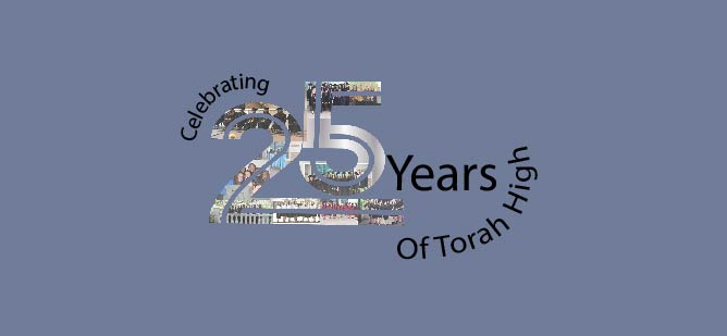
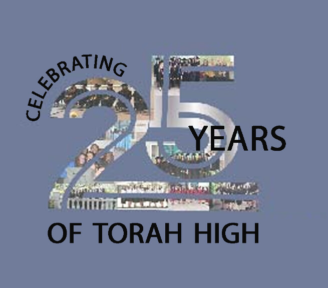
Any ideas for fonts I am having trouble figuring that out
And you like it without the circle better?
This last option is very good
Do you think there’s anything I can do to make it better
i would add swirls or something
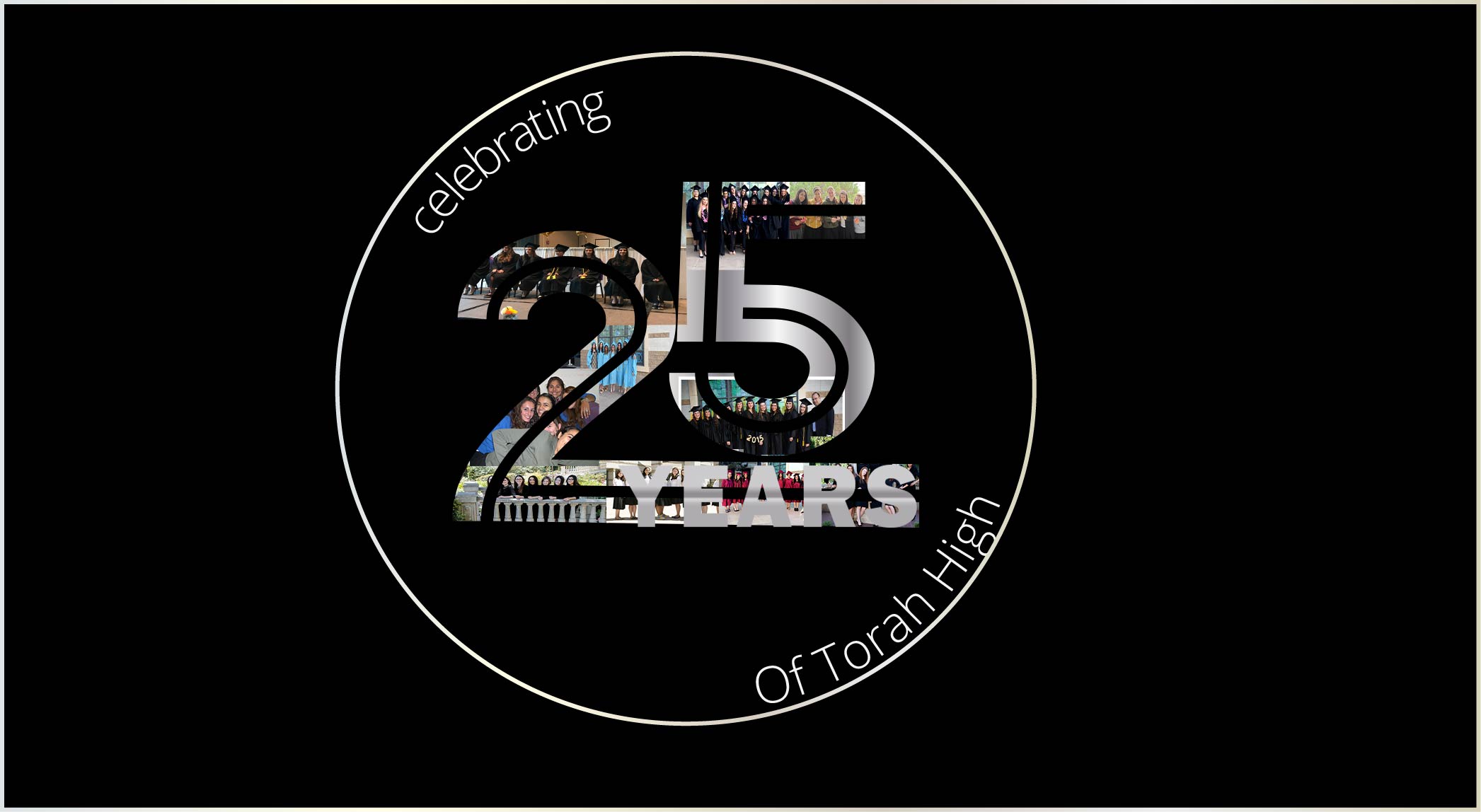
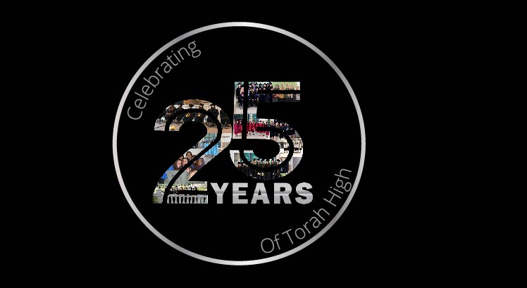
Any ideas for fonts I am having trouble figuring that out
And you like it without the circle better?
This last option is very good
Do you think there’s anything I can do to make it better
i would add swirls or something