Hi,
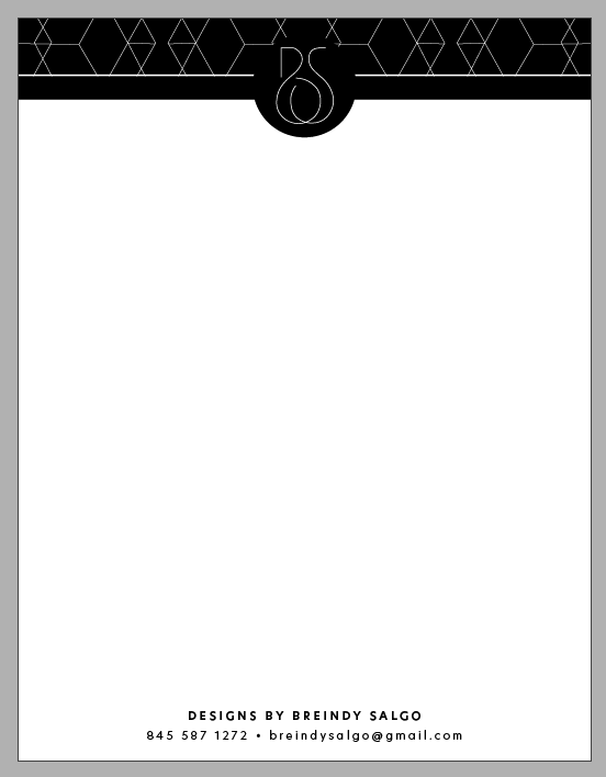
I’m making this letterhead for myself. Is it too top heavy? Should I spread out the bottom info on one line?

The design is really nice! I think the top takes up way to much space, I would bring it all up. I like the bottom info on 2 lines, but I would tighten the kerning of the 1st line so they don’t align perfectly. I personally think it would look better like that
Much! Beautiful!
Maybe bring the text up a bit as well
One more thing, I personally would want the bottom kerning to be closer as well. Email address letters seem very far apart
Thanks so much!
Very nice, Goldie made good suggestions and it looks much better now.
Thanks!
I know, Goldie was so helpful 
I personally find it’s too heavy. A letterhead should be in the background.
Maybe instead of having the whole top filled in with black, you can just leave it as an outline so it shouldn’t be so top heavy.