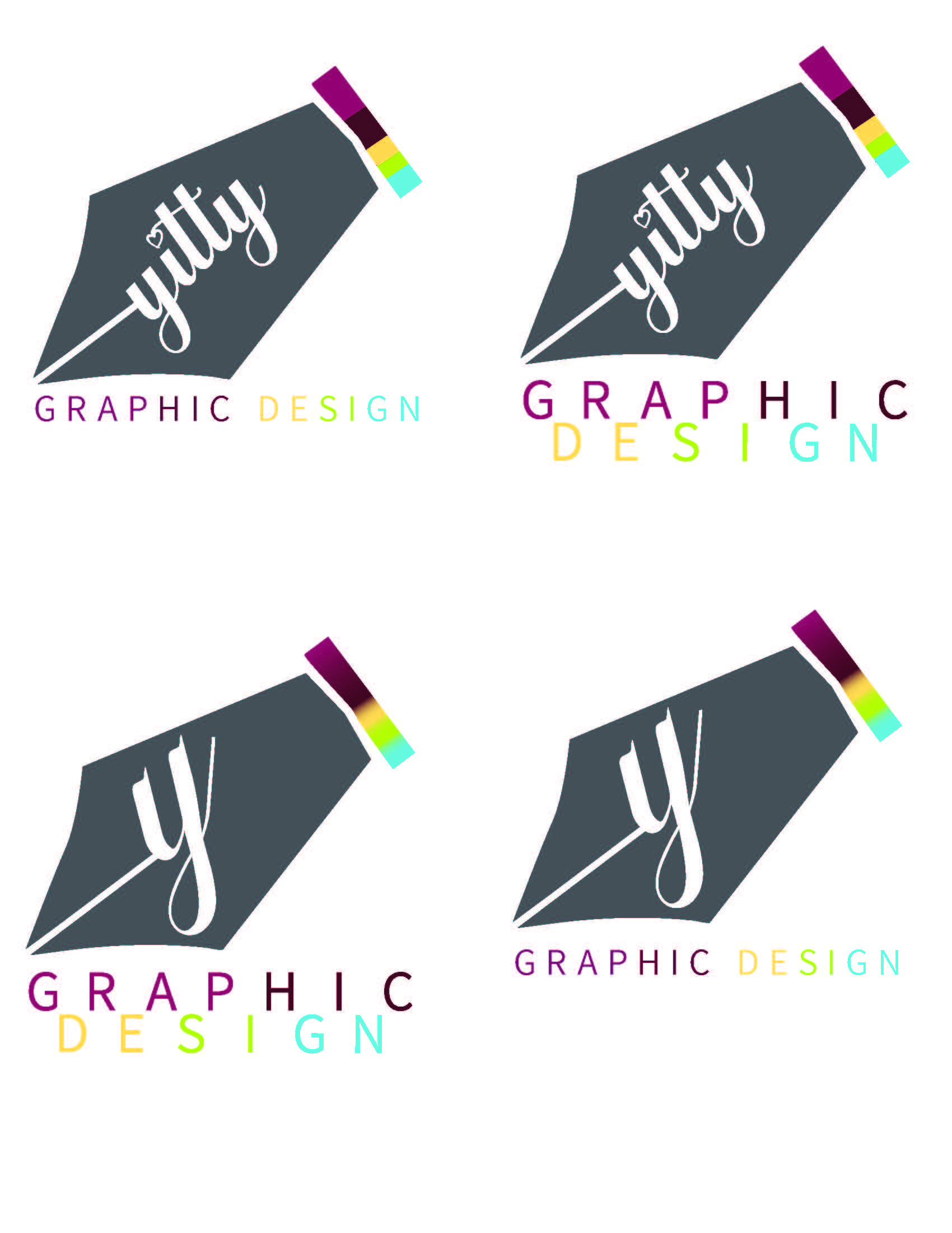
I’m trying to create my own logo. Can anyone give me advice/critique/feedback on these, and which one to go with? Thanks so much!
Yitty
I’m trying to create my own logo. Can anyone give me advice/critique/feedback on these, and which one to go with? Thanks so much!
Yitty
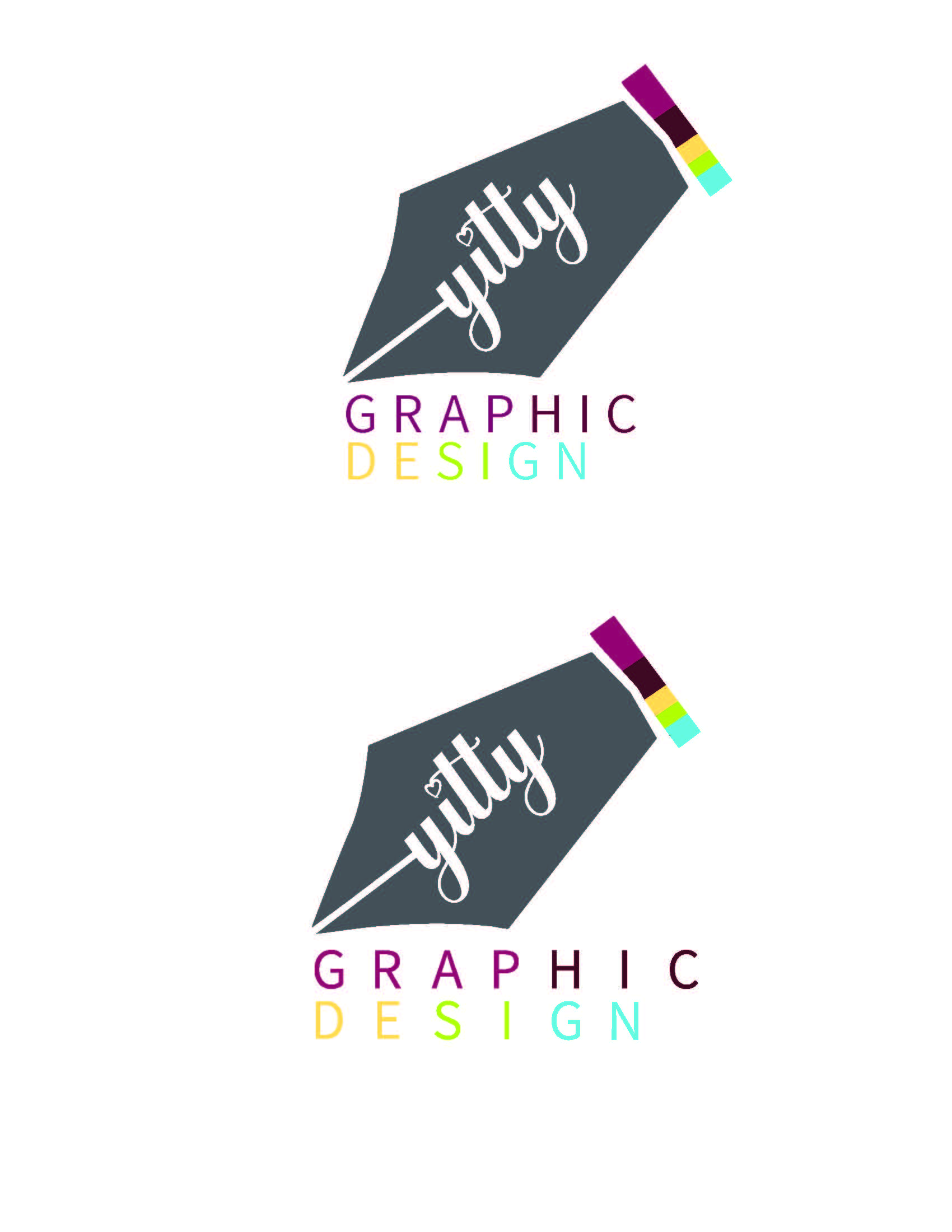
can you try doing the first one but have the Design directly under Graphic
(aligned)
I like the whole name.
how about putting Graphic Design stacked, but not like windows effect?
I meant to try and align it like this first one but put the design under. Maybe you make the design a drop bigger so it can align with graphics or tighten the tracking of the graphic.
Are you only advertising for design or also copywriting?
design
no more like line up the whole thing, so the c should still be aligned- tighten the leading of the word graphic a bit…?
like the top left one. agree about the alignment of the graphic design. Would you consider making graphic design in 1 color? Maybe connect the Yitty and neg. space in a more natural way i.e. curve the edge of the Y it should connect naturally?
Should I calligraphy pen not write script? A logo should not have so many colors. They grey is blending in with the other colors.
agree about the colors
I think you should pick two colors - one for the pen and one for ‘graphic design’
something like this though these colors are quite boring
Also I know you’ve been working on this for a little bit, but I personally happen to think the pen tool icon is so generic for a graphics logo that it might be worth it to scratch this idea and think of something more creative and unique.
look around for inspiration…
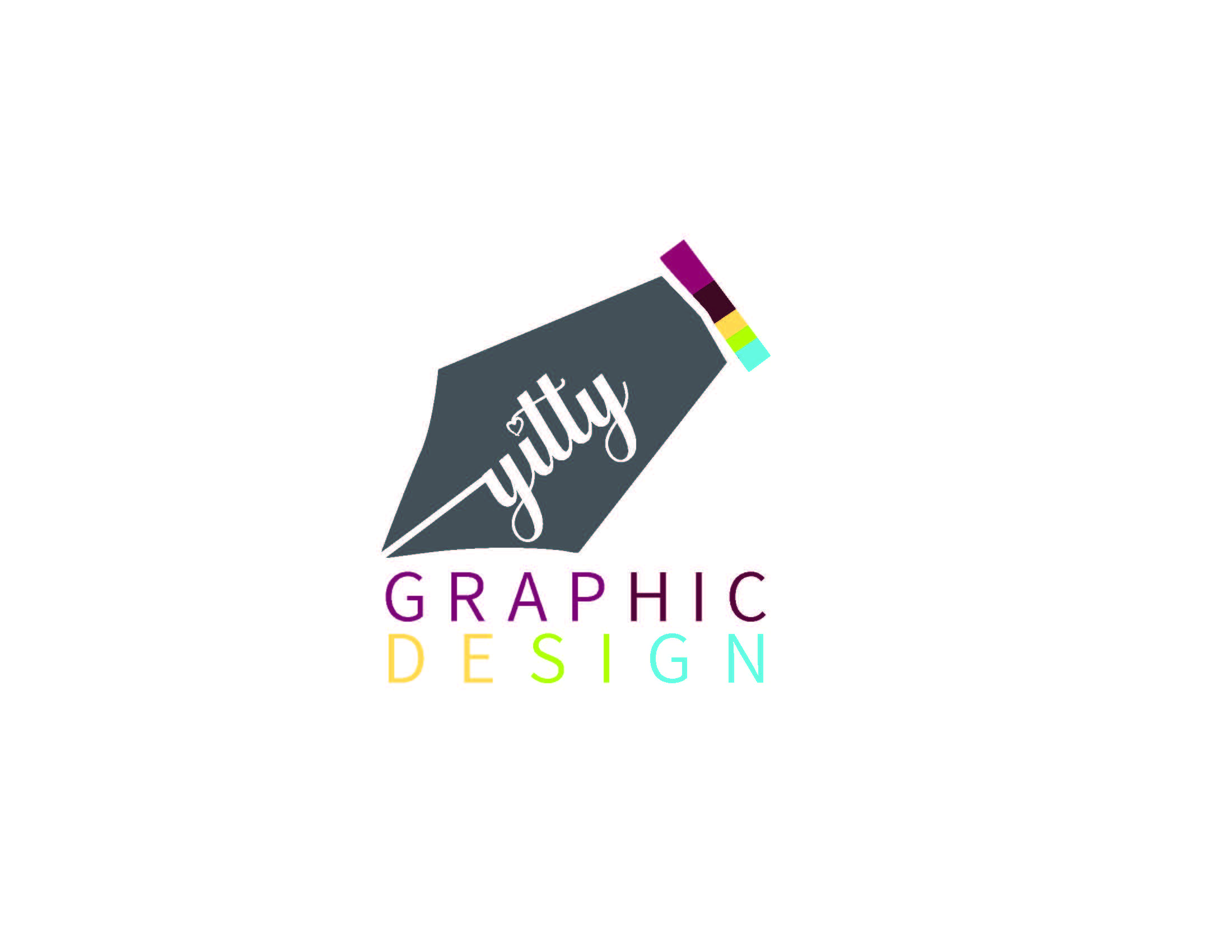
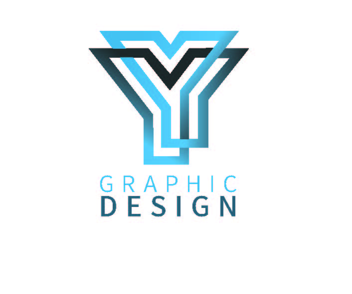
I found this cool Y - maybe you like…
I wouldn’t do the multiple colors in the words graphic design it is hard on the eye, if you want a lot of color leave it in that bar above only.
Yeah, agree with mentioned comments.
Also, the pen feels very big compared to the words graphic design. I can see why you want the pen to be a focus - but the words also need to show.
But like @Breindy-S mentioned, a pen feels very generic and typical.
As many mentioned, the pen might not be the best idea since it also has a bit of an old-fashioned feel, doesn’t give the impression of sleek, contemporary design. If you are using it, the stacked position is better for the words, or have them go straight across with the graphic quite a bit smaller relative to it, either centered above or to the left. The small squares are also a bit busy…if you do want to use them, it might work to have them running diagonally along the right diagonal of the pen-they would be somewhat bigger then, and would tie together the graphic and the the text. Then it would be best to have the text in gray, too, and just have the squares as the colored elements. In any case, the text itself is too many colors. While a logo wouldn’t normally have that many colors overall, some do, but certainly not in the lettering with each letter being a different colors. The name Yitty conflicts somewhat with the Graphic Design text as they have similar visual weight-perhaps make the name yitty smaller, or a more hand-drawn feeling script to feel more like part of the graphic rather than actual text, or make it thinner. Or possible vice versa with the name more significant than the Graphic Design, but that would be tough because you can’t make the Graphic Design words so small relative to the graphic, though you could potentially making them a pretty thin weight and a light-ish colored font. In general, the pen feels pretty heavy visually, if you are set on using it you can try other styles for the pen so it feels less heavy and clip-arty, I would suggest looking for style inspirations in general for different ways that a mark can be drawn.
Another point, if you do a quick google search for graphic design logo, all the options that come up will tell you what is generic for this industry.
I just did a search and got many similar designs to what you have here.
I’d say that you can use it as a springboard for ideas, but wouldn’t recommend to copy something like that too similarly because that will get you a very typical, generic logo.
Rather use these ideas to build on something but with adding more creativity.
For example, this logo for Michelle Mozes’s course uses the anchor points idea which we can argue is also typical but I love how she made it more creative by making the points be the circles of the I’s. She also used a more unique font…
So if you really want to go with a pen, try to think of ways to make the pen idea be more unique and creative.
Awesome!
Do it without the gradient. Solid light blue for one Y, solid dark blue for the other.
Wow, much better! Agree with @al1 one color for the icon and one color for the words, or if you really want you can have the words be 2 colors but take off the gradient. Also, I think the words should be bigger relative to the mark.