Hi,
someone is asking me to post this for any critique…
thanks!
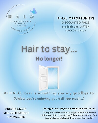
The colors and fonts aren’t giving over the right feelings. You want to give over a calm, confident vibe. I also don’t think that the picture chosen reflects the vibe you want. The concept can work but not with that image.
I would suggest working on the hierarchy as well. Try looking at some ads in magazines and look at how they size all the parts of it. The logo should be small and often is placed on the bottom of the ad.
The final opportunity part could be right next to the contact details and also at the bottom of the page.
Too many fonts
Margins too small
The grey text is hard to see
also I would keep the text colors more consistent
I would work on hierarchy, grouping and spacing/sizing…
the grey does not stand out on the blue
I would put the info at the bottom and the quote above it
There is way to many groups of text.
The logo does not need to be so big.
Make the text black, you can make some darker blue and another color for contrast.
You can also change the background to a pretty floral pinkish more feminine color.
Contact info should be left aligned and can be smaller, or you can put in a row on bottom.
Sorry hope this isnt to much and overwhelming. just ideas.
thanks! I put this up for someone cuz she wants ideas and critique  .
.
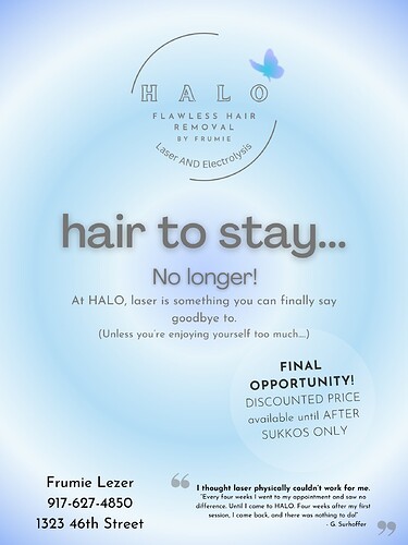
new one
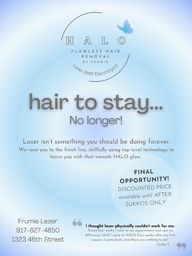
I would change the background so that it’s not a radial gradient.
Also, it feels like there are too many groups of text with different treatments. She should choose another colour for text which should be emphasised, and then make some important text bold. But they shouldn’t also be different size and capitalised as well… The main title can be a different font if she wants, but all other text should be same font.
I like when big text is big and small text is small, if you get what i mean; here I see too many sizes and treatments.
Just some ideas… sorry if it’s too much and hope it’s understandable 
ok, thanks. I’m just doing my job 


