Hi
Does anyone have any critique for this orange juice label. It’s not a typical label since it’s a special product with no preservatives (freshly squeezed).
Thanks
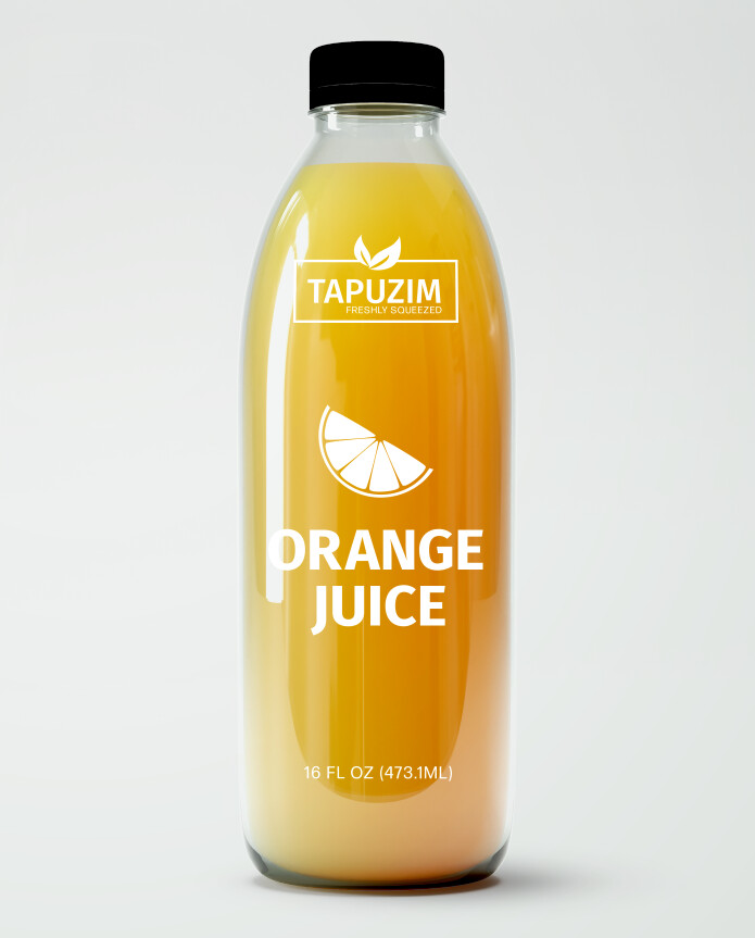
i love it! maybe i would do a not so typical font… to make it look more lively and pop out…? not sure, but it looks really clean and neat love the minimalist design
Thanks!
I agree. A more unique font as well as possibly adding a droplet to the vector may indicate its freshly squeezed
Any font suggestions?
I’m thinking of saying 100% organic juice instead
What about something like this?
i think i like the text in white better… because you don’t really know what color the orange juice will be since this is just a mockup, so it might clash colors… or might not be so visible, but the rest looks nice!
My client wanted the leaves in the logo to be green-where else can I apply it so it looks like there is some repitition?
Do u like this font?
I’m not crazy over it
Something like this?
That looks really nice!
Thanks!
Is the alignment and font okay?
Yes, i think it looks good
Maybe do a darker green. I’m finding it a little hard on the eye against the yellow. Also, I think it looked nicer aligned to the centered. And maybe write 100% organic on top of the orange, and add the word juice. SO it should be 100% Organic Orange Juice. And you can still do 100% Organic in green. let me know if you understand…
Thanks!
It looks really nice now.
I’m not sure the green text is needed.
May be add some green on the peel, that will be less problematic if invisible. the text is essential to be clear.