Any Ideas how I can pull this all together?
Love it!
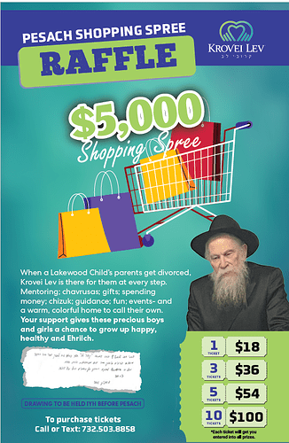
Maybe make the text ‘when a lakewoods…’ a bit smaller
It’s great! Specifically the top!
I love how you displayed the tickets.
Some suggestions (take it or leave it ![]() ):
):
The green ticket as the background does look a bit disproportioned. Any way to adjust it?
I agree with hadassyf to make the font smaller.
Everything is vector, until you get to the portrait. Curious to see how it would look with him on a colored background (similar style to the stroke of the $5000) to help carry the vector look through. And don’t have his picture so perfectly aligned with the ticket.
I would left align the bottom text.
Idea: Instead of the green ticket background being a half a stub, why not have a full stub (like you have displayed for the ticket options) and put the information on the left inside the stub as well?
I like it!
I’d change the font of ‘Shopping Spree’. It’s a very well-know typical script font.
I’d also decrease the font size of the long paragraph, and then slightly increase the line spacing so that it isn’t squashed.
