Hi, I created these Kriah summer ads. I feel like there is something missing, especially in the 3d gradient one. How can I improve them? Thank you!
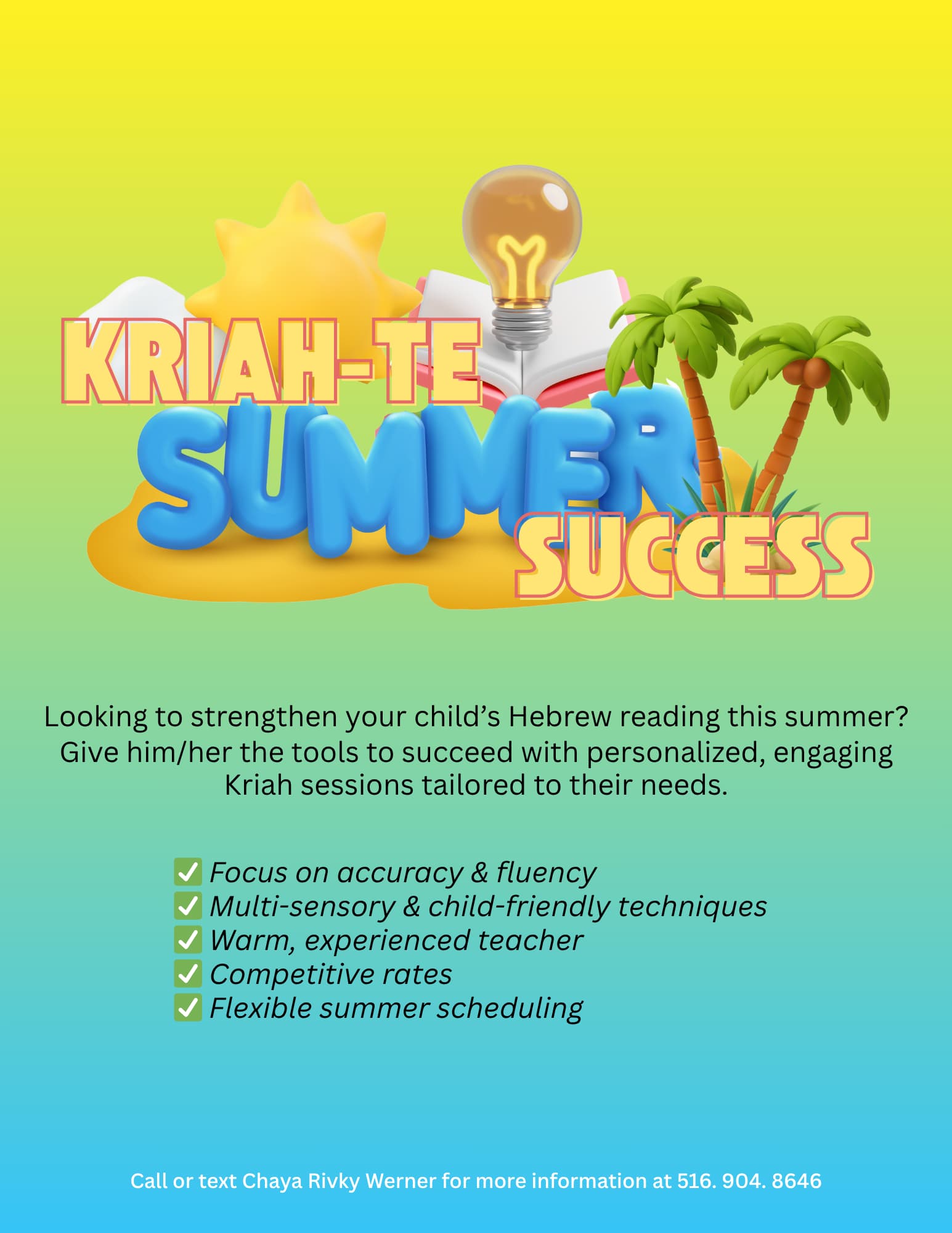
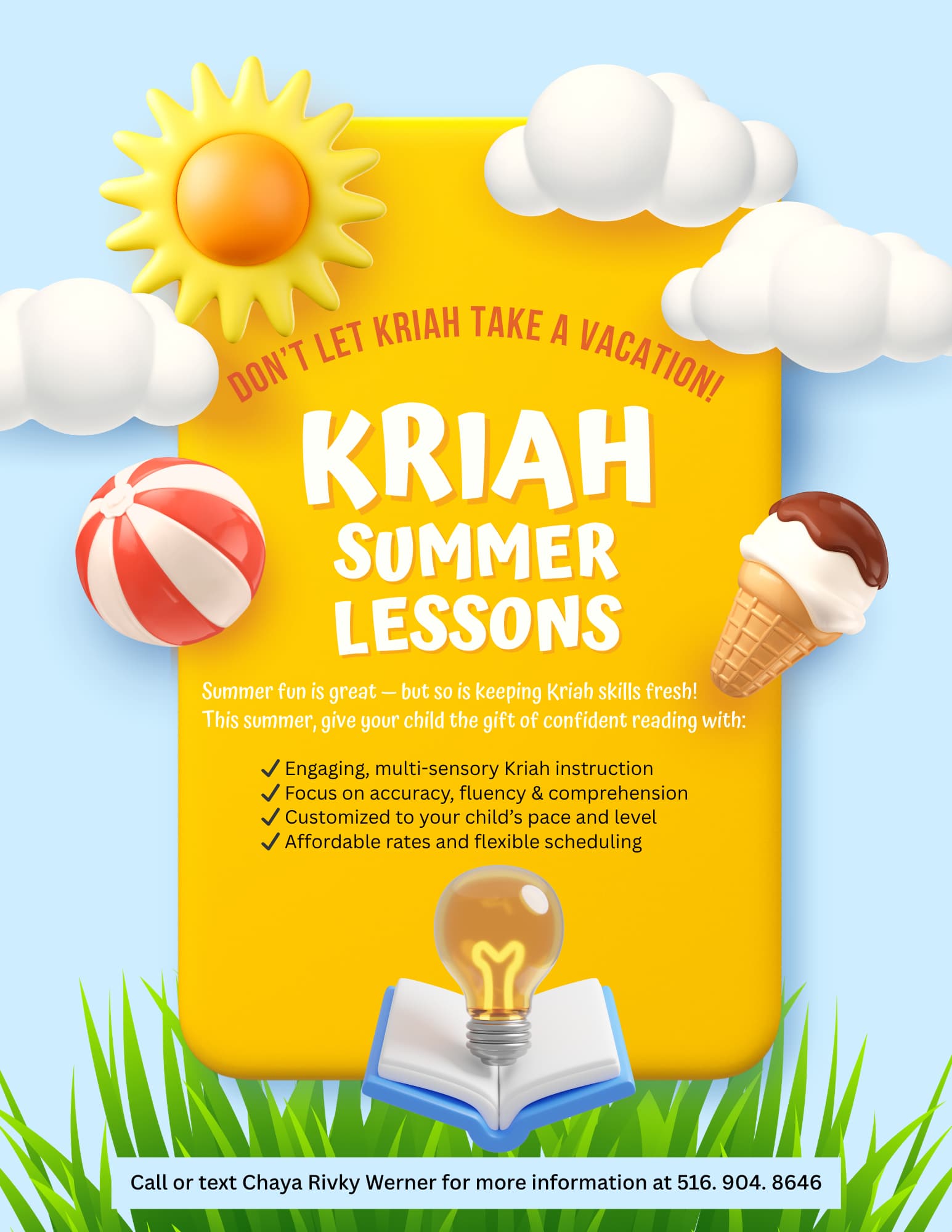
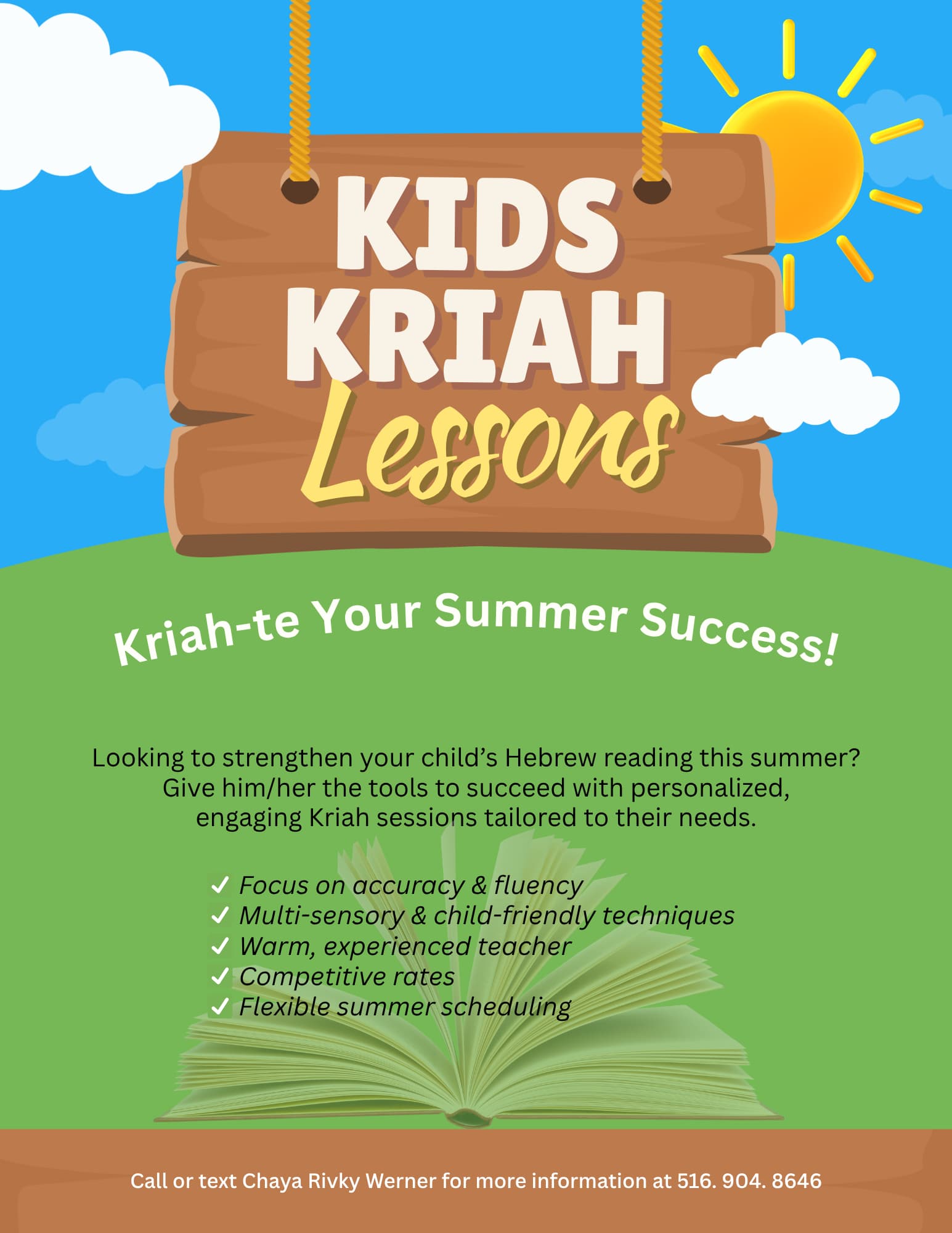
The 2nd one looks great! You should work on the paragraph of text in the 1st and 3rd one. Maybe break it up a bit, making the first line stand out, and you can use a more interesting font and color
Love the second one too!
Same here I vote for the second one