Hi,
I would really appreciate any and all feedback/critique on this flyer.
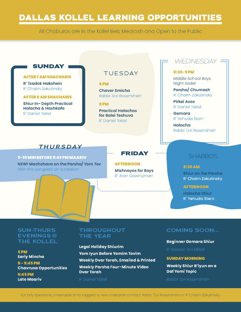
One specific point: Client wanted flyer to look chashuv.
Wondering if this looks too fun/childish?
Was trying to break up the text and make it more interesting to look at…
Thanks so much!!! This group is a lifesaver! 
Nice!
I feel like there’s too much to look at… like there’s too many elements on the flyer. I would suggest using one type of “frame” (I like best the Sunday or Friday one) and only using that for all the days. Maybe use a decorative font (your whole ad is only using sans serif) as the titles like by “learning Opportunities” and all the days of the week
I also think it’s not childish looking, but it doesn’t look 100% chashuv… maybe add some maroon or something like a rich red - and take out the light blue…
Good Luck!!
Thanks so much @Breindy-S for your feedback! I really appreciate it!!
I’d love additional suggestions and critique!
Updates:
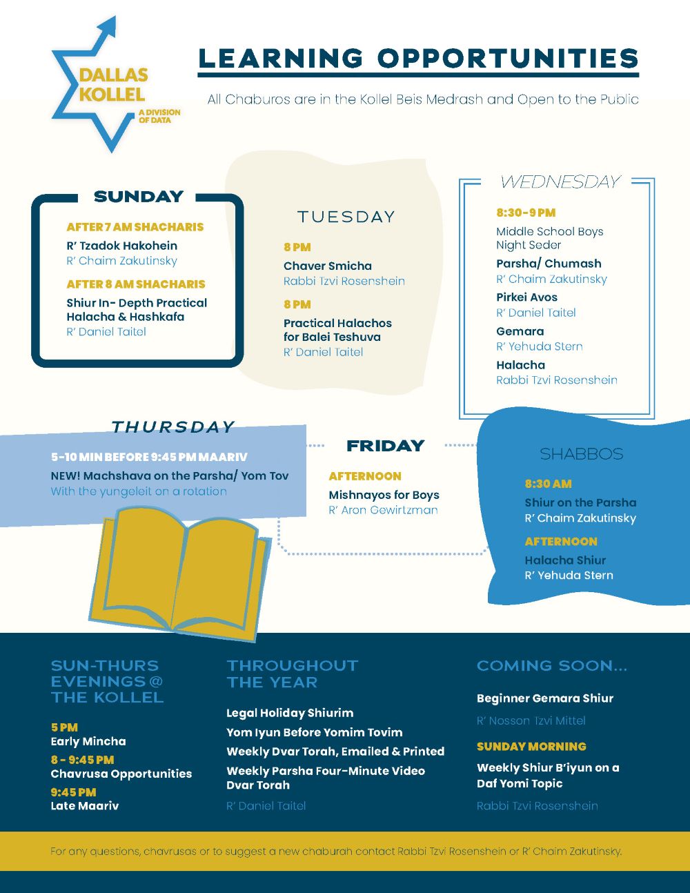
Here’s an update:
Would love feedback on it! TIA!
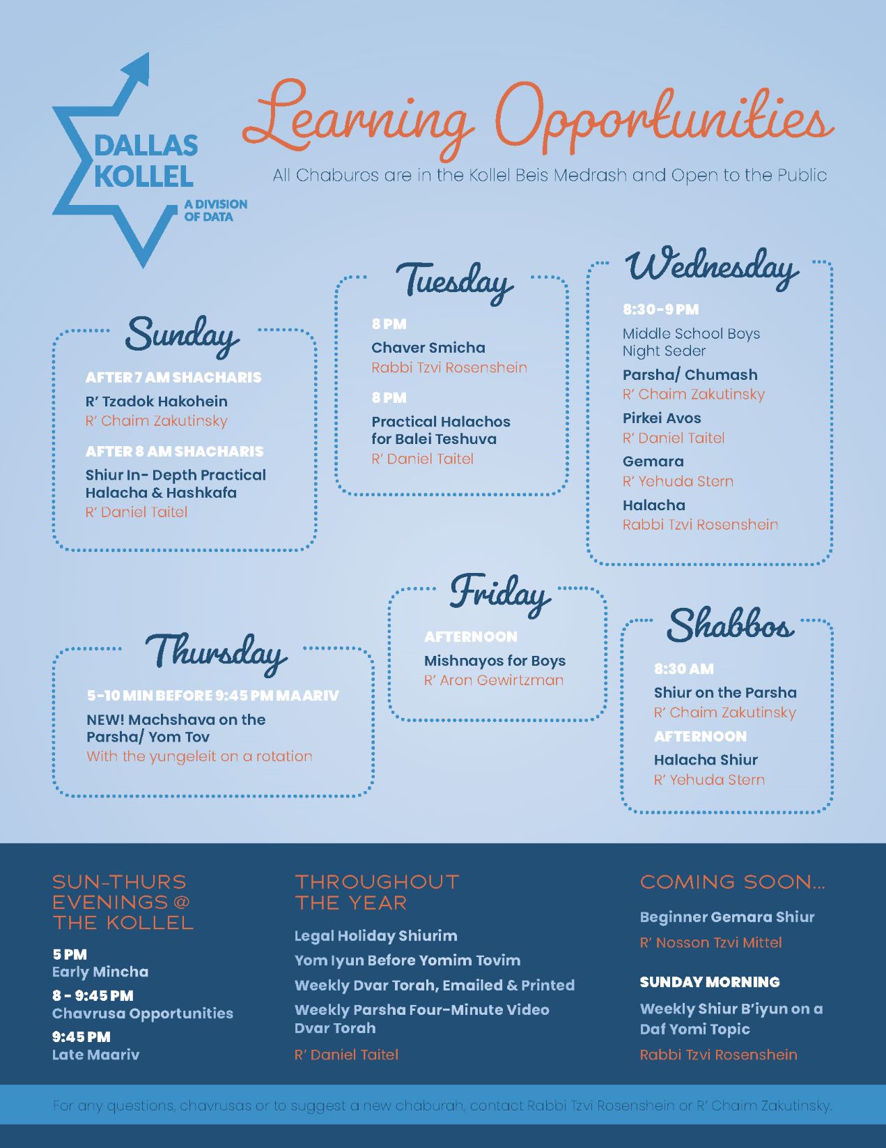
Looks great! My only comment is the text on the blue strip “for any questions…” is hard to read. Try using a thicker font and change text to white
i like it now. can you get the six days into a square? align at the top / bottom?
Thanks @goldie-mezei and @schlomithsassoon for your help!!
I really appreciate all of the feedback!
Update:
I’m not really seeing a difference between this post and the one you last posted (only noticed you changed the bottom text to be bolder and white)
I don’t love the random look you have with all the boxes. Can you try to organize it into a neat square shape or another idea I have is to make it look like the star a little in the logo… basically have sun,tues, and wed going up on an incline and then have thurs, fri, Shabbos going down and then you should have empty space in the middle. It should sort of look like this < With the empty space, you can insert the logo there and then center “Learning Opportunities” not sure it’ll look normal or if you even chap what I am trying to say, but you can give it a try unless you like this type of look… (It’s not necessarily wrong, it’s a personal preference)