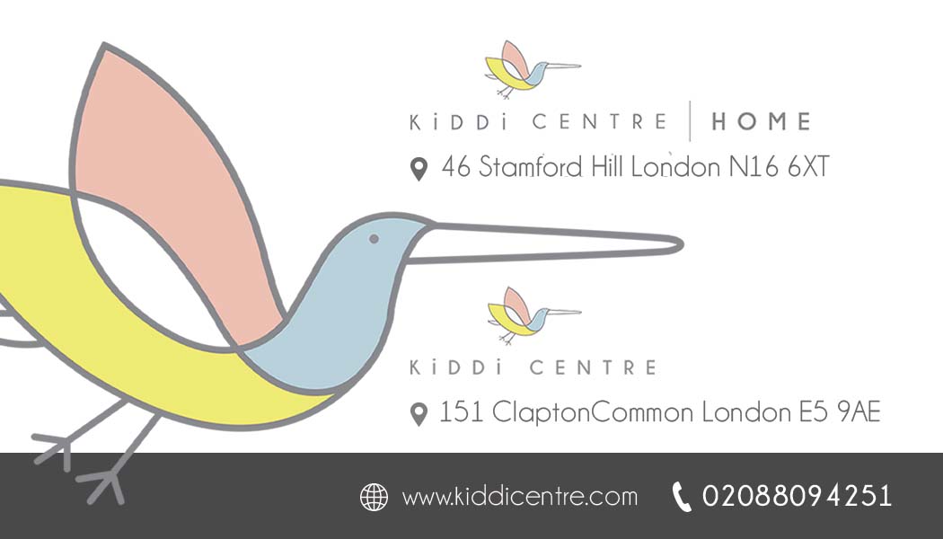
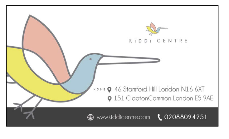
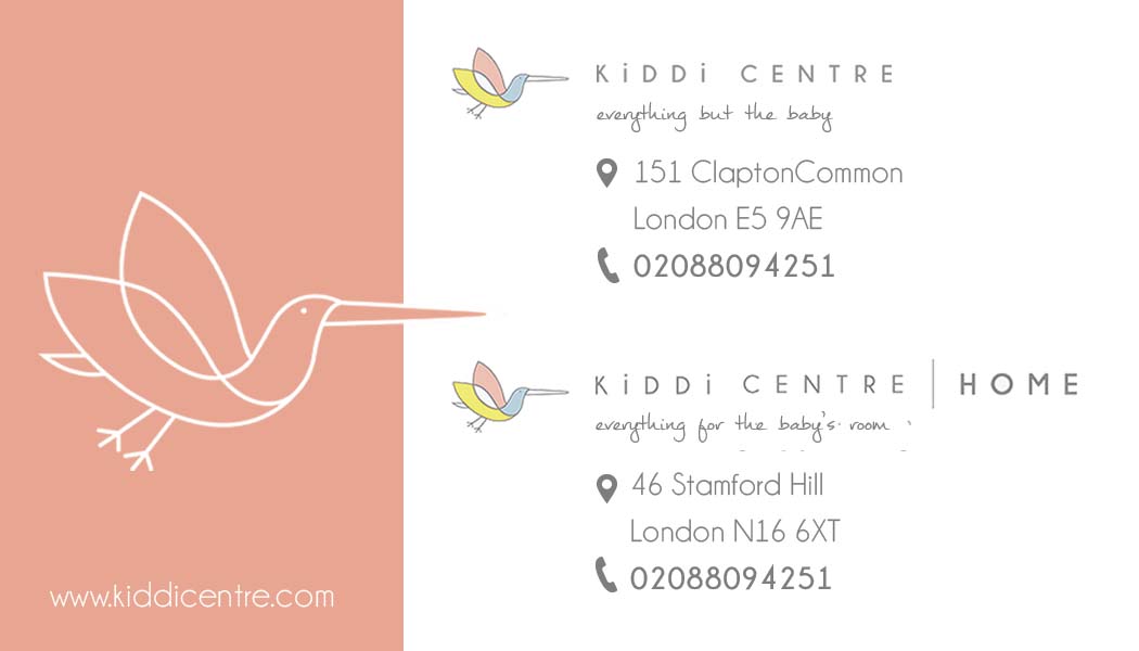
I have never had such a hard time designing a card!!! they want two shops on a single sided card.
I am really not managing… any help appreciated Thank you
since it’s the same logo, you could have the logo in big and then at the side it should say the branch name in bold and underneath the address
I was thinking the same as gitty and blimi.
I like how it’s cleaner but I think the home is too tiny to notice that it’s a different store
I don’t think the home is really necessary even - I just put it there cuz Sheindy had it next to the address…
technically can make the address smaller - it looks pretty big and then can make the home smaller - its hard to work on it like this cuz I dont know the real font size…
@Breindy-S the font size is 8points, do you think i should make that smaller. The client is very into making it very clear that it is for two different shops. Thank you all for your advice, I had worked on this one before hearing your opinions so I now have more ideas to try, though if any of you have some time would love to hear some feedback on this one…
@gittyklein I did not add the home. It is two separate logos which the client sent me…
off the point but did u do their logo/branding? i really love it…
No i didn’t. I also really like it.
well you’re doing a great job working with it 
 Thank you
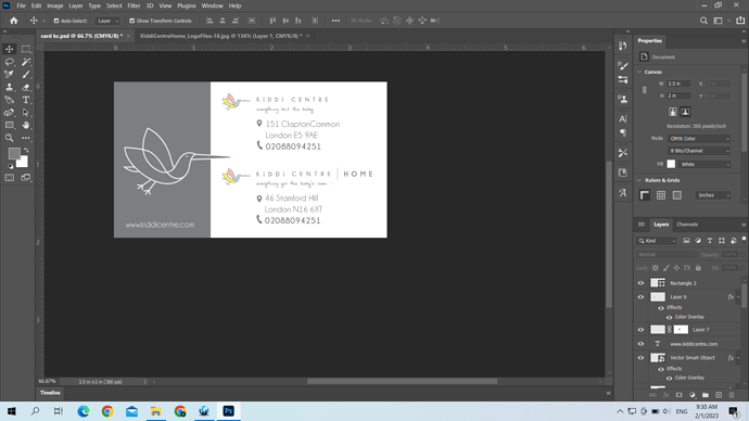
Would love to hear some thoughts on this card if anyone has a spare moment.
no 8 points I think is fine.
I actually like this new bc you’re showing - the only comment I have is that it feels a bit dreary - can the big grey box be pink, yellow or blue?
yes, will try that and post it on… Should i try the text in 7 points or is that too small?
I think 7 is the smallest you can go - try 7.5
I think it looks good like this.
maybe bold the website to make it more prominent…
Thank you so much for all your help
