Hi
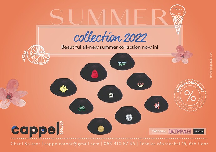
This is an ad I created for a client of mine who does custom prints/designs on kappels.
Anyone online and can critique quickly - need to send off tonight…
Thanks!
Really nice!!
Is the discount missing? it only says %
Nice summer feel!
Maybe make a stronger focal point?
I feel like the heading, images and logo are competing for attention.
Maybe put the whole bottom part - logo, contact, etc. in a separate block?
Hatzlacha!!
Thanks @Breindy-S! I think she doesn’t want to write how much…
@Chani_Wolpin that was very helpful!
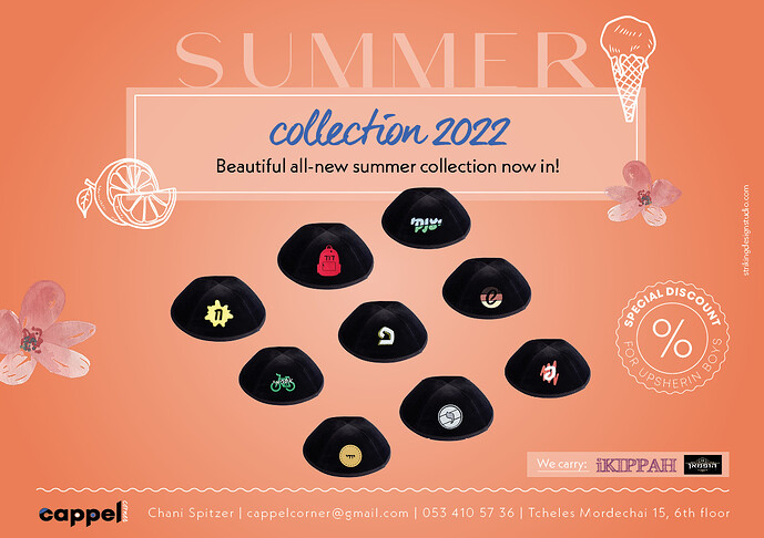
That is definitely easier to read.
I think the top part is a little hard to read, not fully sure why…
I’m not so into the blue by “collection 2022”… I feel like it’s a little random
Also maybe move it up a bit? It doesn’t look like it’s part of the “summer”
Maybe extend the light-colored box down to include the kappels?
Maybe choose a color from 1 of the kappels (yellow/red) for the words collection 2022


