I’m trying to design a logo for a company that is selling charm bracelets for kids and teens. Their name is Link It. I was having a hard time finding inspiration because most jewelry logos are classy for adults but this is supposed to appeal to a younger crowd.
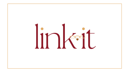
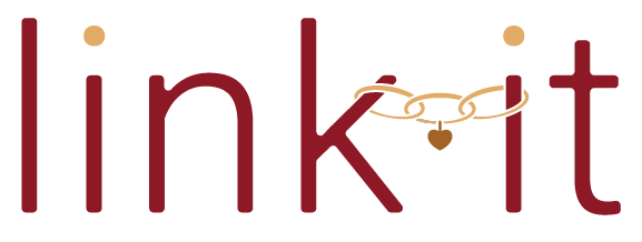
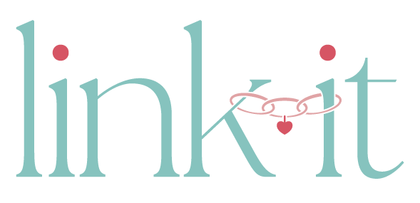
I came up with the (very similar) logos below but I don’t totally love it. Does anyone have critique and/or a way to find inspiration for this logo and coloring?
I actually happen to really like this! I’d just play around with more fonts to find the perfect option.
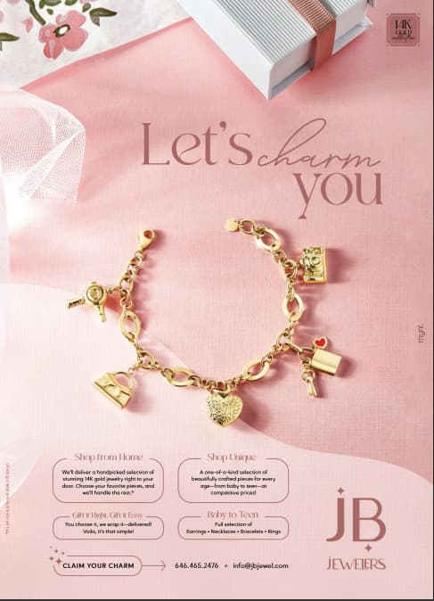
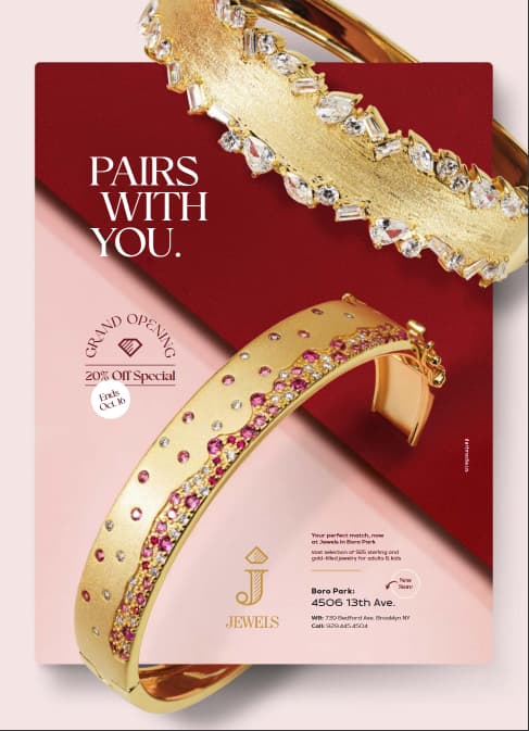
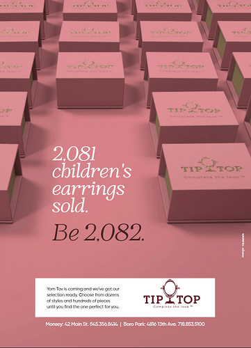
Here’s some ads I just saw recently in the bp view… Hope they help!
I would suggest softening the maroon color in your logo to make it feel more teenage-y, look up what colors are trending with teens and go with something more fun and trendy-the maroon/gold is very typical also, something that is more unique might stand out more. A mauve color like in the ads Aidy posted is “safe”, but maybe something like teal and gold or something in the purples…I would just suggest staying away from the “typical” deep colors like burgundy and forest green and navy blue etc which make it feel more adult-ish as well.
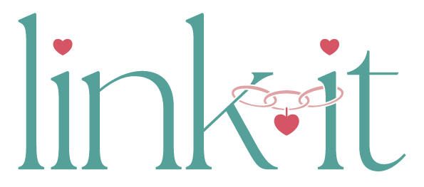
Way better now!
Maybe make the dots of the i’s hearts too? to link back to the bracelet?
agree with @Tali suggestion.
The hearts make it so cute!!
Wow! love it!
Is it too ‘little girly’ with the extra hearts or you think it’s also for teens?
I actually prefer the regular i with the heart only on the chain. But that’s just me… 
k goog. I think the extra hearts might be cute if the target audience was just younger kids but if it’s for teens it’s too much
I also thought too many hearts made it look a little like a charity logo… if you get what i mean.
It is a gorgeous logo!
Thank you!
Did you try a version with 2 hearts instead of 3? Curious what it would look like.
Love the logo! It looks great!
Coloring is definitely better!
