Hi!
I would love to hear feedback on this logo for an Israel summer tour program for high school girls.
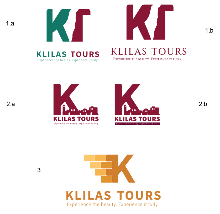
I personally like the 1.a best, but I really can’t decide the colors… (I want it to be sophisticated yet fun looking)
This is a pro bono project so I have the liberty to make it the way I like 
Would love to hear what you have to say on all of them this is great practice for me
Thank you!
The bricks in the last one is supposed to represent jerusalem stone, kosel… does it??
So, 1a would need a switch in the slogan from green to red too, since the K and T share that. I would think the slogan should share it too, based on logos I’ve seen.
1b seems not to fit what you’re talking about.
2a seems nice, but make the slogan sharper, but without a dark box underneath; it takes away the words and they’re unreadable, as a result.
For 3, I needed an explanation of it being the Kosel for me to see what you’re seeing.
The reason I’m listing all of them is so that you can choose which one works best, with the critique given. See what works to work with. I personally agree with you about 1a, and again, its your choice.
But I like the gold of the Kosel. Cool color!
I like the number 2 options, but maybe in a more fun colouring
Just wondering why all the tops are rounded and not the bottom? (looks ok on the number 2 logos but not on number 1. mayber try number 1 all straight and post again?)
Hi! Nice work!
I like the idea of the first logo but
A. I wouldn’t use the colors green and red, looks Palestinian… perhaps a navy/ blue or really any other color combination other than red and green lol.
B. Can you make the top part of the K a little less wide so it looks more like a normal k? Maybe the inside anchor points could be shifted slightly to the right I think it would look cleaner that way.
Regarding the logo with the kosel- it looks more like red brick than stone… maybe if you would round the edges of the boxes and make the stones get gradually smaller from bottom to top it might be more obvious that it represent Jerusalem stone/ kosel.
And one more point- for the slogan, I would do title case- makes it look more professional in my opinion.
But overall great ideas!!
Hope that helps!!
Maybe you could add some illusion of greenery in the cracks of the bricks of #3 to make it more obvious and then have a gold and dark green color scheme and maybe try to have the K with just a bold outline and not filled in
I like the first concept a lot but the T is a little unclear. Can you make it more obvious that it’s a letter?
The second concept looks familiar to me so I feel like another tour has used it already.
The third concept is really nice too, but make it more obvious that it’s jerusalem stone. Maybe make the edges of all the shapes and the K itself more jagged.
Not sure who youre trying to attract so I can’t say which colors I like most.
They all have a lot of potential, I happen to really like the 3rd concept. Just needs to be more obvious that its jerusalem stone. Otherwise, it gives a really neat, sharp, clean feel.
I like the third one too; looked obvious to me that’s its the kosel bc of the coloring, don’t think it needs major edits.
I didn’t think it was the kosel… Just looked nice and sharp! Maybe the idea of adding some greenery will make it more obvious!
Thanks everyone!!
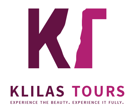
Here I changed the color and the top part of the k like @SGreen wrote, and made the T a little narrower to make it look more like a T like @chanamiriam wrote, and sharpened the edges like @gittyklein wrote… 
I do want some roundedness in the letters so its not so sharp, its a fun tour…
1 Like
its a tour for high school girls
You can add the round corners effect… Colors look good…
the same places the rounded corners are in the original? I just did whichever corner i liked…
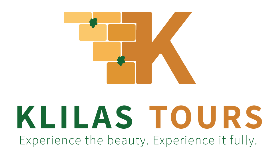
Here I added the greenery and added it to the color scheme too like @eBeB3573 and @AMiller wrote and changed the hight of the bricks, It definitely looks more like the kosel now!
does the “greenery” not take away from the clean look?
I like the coloring of this one. It makes it look more exciting.
I like the pink, purple one. It has lots of character and is fun, yet still incorporates EY.
Hi
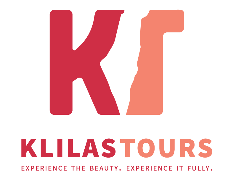
I just finished up this logo…
Thank you e/o for your help!
2 Likes