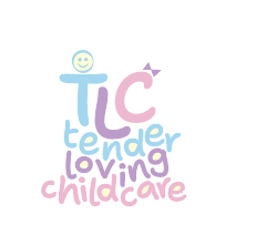
I love the font you chose! This logo definitely has that child-friendly vibe.
I’d love to hear what others say about it being busy - because it would make sense to be somewhat busier than a regular logo in this context, though people might find this too busy.
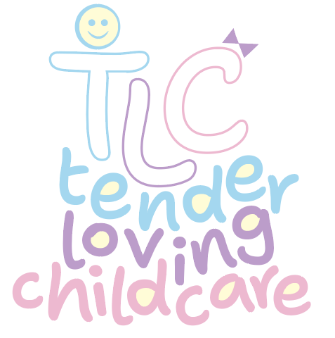
I’m not sure if you need the yellow in the letters, but I’d definitely go for the one where the TLC is filled in, not outlined.
I also feel like the smiley face doesn’t match the rest because its outline is not consistent in width and the letters’ outlines are. Maybe it’s not necessary at all…
Just my opinion - take it or leave it - waiting to see what others have to say ![]()
I think it’s a bit busy, it already has a lot going on from the uneven baselines of the letters, I think it’s too much to also fill in the shapes with that yellow.
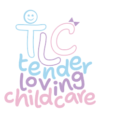
I also don’t go for the outlines, I prefer the one where the letters are filled in.
Actually, I think the yellow isn’t necessary at all.
I wonder how that smiley face would look if it was thicker and not filled with yellow.
The font is cute and the colors are working nicely as well. My vote is for the middle one with the TLC letters filled like in the left one.
I love the font and piled up wording!
Also go for the filled in letters. Can you try to make the bow and smiley match the line with of the letters? more curved and less sharp.
I like the yellow coloring, but maybe it makes it too busy, so drop it.
Love the kid friendly vibe!
I love the concept!! Very kid friendly and warm!
I would for sure do the filled in letters, and I actually think you should drop the smiley face and the bow all together. They just add unnecessary busyness because the font and coloring really do it all. Kol hakavod!
I second that! loved the filled in letters and i think it blends more with the design than the icons do.
I think I still like your original logo best (3a).
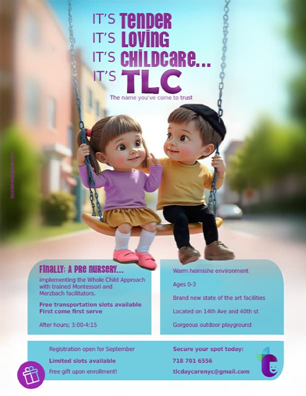
This ad is so cute! Love the idea, the colours… really adorable!!
I’d give the text at the top some more space, it’s a little squished.
The list on the right could maybe have bullet points or icons to add interest. If not, line spacing can be lessened a little.
Are the chains ai generated? They look a bit deformed, but maybe it’s just unclear here…
I’m wondering if maybe ‘It’s TLC’ can be removed from the title - the other text gives it away anyway. And then the logo can go somewhere else…
I would keep your original logo and play around with it.
The ad is soooo cute. love the kids! The top is way to squishy. Maybe make the info on the bottom take up less space so you can move the whole picture down and have more room on top.
Maybe try getting rid of the top 2 blue bars and just have the text in small so it takes up less space.
Cute image! The chain is running through the boys brain though.
Ad looks very cute, just pointing out the ages is 0-3 and you have the boy with a kappel on which is usually +3 so maybe change the kids to younger more toddler ages
I love the new logo idea!
I would go with 2b, but make the words larger and icon smaller.
also I like the old colors - light blue, purple, pink.
The ad is adorable, I also think the text is too big.
I like 2B from your new logo options very much, I’d stack the words to the right of the icon, though, it’s not looking good when it’s so tiny on the bottom or disjointed in 2A. I’d go back to the original more pastelly colors… And make the heads (circles) thicker to match the overall look.
Saw it in The View!
![]()