Hi,
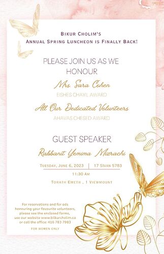
Does anyone have a quick second (I know it’s a busy time;)) to help me format this invitation so it looks cleaner and reads more easy.
Thanks in advance!
I think you can make the design on the bottom right a bit smaller so it doesn’t seem like it’s taking a away from the text.
The date and info, can then be moved down a drop to create more space.
Use a “soft enter” and create another like after the words: Please join us (soft enter) as we honour…
The info on the bottom left can be made less bold and a bit smaller.
Let me know if you need more help!
Really nice!
I would also left-align the bottom text.
Also, maybe have the lower butterflies a little less bold
Really beautiful!
I would adjust the space between each name and the award title to give some organization. ex: name right underneath title and then bigger space and name, title
The note on the bottom could be more spaced and the women only you should put on the top of the page (on the pink)
