Interior Design Flyers

Hi!

I created flyers for my Interior Design and Professional Organizing business.
Any thoughts or ideas?

The difference between the 2 Chanukah is the color of “Chanukkah through January 15th, 2022”. One is pink and one is white-which one looks better?


Thank you so much in advance!
-Sarah

I like the first one! Good hierarchy, leads the eye thru the info nicely.
Cool that you do interior design + professional organizing!
Hatzlacha!!

You might want to try flipping the photo so that you start reading from the left and continue on to the right…

I love the second one, so neat and classy!

1 Like

Thank you so much for your feedback!

I flipped the photo in the first one. Does this look better?

I think it looks great this way!
You can tighten the spacing between lines in the 2 text groups on the right…

i love seeing the comments that i would have written - given over by my amazing grads on their own!

Thank you so much!
I tightened the spacing. Does this look better?

Add more margin on the left. Nice flyer

introducing is not centered

i would put all your contact details together rather than 2 separate elements and the modern serif font is not the most readable for contact details,

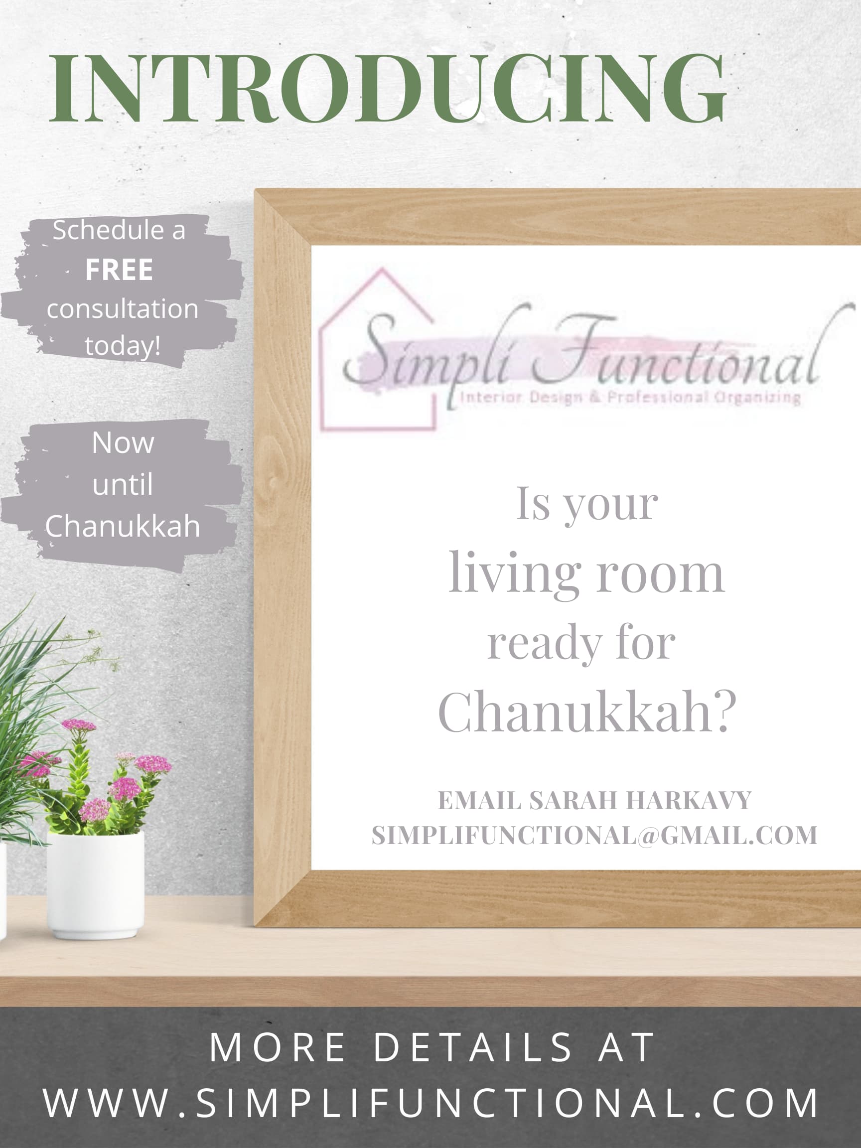
Can you make the words “Introducing” have more tracking and align the G to the a of “Schedule a” if need be, make it bigger so it aligns nicely
The font “email…” is hard to read. Can you use the same font as the bottom text “more details at…”
I don’t love the font for the focus - it doesn’t look so attractive - You should have something that better portrays your business - something more sophisticated since you are an interior design company - ppl might judge your style on this ad…
Also, is that how you spell Chanukah? or it doesn’t matter cuz its a Hebrew word?

Really nice!
Is the “now” and “until” on two separate line on purpose?
And maybe align them horizontally within the smudges.
And is the logo too close to the left edge?