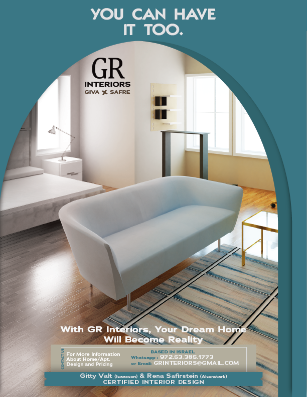
Hi,
I am finishing up an ad for a start up interior design company.
Wondering if anyone has any thoughts.

TIA!
Hi,
I am finishing up an ad for a start up interior design company.
Wondering if anyone has any thoughts.
TIA!
Looks really nice!
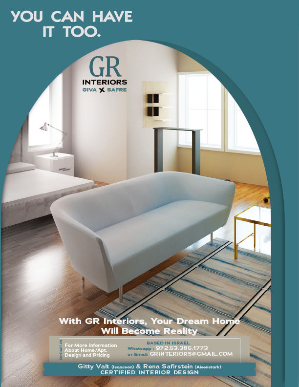
for the font on the top I think I would go with a more modern sans serif
on the bottom, maybe put a box behind the text-banner style cuz its really hard to read right now…
Good Luck!
Really nice!!
I dont love the position of the top text, maybe leaving some space under would help.
Maybe you can have the arc extend to beyond the page on the right side and leva mmore of the beige color on the left side and put the text there straight. But just an opinion so i think its fine like this if ur done playing around.
Did the client give you this image? if not then maybe I would change it to something that looks more like a room which ‘I would want to have too’. This image somehow doesnt pull me so much.
I really like this idea!!
I also thought the bottom text is hard to read.
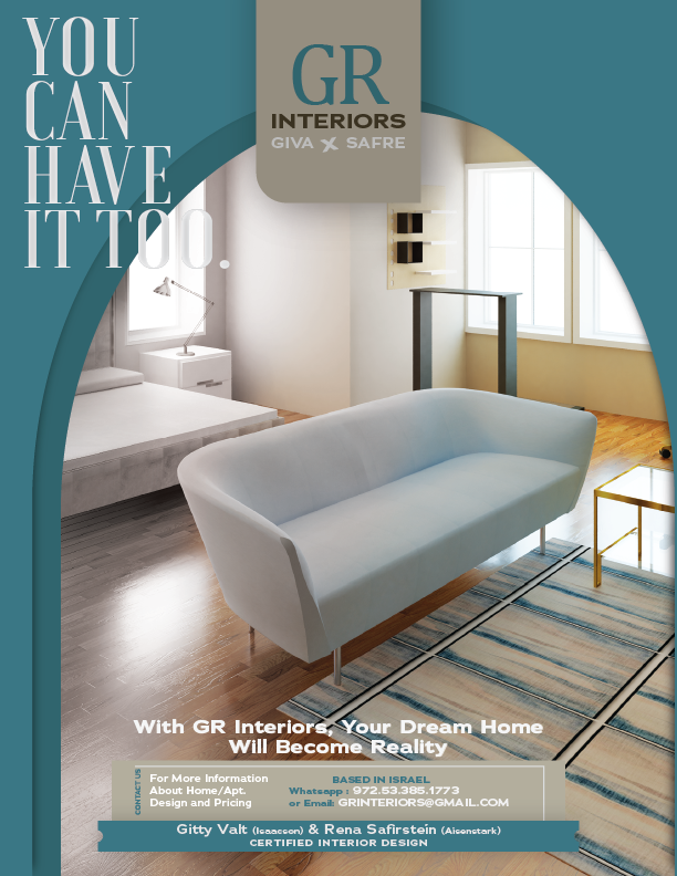
Looking great! The arch looks a bit warped. Maybe fix that.
Like Blimi mentioned, might be worth a try having it bleed off the page on the left side and have straight text, since the text seems squashed up there. I would also consider removing the shadow under the lighter arch so that it has more of a “doorway” look- giving them a peek into house
Looks really nice!
I think you should add some color to give it some “pop” (maybe use a darker blue from the rug)
also, like others mentioned, its really hard to read the bottom text.
There is weird spacing by the top text. maybe put it on one line and make it bigger? (or change the font to something more elegant and sophisticated) I also feel like there is not such a strong focus here… The logo also looks out of place. I think the logo looked better how it was in the first draft… If you put it back to where it was, maybe it’ll create a good focal area…
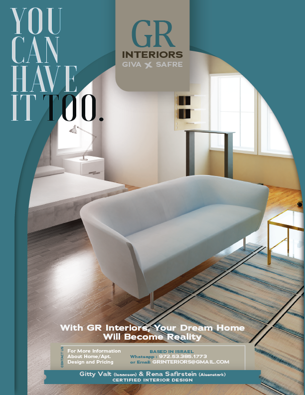
I like the coloring much better!
The bottom is better with the background behind it but it is still too squishy… maybe make it a drop smaller and give it a little leading… Also, is it all the same font? something looks different about it - maybe u have diff sizes - I think it’ll look neater if everything is the same font and size and then the things that you want to stick out, bold it…
also, not sure but it appears more to the right than centered exactly… just make sure its centered properly…
one more thing, I would put circles on the blue bar by the bottom text instead of the triangles you have there - just to match the rounded theme…
I also think it looks cleaner without seeing the left arch…
coming along nicely!
Its looking much better!
Maybe try flipping the doorway and having even more of it cut off, and then you will be left with more space on the left side.
Try left aligning the top text.
Love this flyer! Looks nice. I like the text like this overlapping, but Maybe try the word too in the tan color from above by the logo. That might show up and look nice. Or a lighter version of that. I like how you placed the logo in that box. Much better than before. Bottom text a little hard to read. Firstly the tan background is too light for the white text. Not enough contrast, maybe darken that tan color a bit. Also maybe try aligning the text down there a little differently. Seem not proportionate. Also I wouldn’t put the contact us sideways. Overall looks great though!
Wow! It looks so much better already! I really like it!!
I agree with Daniela about the rest of the changes…
Wowowow i love the way its coming along!!!
Maybe for the right side where only a drop of the wall is showing you can extend the picture even more so that even that doesnt show.
Everything else lookls great, the only thing i would change is to make the email address either in lowercaps or smaller, and to increase the leading so it shouldnt be so squished.
How about you write the Contact us paragraph all on one line extending across the beige shape, and underneath it you can write whatsapp, email, etc. maybe with icons to save space.
This is so nice! Love how you developed it.