Hey I’m doing a logo for a makeup client and I’m having a hard time coming up with an original idea for a logo. I feel like they all look the same at the end and I’m trying to come up with something less typical…
Anyone have any ideas/inspiration?
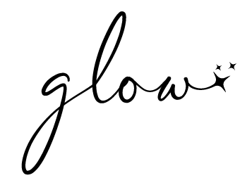
The business has the word glow wants it to be like glowy fun but also business…
It’s slightly complicated
Thanks!

Try and find a font that you think represents the feel of her business
also looking at logos and marketing from makeup brands help
iv done a logo for a makeup client was harder but bh we managed something different and unique! you can check it out on my website or insta - kixart design studio

ok these are 2 that i came up with. idk why im having a really hard time thinking of ideas even with all the inspo. any other ideas/critique on the ones i did so far?
thanks!
I like the second better! It looks like it was harder to make and not anyone can do it.
I like the second one better but I think that a makeup logo should be more delicate.
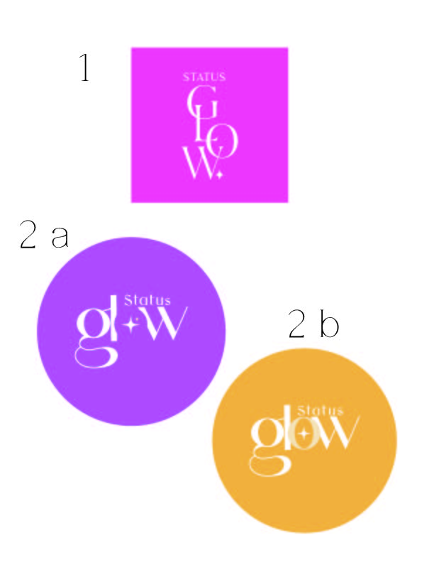
I love 2a - it has a nice negative space… and I like the color of 1.
I wouldn’t show the client the logo in a shape - would show it like this
its the wrong fonts cuz I dont know what you used but you can get the idea - I think it looks more “professional” like this instead of being inside a circle or square - thats my personal opinion - I have no idea if Im correct…
I made the word “status” with a sans serif font since I felt that the one you used isn’t so clear (and will be hard to read when scaled smaller…)
i also like 2a best, and i totally agree with Breindy’s critique.
i think you’re going in a great direction with the unique ideas and typography… i think the delicate vs boldness will depend on that person’s specific makeup style…
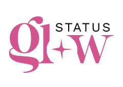
interesting name…i would maybe already try adding a tagline as it’s not soooo obvious it’s a makeup brand from name ‘status glow’… unless i’m really outdated :>
it’s really nice
Make the logo smaller and take away the glow around the words
and btw the logo looks good now 
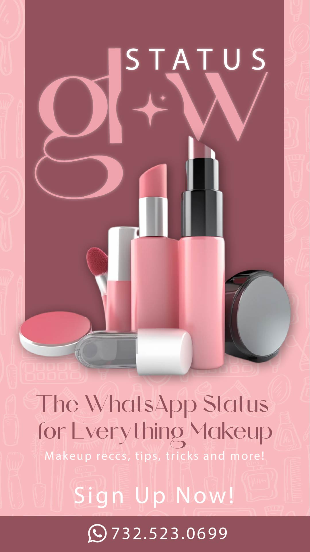
wow! really nice ad! is it me or is the logo not perfectly centered?
Really nice!
the white sentence under the whatsapp status is hard to read.
did all the makeup come in one image? or did you put it together? the pink container in the left seems to be in a different perspective.
I would also soften the shadow and move it down
I like the texture in the background
Looks great!
i would make the whole makeup picture smaller it shouldn’t be touching the logo. Also move it lower down then you can move the rest of the text lower and put “sign up now” in the box with the phone number.
Also the word Status in the logo should be aligned to the end of the W
Good luck!