My client is happy with the logo but not sure about the colors. Any suggestions and of these three which one would you pick (they want it as colorful as poss but still elegant)
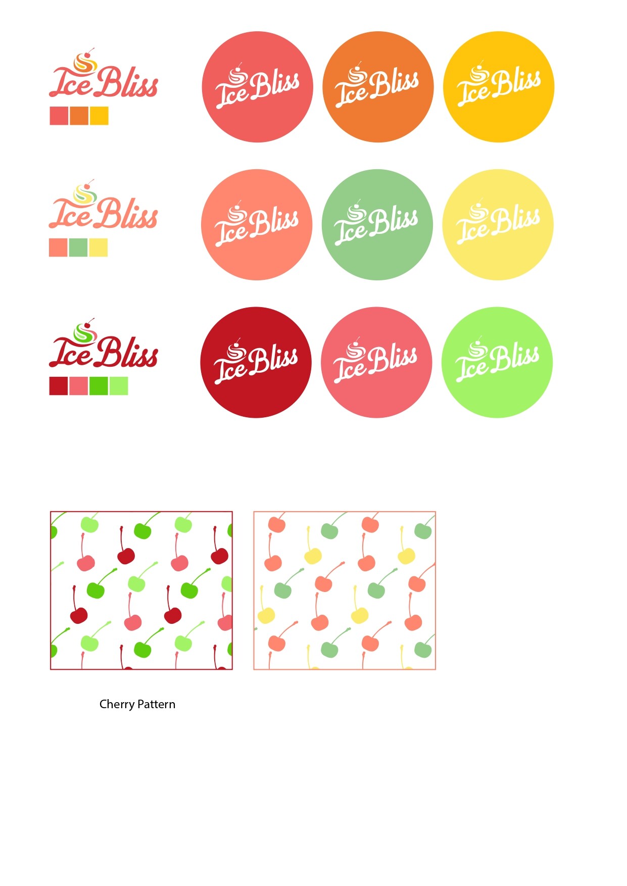
I would go for the middle. But the yellow is getting a bit lost in the logo (it could be because its very small).
so beautifully done!
I think you did keeping it elegant while still make it colorful.
The pastel colors in the second one look the most ice-cream-ish but I personally like the combination of the third one. I think it looks the most elegant.
Thank you so much. So the first one is more or less a no, no…
I like the second as well
Well done!!
I like the third best. Really neat logo!
Love the logo, another vote here for the second one.
I like the colour combo of the third, but would do the words in the lighter pink, instead of red
I like the sharp-and freshness of the third but agree for ice the second is probably best
Funny cuz I love the first! Reminds me of ices
I like the second… maybe those colours in brighter… I like the yellow pink green combination.
Really nice logo!