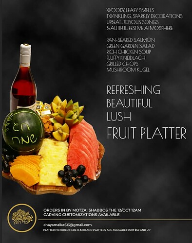
Hi.
I am trying to create an ad for Shavous, this is a previous, I want to fit in with the same vibe so it’s recognizable as the same business. I had another one that was very similar. The colors are black and gold. Any ideas how to change it up a bit?
Thanks in advance!!
Nice start, how about moving the logo to the bottom right corner and then move the text to the top left,
maybe also try adding some texture to the black background,
hatzlacha
Thanks! I really like that idea!! Any advice on what sort of textures?
you can have a look, on adobe stock i typed in black texture and lots of good options came up, these are two of the first ones…
looks much better already!
try giving the headline a nicer font, and the smaller text a more simpler font, not uppercase
Nice! Give it more padding. You can try block text (watch Adina’s video on DA newsletter)
The small text is a bit hard to read
A bit heavy on white colored text. Needs a big top margin. Avoid all caps for small top text, especially in that font which would need more linespacing-too straining to read. It is also a bit unclear that the top text is a list rather than a paragraph, especially the top most paragraph (or is that meant to be read as a paragraph?). You can try alternating slightly the color/tint of each item or another way to make it easier to read…


