Hi! I am in middle of working on this logo. I am trying to clean it up.
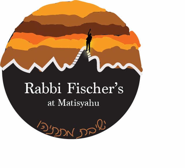
Do you have any suggestions? Like how to blend and neaten up the color lines…
Hi! I am in middle of working on this logo. I am trying to clean it up.
Do you have any suggestions? Like how to blend and neaten up the color lines…
Nice colors. Overall rather busy for a logo. Can you simplify? Eliminate the black lines by the person, and make the person bigger so recognizable when the logo is smaller. Text should be bigger and bolder compared to the logo, you have more space to enlarge and you could choose a bolder font option at least for the main text. Perhaps fewer colors in the sky, sticking with the lighter yellows and oranges so the figure shows up more and the overall effect is less busy. Be sure the white line actually divides the two halves, there is an overlap on the left side. Would simplify the white line as well, less bumps. Assuming you will clip it into a clean circle?
Use less colors in the sky and make the name of the yeshiva at the bottom more bold and bigger. Take out those lines on the path and I agree with above - make the man bigger too.
Good luck!
Nice! I love the warm feeling it gives off.
I agree with all the above comments.
If you would like to “blend” the colors, check out this link.
It might be helpful…
Smooth and blend colors in photoshop
You can probably get away with using the smooth tool in illustrator.
Hatzlacha!