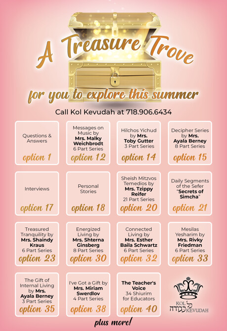
Any suggestions how to lay out the top treasure chest with the words?
And where to put ‘plus more’ on bottom?
And maybe suggestions to add more color or pattern if you think it need?
Any other feedback/critique is welcome
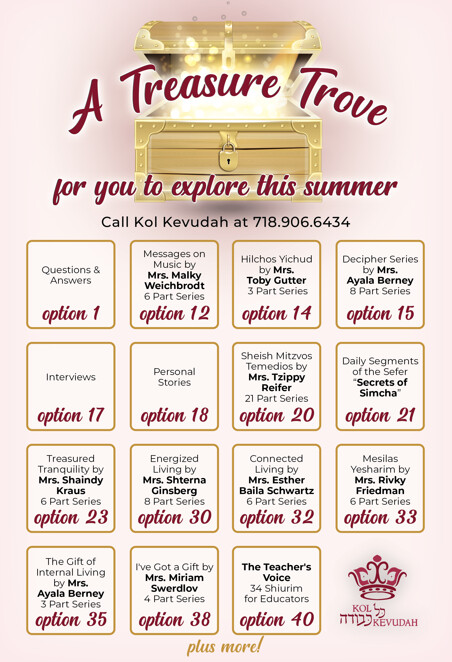
Any suggestions how to lay out the top treasure chest with the words?
And where to put ‘plus more’ on bottom?
I like the second one alot more!
yes i also like the second one…
‘plus more!’ should probably be done differently or maybe should say ‘more options available by pressing xxx’ in the simpler font maybe
Love the second!
Try “plus more” in the same gold effect as “treasure trove”
beautiful!