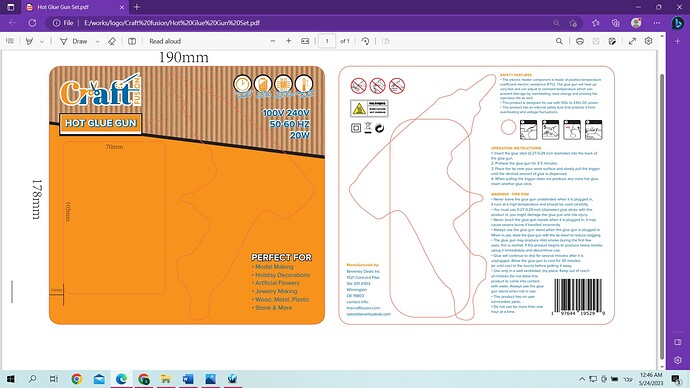
Any thoughts or changes for this packaging. It is a double sided paper.
so fun!
I like the scissors in the logo
Thanks Adina. I am really not in love with the logo (was so upset when he chose that one that regreted sending it to him in the first place) But he was not happy with the more modern logo’s I tried so I sent him some of these versions. BTW do you send out work that you do not like???
Anyway-any points to consider regarding the packaging? Any recommendations??
Thank you
i learnt the hard way not to send the client an option i dont like because i also ended up with a client taking something i didn’t like
I marked to him the ones that I would suggest. But he still went for this one…
I don’t have to mark my name on it or put it on my portfolio so not like I loose out…I just felt the others were so much better…
I would still love some critique on the packaging if anyone could help me with that.
I love the back looks really neat! the front maybe is a bit busy? maybe take away the strokes in the titles and where it says hot glue gun make it a bit simpler?
It is craft paper, but i will try it with a solid brown and work on your corrections. Thank you!
cool looks like a complex package, well done! about clients always picking the logo you dont like, so true!! so i googled to see if this is common and one person on quora - paul hopkinson writes it very sharply but maybe it will be somewhat of a comfort to us designers:
Why do clients always pick bad designs?
The more pertinent question here is why are you presenting bad designs to your client?
What quantifies a bad design? In terms of graphic design we always tend to present a client with a few different design options.
There will always be the one you hope they pick. Like your precious first born, it is your baby and the one you are most proud of. Like that first born, you fear it facing rejection when you proudly send it out into the world.
Typically it might be that it’s something new you’ve tried, or something that’s really on trend or something which speaks more of your preferred style.
None of this means anything to your client.
Your client has their own tastes.
Often they prefer things that feel familiar.
Familiar might, to a designer, be cliche or boring or safe. Familiar might not be the design you are most proud of.
Herein lies the secret. A good design isn’t necessarily always the most creative, or the most attractive.
A good design is one which solves the clients problem efficiently. A good design is one which answers the brief comprehensively and leaves the client feeling satisfied.
We can’t always produce ground-breaking designs, we can’t always produce designs which are to our own personal taste. This doesn’t make them bad designs.
We aren’t designing to satisfy our own ego, we are designing for a client. If you want to design for yourself, start a personal project. Do this because you’re passionate about it, do not expect it to lead to financial reward.
If you want to be paid, design for clients and accept that sometimes this won’t give you complete creative freedom and control.
Clients only pick bad designs if we present them with bad designs. Even the most beautiful and profoundly creative designs are bad if they do not answer the clients brief.
If we fail to answer the clients brief then we won’t have anymore clients to be able to choose ‘bad’ designs in the first place.
Wow!!! Thank you, that is very important and has given me much food for thought!!
What I found interesting is that he chose me based on my portfolio where my style is clearly presented, but then wanted his own style. I guess that’s just part of the business:)
also however much i dislike the logo, i suppose it’s all worth it to have a happy client, so really it all worked out well…

