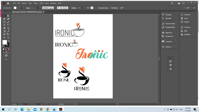
I am working on a logo for IRONIC café. must be somewhat artsy as that is the crowd it caters for. here are some of my trials. would love advice and criticism. Processing: trial 3.pdf…
I like the orange and mintgreen one. What are the 3 dots though?
can the cup maybe be part of the work (like as the O)?
thought could look like 3 individuals, the cafe caters for groups of friends to hangout together. though if not necessary will remove. what about the colors? is there anything you would change?
thank you so much
did try that. but will try again… thanks
Hi Breindy. can you describe which one you chose because the image is blocked…thank you so much.
i like the lowest on the right with the smaller letters and lines underneath, has the mot quirky/funky look whilst still being very clear to read. i would probably add the words ‘cafe’ in small somewhere for when the brand still needs to be established as it’s a very unusual name for a cafe…
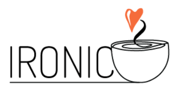
The one all the way on the top.
I also like the lowest on the right best! good job!
I love the lowest one!!! And agree with adding the word café.
Thank you so much for all your help. will try adding café to the last one.

