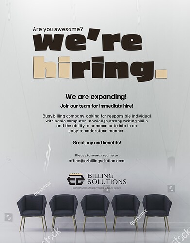
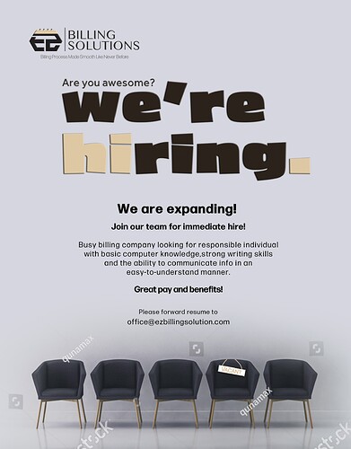
Hi. I am working on this ad and I need advice on text layout and not sure if the logo is in the right place.
Thanks in advance.
Very nice!
Maybe put the logo on the top left and move all the text down…
The beige color with the black and grey looks a bit drab - maybe do a bright green, light blue, purple, pink - really any bright color can go…
Maybe also color one of the chairs to represent an open position…
I think put “We are expanding!” in Caps
The reason I made it gold is because I wanted to match it to the logo.
I did make the background lighter so it shouldn’t look so drabby.
I love @Breindy-S Idea of changing the color of one chair. If you want to keep to the beige, I would change one chair to that color and see how it looks.

