Hi,
Just as a disclaimer- the graphic designer I am working with approved me posting on this forum for feedback.
Ok, I hired a graphic designer to design a yeshiva logo. However, it is not turning out how I was hoping and I’m wondering if any of the talented designers on here may be able to help with an idea of how to tweak it…
I will attach the logo she created so far…
There is a lot of hebrew text (yeshiva name plus a passuk) which is what I think it making it challenging.
I was hoping for an outline of yeshiva building around the yeshiva name and then the passuk on top of a sefer… (not sure if a/o can visualize this…)
(I will attach image of building in sefer which might help explain…
I’m not sure if this idea is feasible and won’t look too complicated… If it won’t work, at the very least I would like the sefer to be more clear what it is… I showed this to multiple ppl (all men) and they didn’t understand the logo… (in the end of the day I need men/ boys to understand it…)
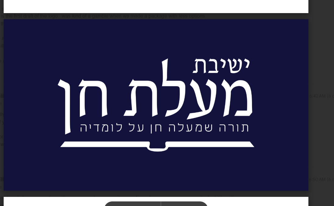

Seems like a sefer to me… She can round it out more so it looks like the open pages of a book…
Does the passuk always need to be there? In most logos there is a version of the logo with the tagline and a version without.
I’d suggest moving out the passuk from above the sefer, and then moving the sefer illustration up and fitting it nicely with the main text, and then adding a variation with the tagline below.
Also adding an outline of the yeshiva building may make it too cluttered or not, depending on the execution. But generally, with logos the idea of less is more is really applicable. The building illustration can always be added in a brand pattern later…
I actually like the first logo. Its so clean and neat and right away I saw that its a sefer.
Thanks for the feedback. What do you think about adding that material type of bookmark that seforim have in the middle and also I thought maybe we can make it look like separate pages…
In terms of including the tagline - yes we can make a version without as well.
I hear the point about it looking too busy with building illustration… I wish I could see a version with that to see how it could look…
The first one is really nice. It’s simple and modern. And as @AMiller said, you don’t want something cluttered and busy.
The only thing I might work on is maybe to add some touch that makes it recognisable and not generic-looking - though I’m trying to think what that ‘something’ could be ![]()
Maybe she can try some more versions according to your suggestions?
I agree. When adding multiple concepts into a logo, you need to do it in a way where it hints towards the concepts but doesnt fully express it. Otherwise it gets messy.
What about trying different angles where you combine them in a more abstract way? In the end, it might not be obvious to every single person who sees the logo that there is a sefer and building in it, but the hanhala will know (show in your presentation how it is incorporated in).
@chanamiriam- any ideas what you mean how to hint to the concept? I’m not sure I fully understand what you mean?
@shevy I think it’s easiest to show you if you email me so i can show you a few logos that I’m thinking of. My email is hello@silvertonecreative.com