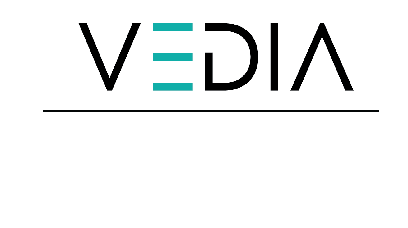
I’d usually prefer to keep the logo to less colors and introduce the other brand colors in the rest of the branding.
I’d suggest adding more interest though to the whole logo - like try a diff font or editing the existing font to make it more interesting. A new trend I was seeing lately involves chopping corners of the letters… I’d also try a font that is slightly thicker.
i actually love the last logo. It’s so sharp and cute;)
Thank you! I actually tried the cutting corners thing, but it came out too messy. I like to keep it clean and neat, yet sharp…
Regarding the colors, @AMiller why would you prefer less colors?
I’d fix the kerning. I feel like the E should be closer to the V
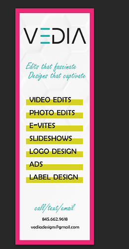
I would make the yellow lines the colors of your logo, and make them all evenly straight.
The Script font doesn’t really come in, use more of a basic font.
Also, maybe do a solid color background.
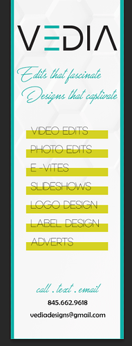
I like the idea and overall design, but think some things could be tweaked to make it a little easier to read: I don’t think it needs a frame, at least not such a thick one - it looks there’s too much info crammed inside and there’re no margins to give breathing space, decrease line spacing between the two script lines, maybe you can omit one colour - not sure it needs all three included, and would you try making all the bottom text a bit smaller (obviously only if it’s not being printed very small), and agree with @ISilver about trying to align the lines and text.
Just some ideas, take them or leave them 
Can you left align all the text thats underlined in yellow?
The font used for the list and the contact information looks like a very basic font, I would change.
I’d keep the logo to as few colors as possible, here are some of the reasons.
Pantone printing gets more expensive when more colors are involved.
Inverting colors is easier when you have less colors - you don’t need to worry as much about the contrast of each color on the inverse. You can just choose one dark color and one bright color and your logo is good to go.
It’s easier to keep the correct color percentages when the logo has fewer colors, those are like your 30% and 60%, and the additional colors you add are your 10%.
Regarding your ad, it doesn’t seem like you fixed the kerning on the E and V there. The V needs to be closer. I’d still tell you to play more with some more interesting fonts, even if you don’t want to do the corner chop. The font you are using now is quite boring and typical…
My rule of thumb regarding fonts is that if it came by default with my computer, I don’t use it. Obviously there are some exceptions, but usually the rule stands. Default fonts are way too overused and typical…
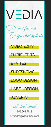
The changes you did made it a lot better. The aligned text is much easier to read. I would change the font though because it’s very recognisable as Berlin Sans - I’d use something less common and boring. I would say like @AMiller said, try downloading a new font for that.
Same to the script font, Freestyle Script is very overused because I think it comes preinstalled as well. So I’d try changing that if it’s not too much of a bother. There’re loads of free fonts you can download…
I wonder if you can have two versions of the logo, one with the colours, because I do understand why you prefer it. But I’d keep to this one for the reasons @AMiller mentioned
I feel like the pink boarder and the yellow lines are way to overpowering. Can you make them fade out? So will start dark and then get lighter and lighter.
Wow! What a difference, I really do like it now! Just increase the tracking of the list (video edits, photo edits etc) because it’s quite a condensed font, and try making those words a bit bolder might make them clearer.
Looking great!
Thank you all so much for your help!!! It really helped me a lot!


