
Hi, client wanted advert for upcoming event she is working on. its for coaching and I am not sure it gives the calming feeling that it should be. Any help with that point and any critique in general. thank you all
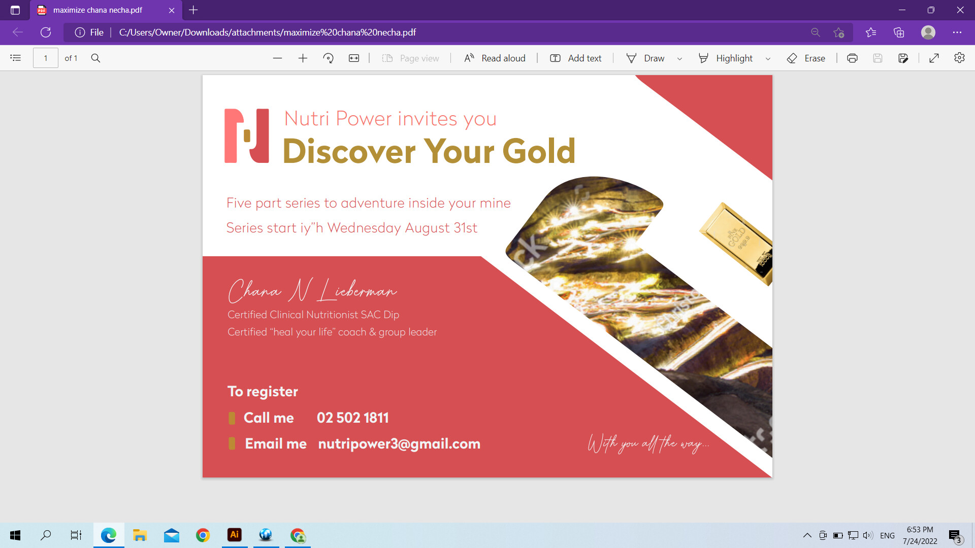
sorry, forgot to add that she really wanted a real picture of a gold mine somewhere in the ad and a bar of gold. thanks
I don’t think the coloring is right for the tone you want. maybe green (for health), or blue or purple would work better. I also think the gold bar and mine pictures need to be incorporated better into the whole design. Now they are distracting since they seem to be separate from all the text
Nice! Very neat!
I think you should tighten the leading by five part series…
You should capitalize the H of iy"H
The gold mine picture doesn’t look so clear - like I couldn’t be able to tell what it is if you didn’t tell me the client wanted to include a pic of the gold mine…
The bar of gold looks a little of place - maybe it needs to be made bigger…
I think it also sounds funny to write call me , email me - maybe omit that and just put the number and email there…
The colors dont bother me because its the colors of the logo but a green can look very nice and soothing…
thanks, will work on it. how would you incorporate the gold mine look better? the gold bar is the same proportion as the gold bar of the logo, should I still try it in larger?
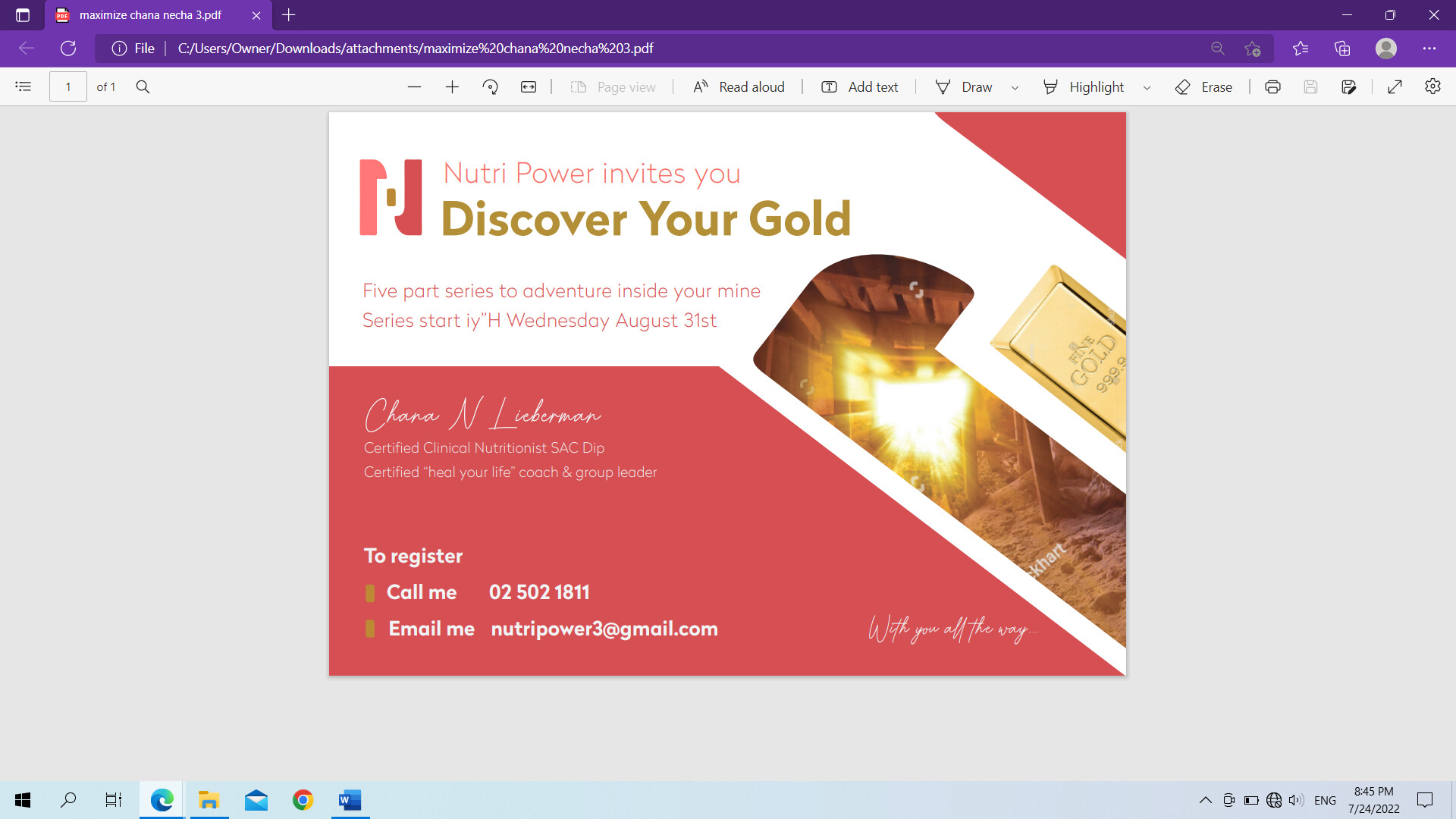
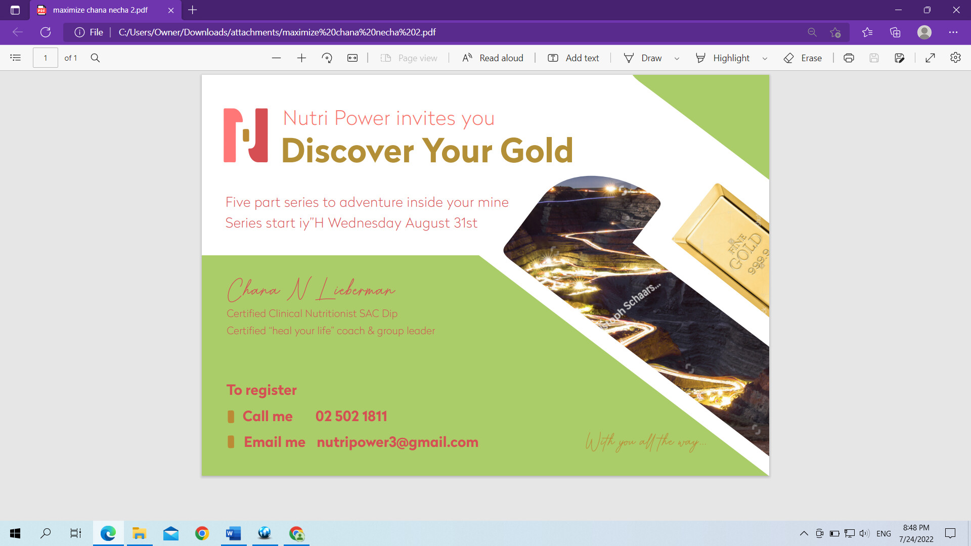
are any of these images better? coloring? i dont like the green but would like to hear what you think about. is the gold bar looking better now that its bigger?
thanks so much
client is the one who wanted call me email me as feels it sounds very personal…
One quick thing I noticed is that it should says “invites you TO”
oh, will add the to, tried this out as well though not sure client will be happy with it because of the image
What if you do more of a sage green that might be better…
The image in the light green version looks the most like a gold mine
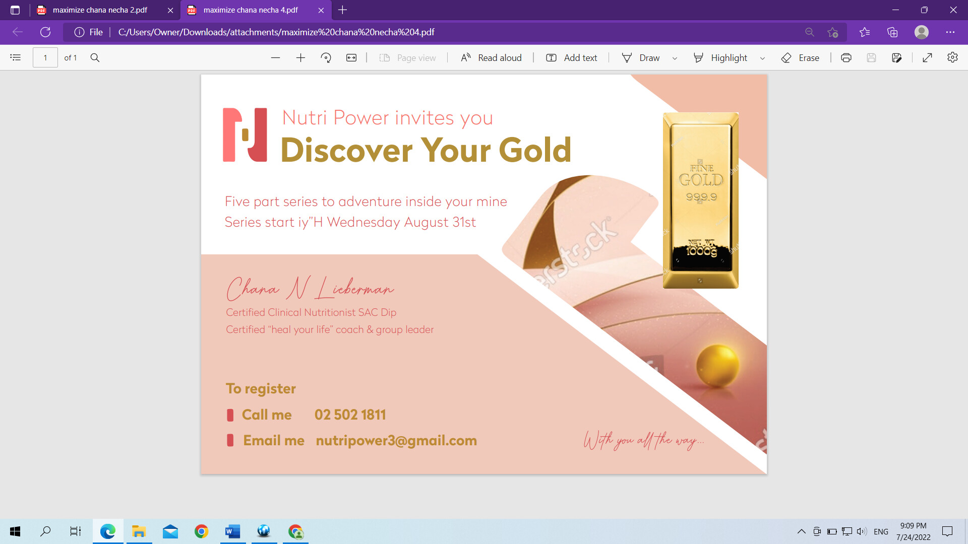
The gold bar is much better at a larger size as it fills up the empty space - but I dont like it how you have it in the light pink version.
Personally, I think the original coloring looked the best - it had the most contrast and popped nicely. I also like the light pink color but I dont like the pictures…
I like the light pink color best - it has that calming feel, just with different pictures