
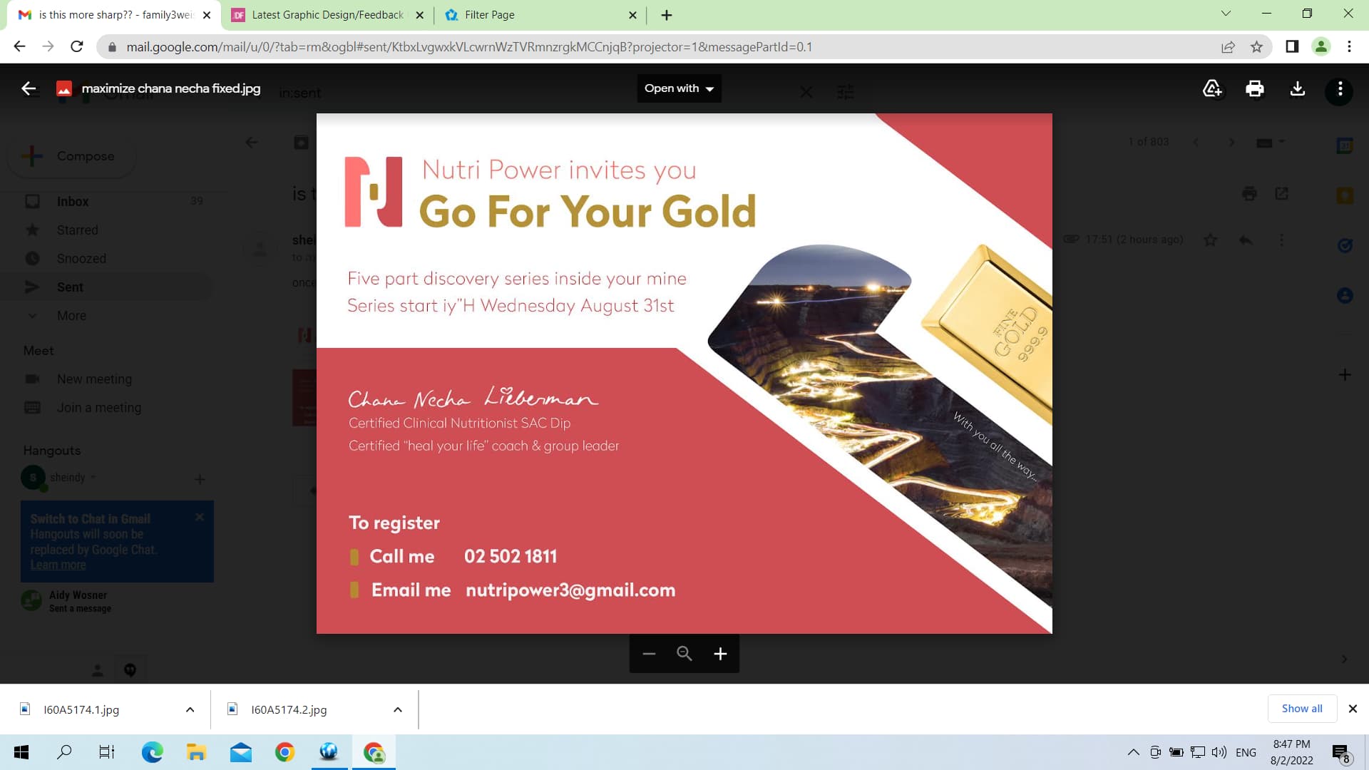
this is the end result for the ad. Thank you all for your feedback. we are now working on a banner that she uses for her email signature. not sure between the two. Also please let me know if the logo looks better with the bold font or thin (i put one of each in the two separate banners) Thank you so much!!!
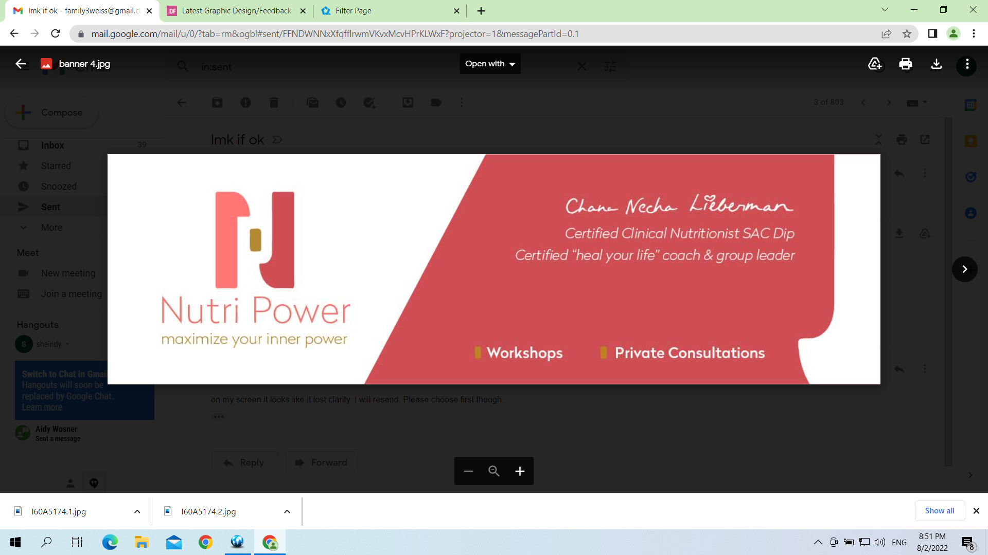
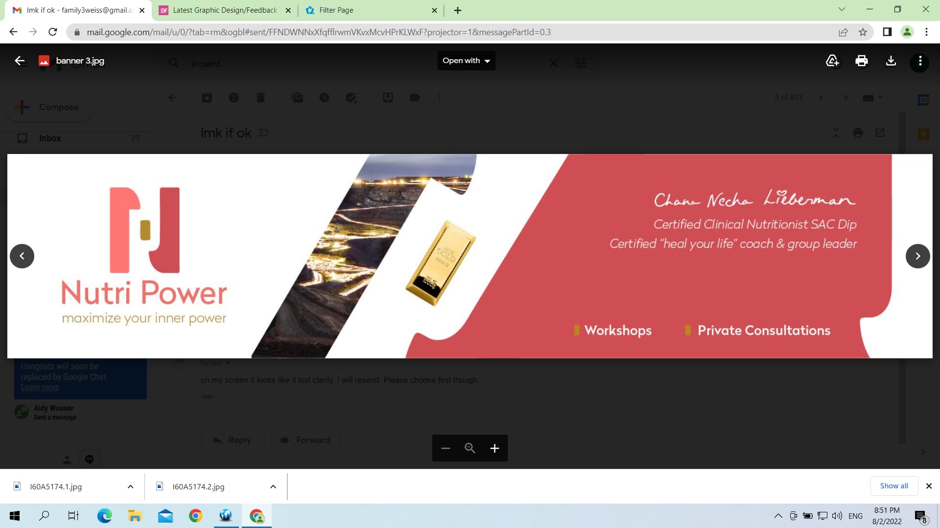
I think for an email signature the first one is better because it’s less busy. nice job!
thank you. what about the bold font in logo or thin? which one do you like better?
The thin looks more professional and smooth.
I like the first banner better with the thin font in the second.
Great job!