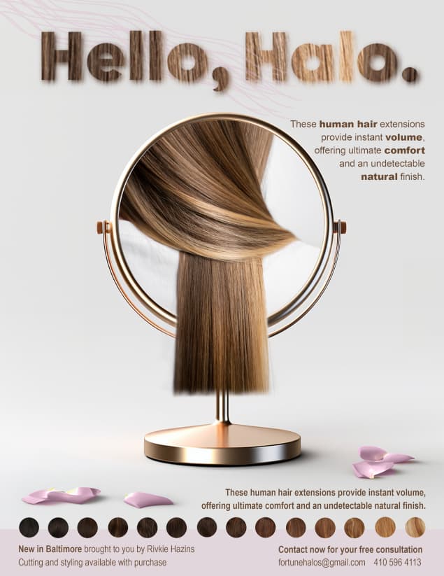
Hi, Im making an ad for someone selling halo hair extensions. I made this but I think it might be too busy… ANY critique welcome!
Thank you!
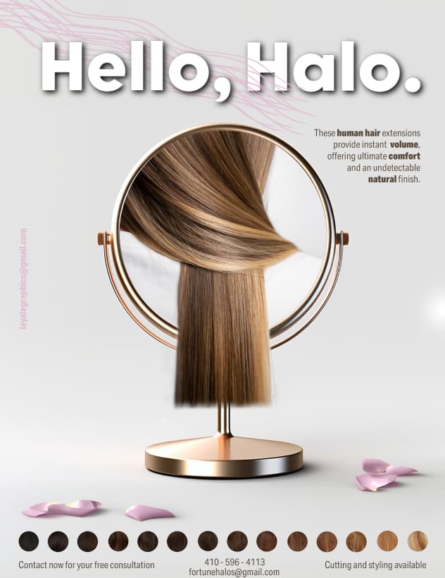
I think you did a great job!! your email address should be smaller I think its too noticeable and detracts from the ad now.
The info on bottom can be presented a bit better, maybe even put a bar of pink on the bottom and the hair colors could be half over the bar half off and the info in it?
Love the ad
Super Pretty
I would try changing the font (to something a with a little more character) and getting rid of the shadow behind it
maybe try making the text a dark brown or another color from the ad.
would also change the font for the blurb at the top
also the info at the bottom is a little to close to the edge
Looks really pretty, i agree with @adinacahn,
i would also suggest you shrink all elements a bit, so you have a wider margin.
I agree with @shaniporetsky I would change the font on the side to something a little more clear
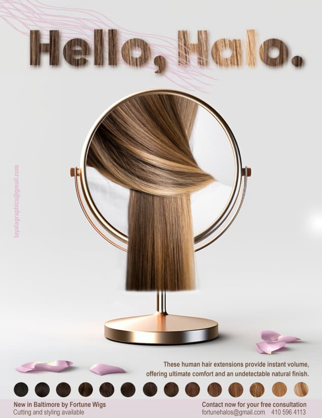
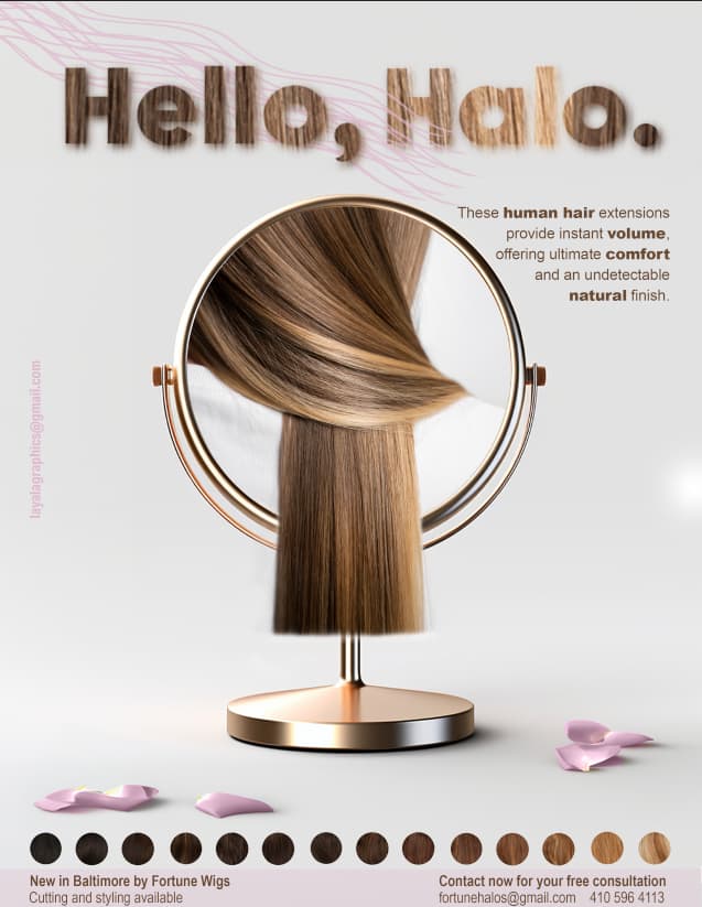
I would take out the strings of hair on the top as that’s distracting from the beautiful hair colored font we have here.
And the description goes better by the mirror than at the bottom, I think.
Sent you a PM
It’s a gorgeous ad! Not sure if its just the screenshots, but the bottom margin is very tight
This is beautiful! I would just add by saying that I very much liked the title ‘Hello, Halo.’ in the first version. The lighter grey created a very clean and effective contrast.
Good luck, it really is a beautiful and attractive ad!
It’s looking very nice!!
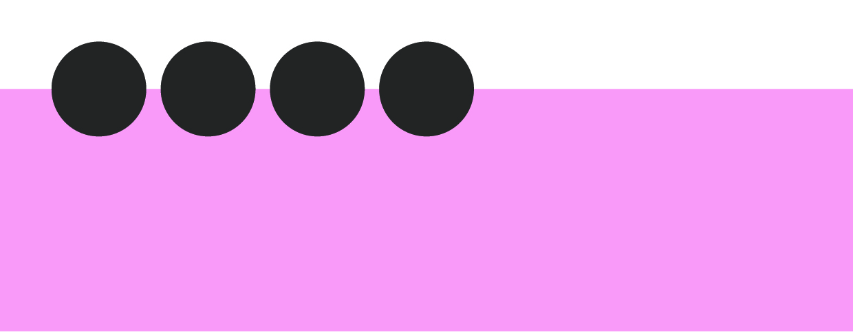
I’m attaching here what I meant with the bar- It needs to be raised higher and the circles should be overlapping it not above it.
The text on the bottom is very close to the bottom of your page still- give it some more space
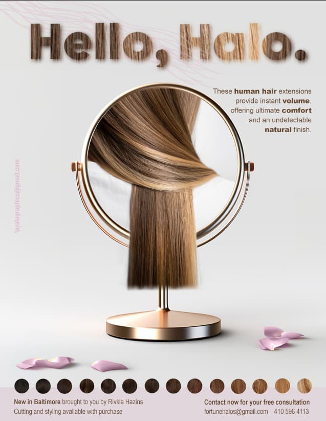
I made the swish of hair on top lighter… is it better now or should I get rid of it altogether?
is the contact info margin still too tight?
and which one should I use - text on top or bottom…
AND, was the “Hello, Halo” better in white?
thank you everyone so so much this is so helpful!
I liked it better in white
@Yael I agree the letters look nice in white or maybe in pink
Stunning ad!
I would also leave it the top text in white, maybe you can switch the font to a nice script to see what it would look like.
I still think your email address on the side is too big,
Its a really nice attractive ad!!