
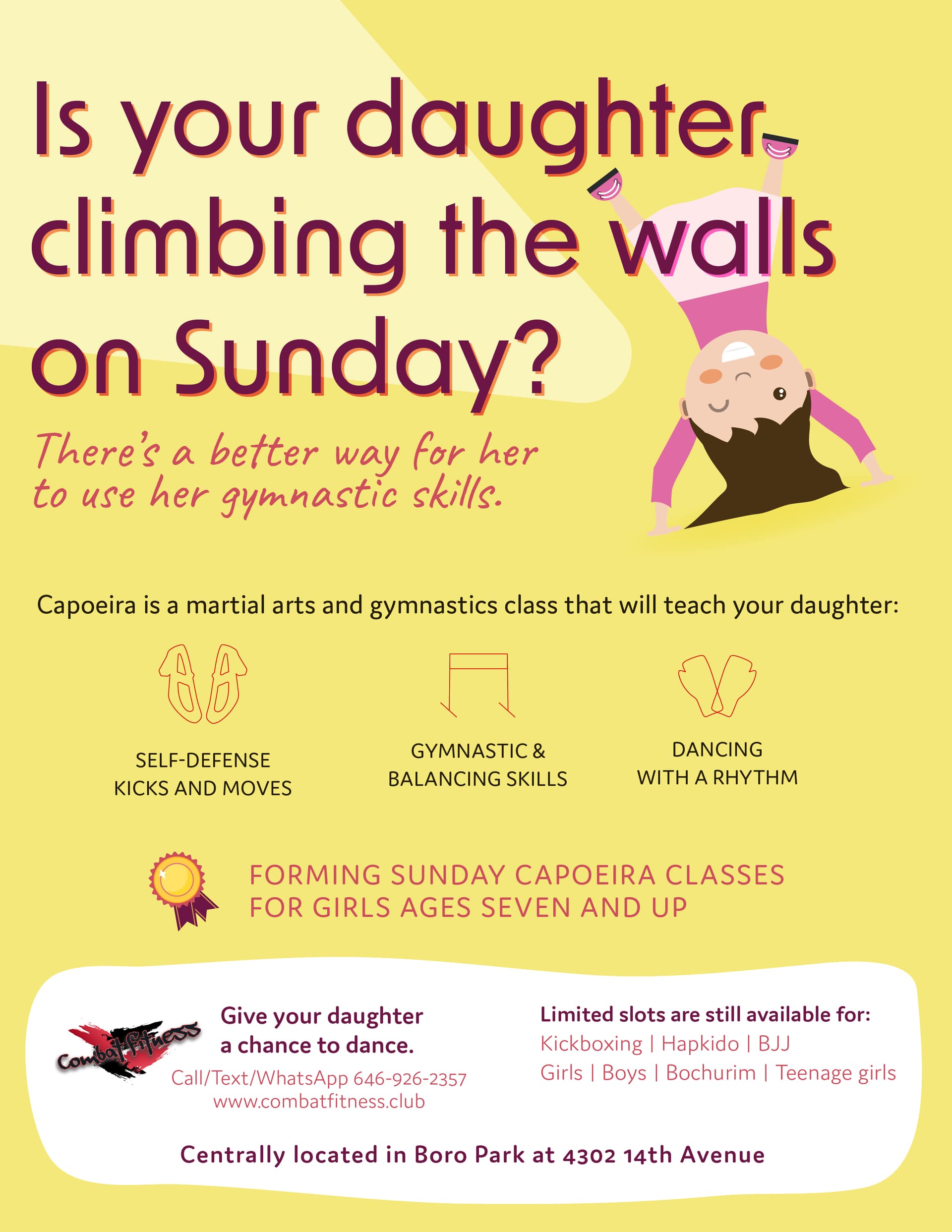
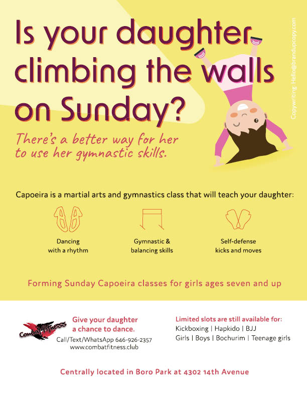
Any critique on this ad? I made 2 versions


Looks amazing!
I prefer the order of info in the first ad.

@chanamiriam I like it a lot!
I would either left-align or center-align all the text on the bottom
It looks like the dancing and self-defense icons are flipped…?
I would maybe look for solid icons as opposed to just line art, I think that would stand out more and be more easily recognizable.
Personally, I would also choose a different header font. Maybe something a bit bolder. This font is a casual easy one but the headline is such a good one it deserves a bolder font. Also maybe centered?
I like it so much better than previous versions.
Really nice! I like the 2 newer options!
Maybe add a bit more margin space to the left side of your ad…
Just an update, client ended up going with these changes. Thanks for all the help, @Silo, @DenaPossick and @Chani_Wolpin 
So cute!