Hi!
I know it’s crazy hectic before Yomtov!
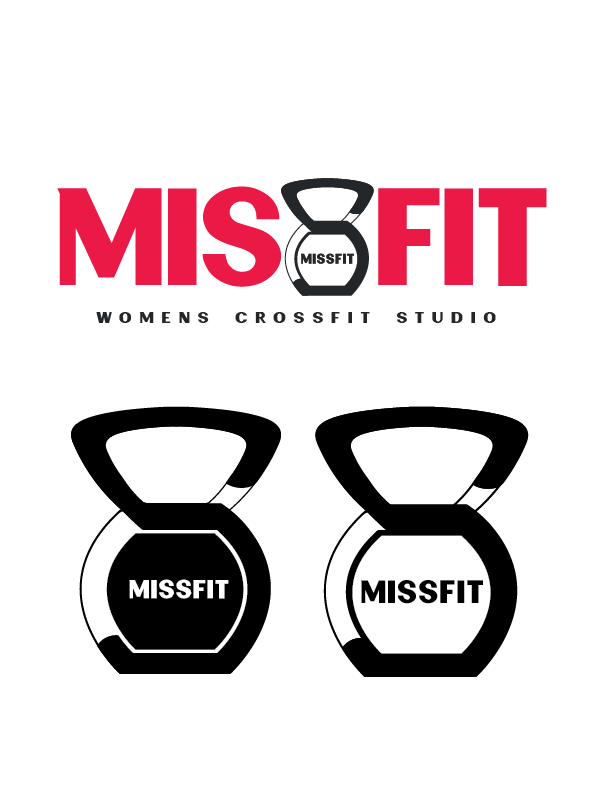
If anyone has a second and can give me their opinion on this logo, I’d really appreciate it.
It’s for a womens crossfit gym. The concept is to have the second “S” in Miss to be the shape of a kettlebell. What are your thoughts on this?
Why are there two b/w options on the bottom? are they options for what should be inside the word “missfit”?
I really like the logo - looks so good for a gym!
The only thing I’m thinking is - do you need the word written in the kettlebell? its kind of repetitive…
Also, maybe make the black S red so its clearer…
That’s the icon separate from the full logo, Just so you can see it clearer. And yes, I can take out the extra missfit from the kettlebell. And I tried the S in pink- wasn’t as sharp, but I’ll try it out again. you never know! Thanks!
Do you think its easy enough to tell that it’s an “S”? I keep looking at it and thinking maybe the S in the kettlebell should be more similar to the S in the text. I’m conflicted!
I was thinking that actually - that maybe you should match the S more to the font - I guess it doesn’t hurt to try another version…