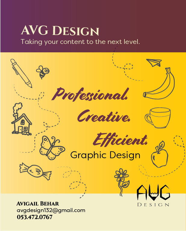
Hi, I’m designing a flyer for myself. These are the two versions I have so far - I like the second one a lot better. Any feedback would be greatly appreciated. Thanks!


The uploaded image looks a bit squashed - I’m not sure why.
I like the first one better. Looks cleaner and easier to read (though that could be just cuz the second one is more squished)
I like the concept of the second one - its cuter, but the first one is more professional and neat looking.
If you go with the second one, you should keep both top and bottom boxes neat. from the top one, take out the cupcake and swirly path and from the bottom - take the words “graphic design” and put it under Efficient - maybe more to the left so it stands out and reads professional. creative. efficient. graphic design. Then in the bottom box only have your contact info and ur logo (and make sure to align them)
In the main yellow box, I would lower the opacity in the illustrations - they are really cute but are taking away from the main focus…
I also think this can use some color somewhere - black and yellow remind me of a bee - maybe stick in some purple (which is more of a creative color) or torquoise…
Like the 2nd one better. Really cute idea!
I like the first one!
I like the first one, although the second could look good. it could be it looks crowded because its squashed.
In the second one, maybe make the illustrations less in your face- faded or thinner strokes. You want the text to stand out way more than the illustrations.
In the first one, center or align the “your logo here”.
And make sure the leading is even in the bottom bar. and dont write your name in small caps.
nice logo!
They are both very nice! The first one gives me more of a clean, professional feeling and the second more creative and fun. So whichever feeling you want to give off/ type of clients you want is the one I would choose.
If I would be looking through a bunch of ads the second one would be more likely to catch my eye because it is more unique and less “standard” template looking. I agree that the illustrations are a bit too heavy and can be made lighter.
I feel like a big part of deciding which style, would be depending on where you plan on posting this.
The first one looks very professional but its also more typical. the second looks more creative, but can also have a very kid friendly look to it.
I also think Breindy-s idea of adding purple would really enhance it.
I agree with chavi.
It depends which message you want to send to your customers: Are you more to the professional side or fun and creative
i really think the second one looks great but i would change the font of ‘graphic design’ on top of your contact details to the sans serif font you used, as i dont think it needs to shout out so much.
Thanks for all your helpful comments! I played around with the colors a bit and made the illustrations lighter. Here are a bunch of color combinations: which one do you like best?

black yellow
top middle two and bottom outer ones
What if you do a more blue purple? Otherwise, im thinking that i like the 3rd one from the left or just keep the colors how it was.
Maybe try text in center in white when it’s on top of purple?
I like this the best, just I feel that you should maybe have less black on top or make that purple.
Also align the logo to the top of your name - it shouldn’t be overlapping the darker yellow…

I think I like this one best, too. Here it is with a purple top - I’m not sure I like it so much, though. When I saved it as a png, it came out maroon, for some reason - what do you think about that one?

Another vote for the first one…looks more sophisticated and professional.
From those two, I like the second better.
The AVG logo should really be moved down into the light yellow box to align with your name.