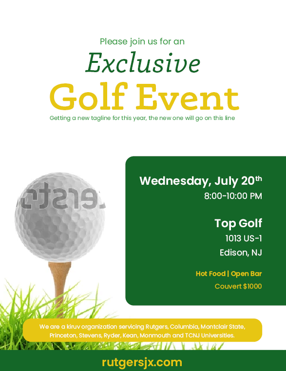
Any advice on how to make this better? I can’t figure out what to do with all of the text, especially the bottom.
Any advice is welcome! ![]()
Any advice on how to make this better? I can’t figure out what to do with all of the text, especially the bottom.
Any advice is welcome! ![]()
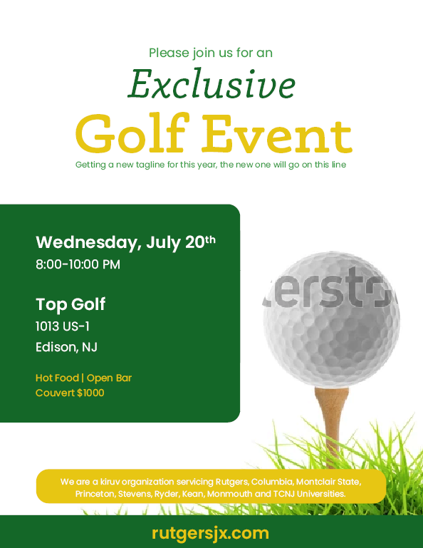
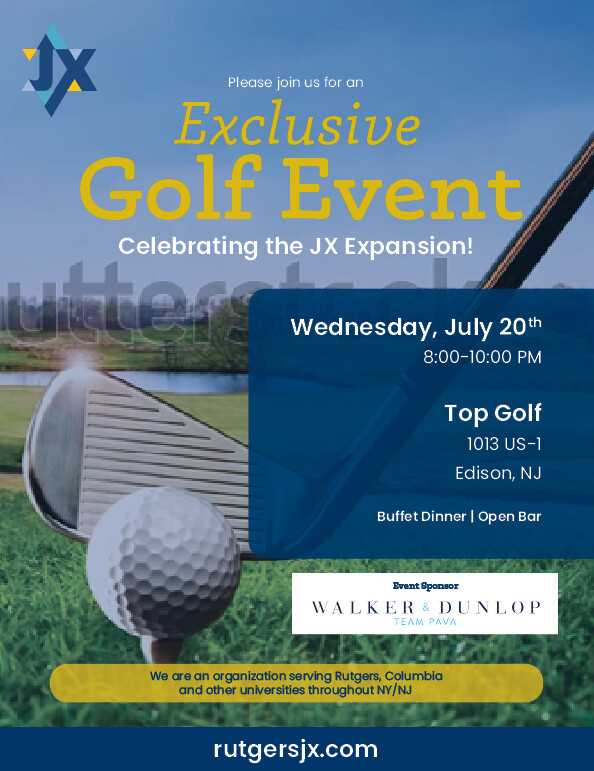
I think the second layout is better (where the green box is on the left)
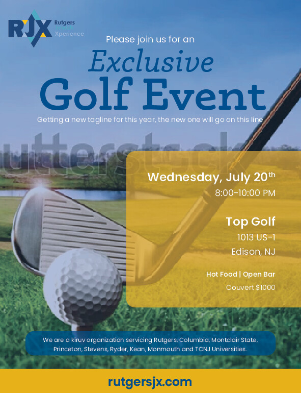
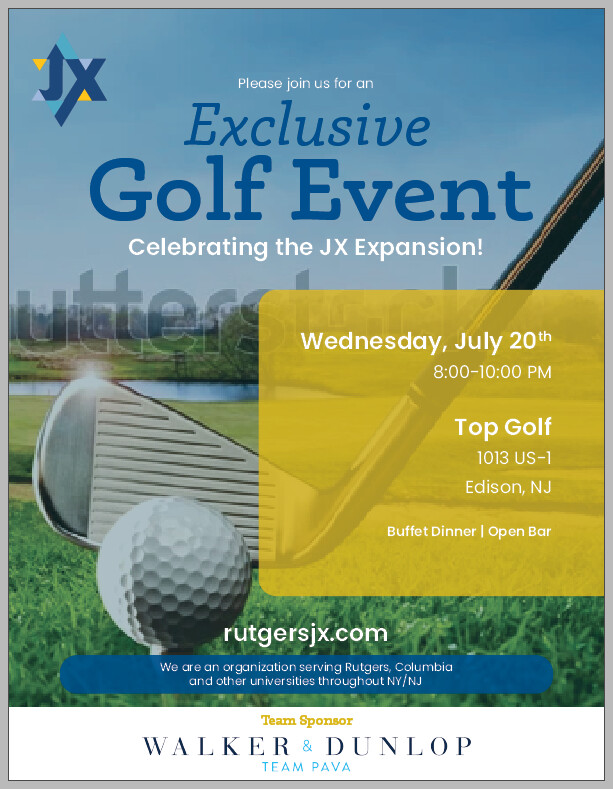
I think the word “exclusive” should be in the same yellow color as the words “Golf Event” - it’ll be a stronger focus.
The text in the green box needs to be nudged over to the left (but not too close because it still needs margin space)
I’m not loving the picture - can you maybe find something with a little bit more interest? maybe add a golf club?
otherwise, its really nice!
I liked the first one much better…
i love the new one way better -it’s alive, makes me wanna play even tho i dont love golf!
i would just make the yellow box less transparent or text darker/blue on yellow so can read it
Yes, the second one is much better!!
The text in the blue box should be moved up a little - its closer to the bottom of the box
Love it!
Really attracts the eye!
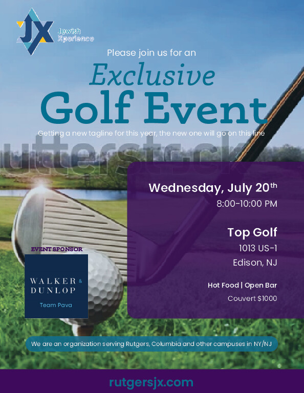
i like it, def more readable now… the purple is classy but possibly more feminine whilst the yellow felt more like ‘let’s take action’… i would probably show the client both colour options.
The client now isn’t sure if he likes the purple. Any advice on a good color combination for the flyer?
Thank you!
They had also nixed the yellow?
Magenta color might look good -its an action color - but if it’s for men then that might not go well with your client either 
You can try orange too…
I liked it best with the yellow as it was repeated from the logo…
I’m going to try to go back to the yellow. (I made it a bit brighter)
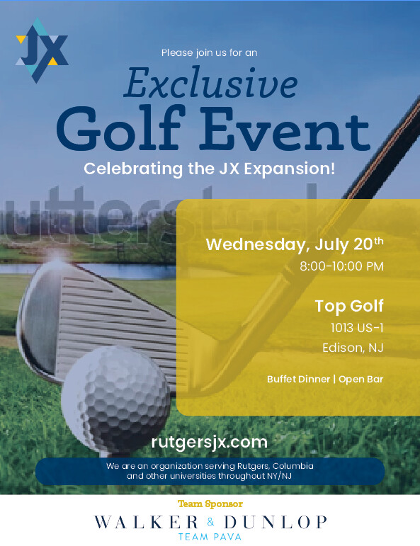
They changed some of the info. How does this look? I’m struggling with where to put the team sponsor logo.
very nice.
i’m wondering if muted or dark blue text would be better on the yellow b/c it’s hard to read as white on yellow - maybe its just me/my screen… i do like the yellow though
i think the team sponsor is in a good place
just re the content…
i’m just not sure about the rutgersjx.com address - what is that to do with? is it a ‘for more info visit…’ thing?
Is there a call to action? do they need to RSVP? if so there should be an email or more specific link on website to a registration page…
Also ‘we are an organisation serving’… maybe they should say which type of organisation?? i see it seems to be a kiruv thing so maybe the ad should say ‘for young professionals and students’ or whoever it’s for… (unless it’s going to be put up/sent out in places where only their audience visits… )
Also is it free entry or paid? i think it should say.
then i would maybe make that whole blue area a contact area…
well done for designing before the content is fully ready - i would find that a big challenge but you’re doing well!!!
I like it with the yellow. I really liked the first yellow where it’s repeated in the strip on bottom.
In the logo on top, is there supposed to also be an ‘R’ there? Cuz you had it in there in one version but not the others…
Thanks so much everyone! I think the client said it’s going to be sent out via text, so I’m assuming it’ll reach the target audience. I’m not sure what the website is for, maybe so people can see what the organization does. They switched the logo, so now there’s no ‘R’. ![]()
Do any of these versions look better? I switched the yellow and blue with each other and made the blue darker.
Or does the original coloring look better? And which layout?
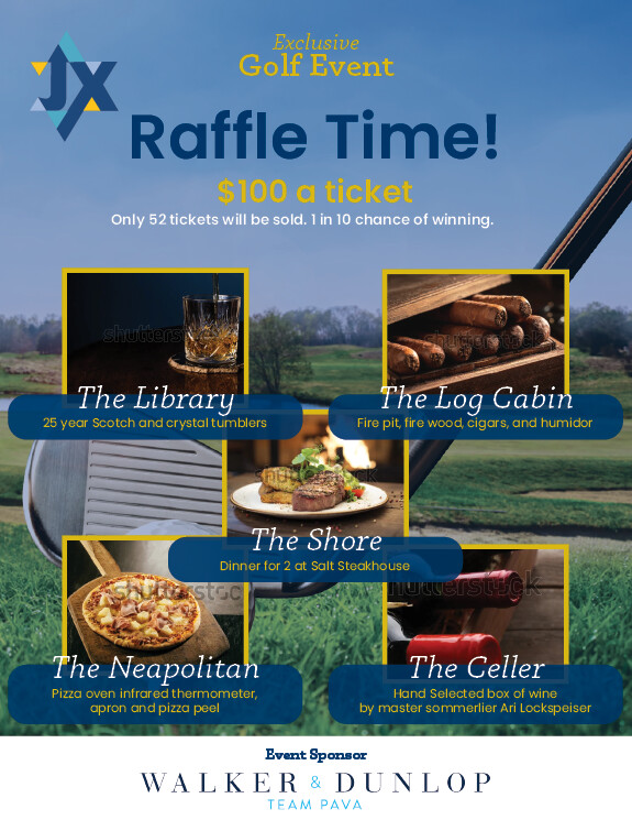
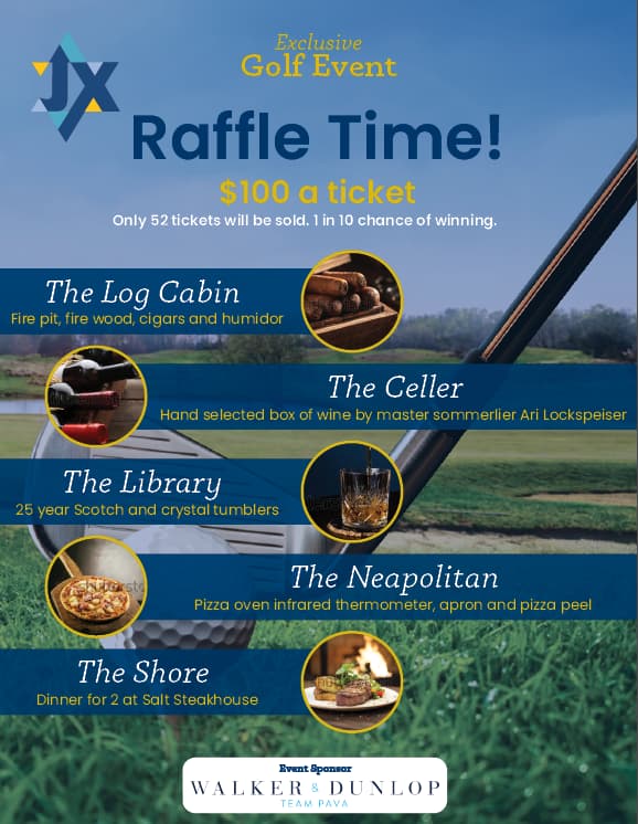
They asked for me to make a raffle flyer for the event. Any ideas on how to format all the info and prizes?
I like the second one with the round pictures better. The font is a big elegant looking compared to the main title on top.
I like the second one.
Isn’t it spelled ‘cellar’?
The second one!!